A territorial brand needs more than a logo
How should a county, municipality or region communicate when it already has a coat of arms, multiple institutions, local initiatives and a separate promotional brand?
In many local governments, branding is still treated primarily as an advertising tool. At LNV°ST, we see it differently. A territorial identity should first and foremost be a coherent system that people can actually use, not something designed only for a promotional campaign.
Another important aspect is establishing a clear communication hierarchy:
coat of arms → institutional brand → promotional brand
This was one of the key challenges in creating the new visual identity system for Radomsko County.
Our answer was not to replace the county’s existing heritage with a new graphic symbol.
Instead, we developed a clear brand architecture in which different elements of the identity perform different functions.
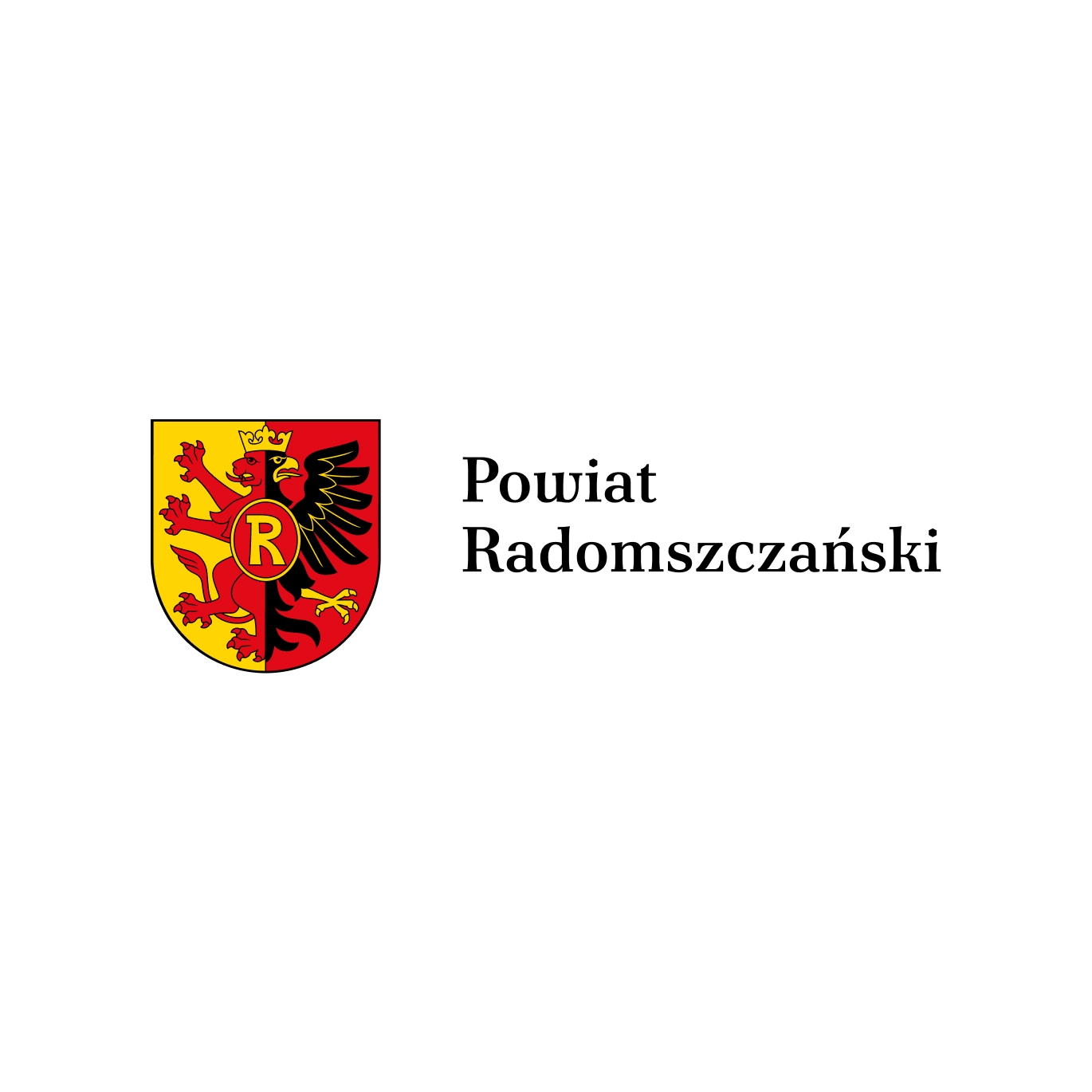
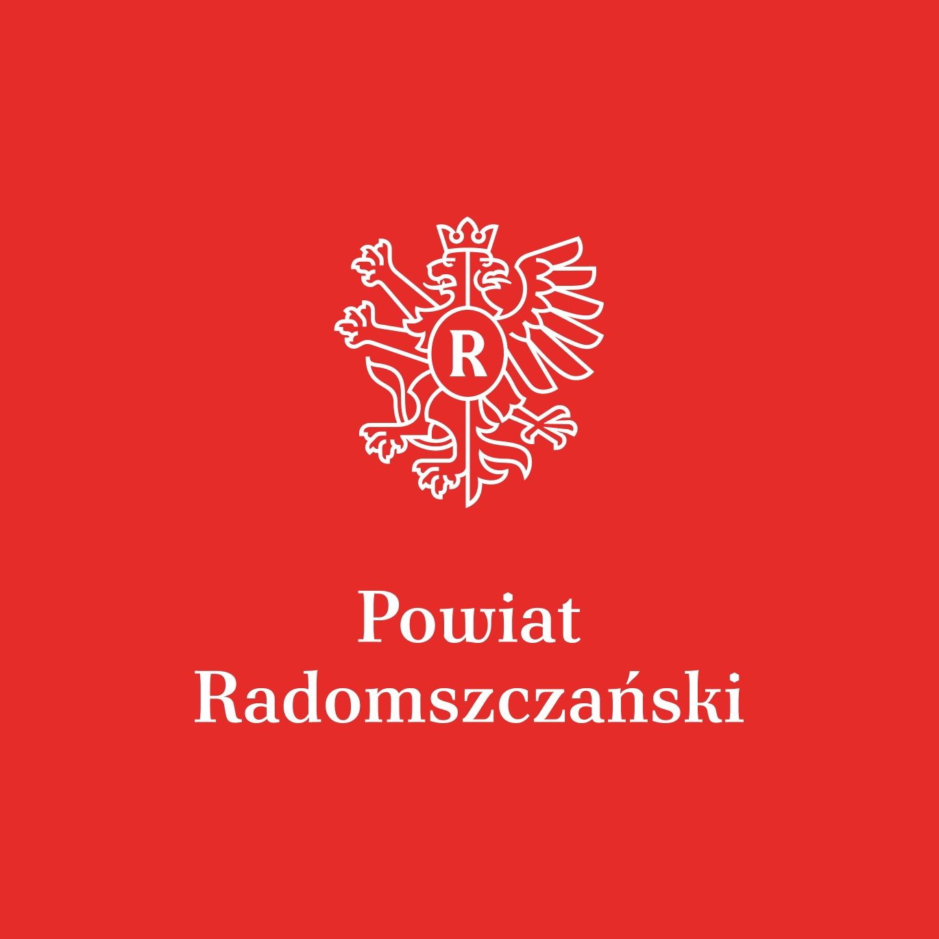
The coat of arms remains the official and ceremonial symbol of Radomsko County.
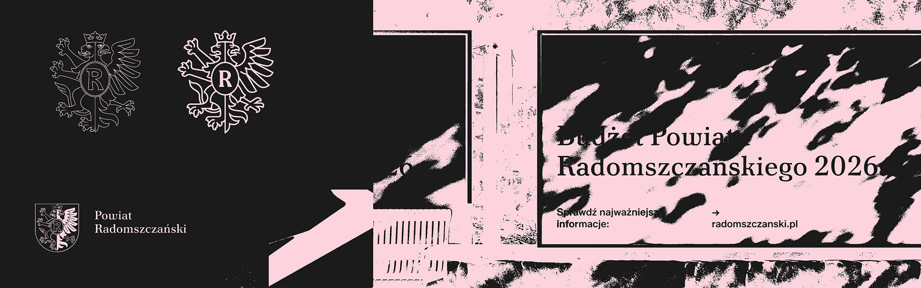
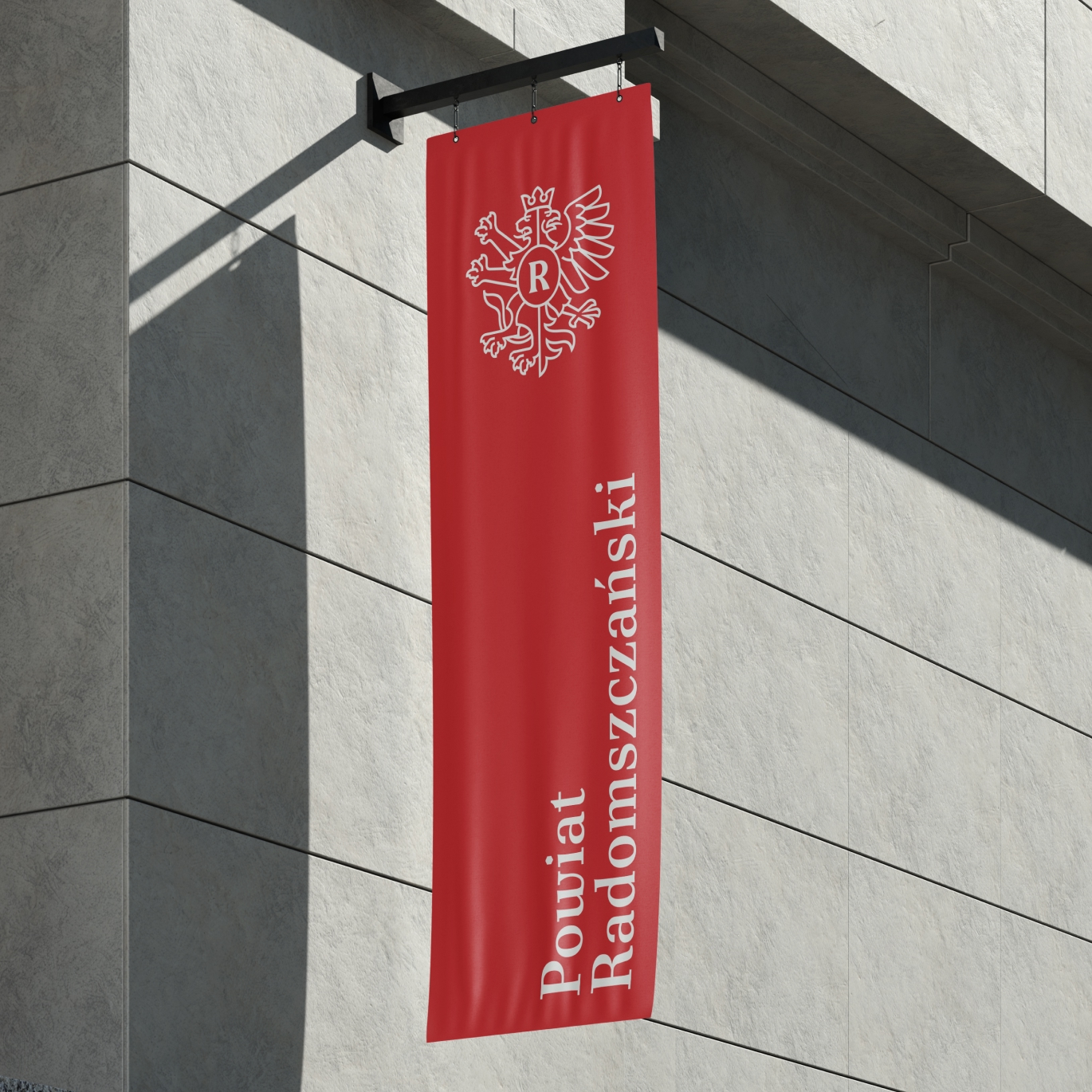
The new county logo, derived from its heraldic identity, is used in everyday institutional communication.
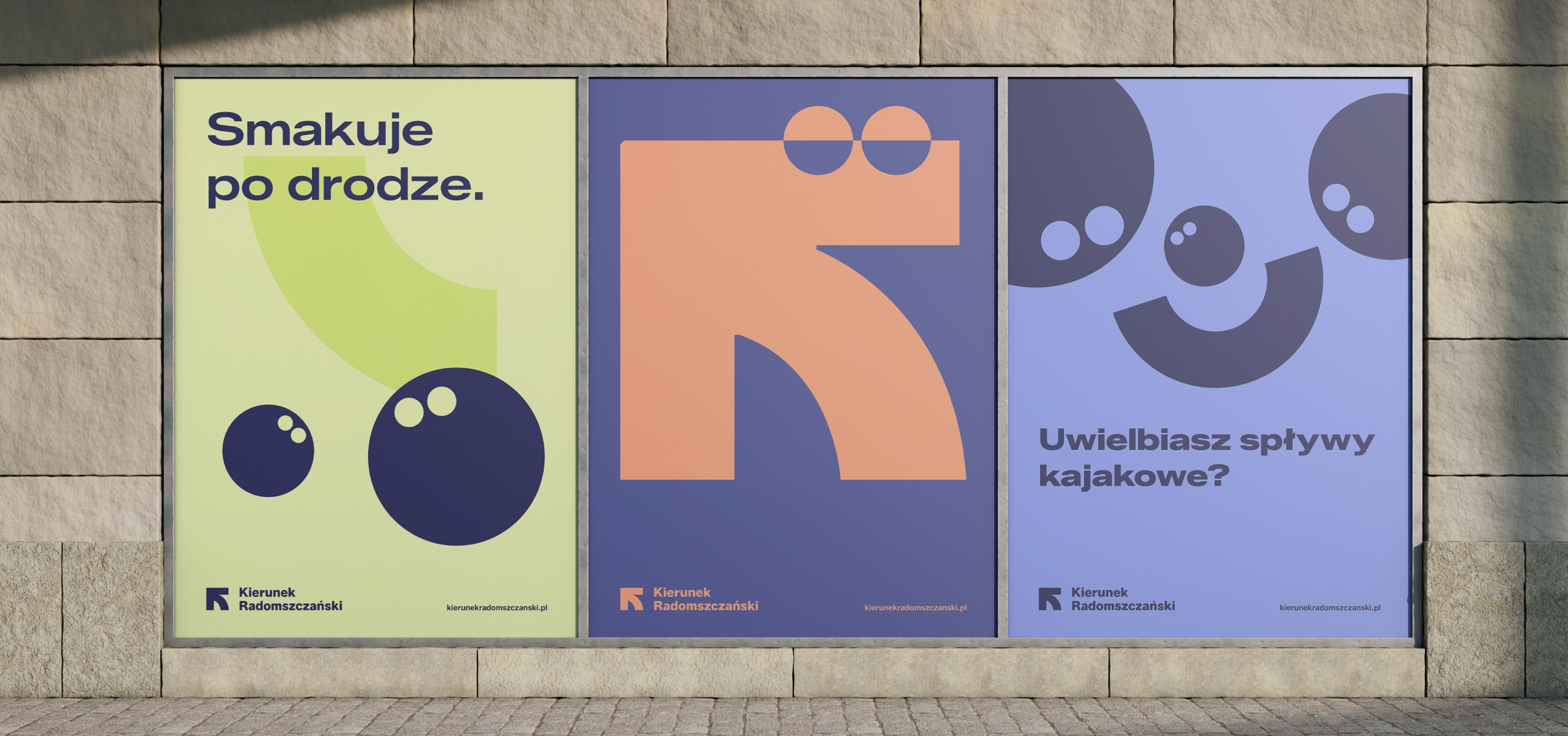
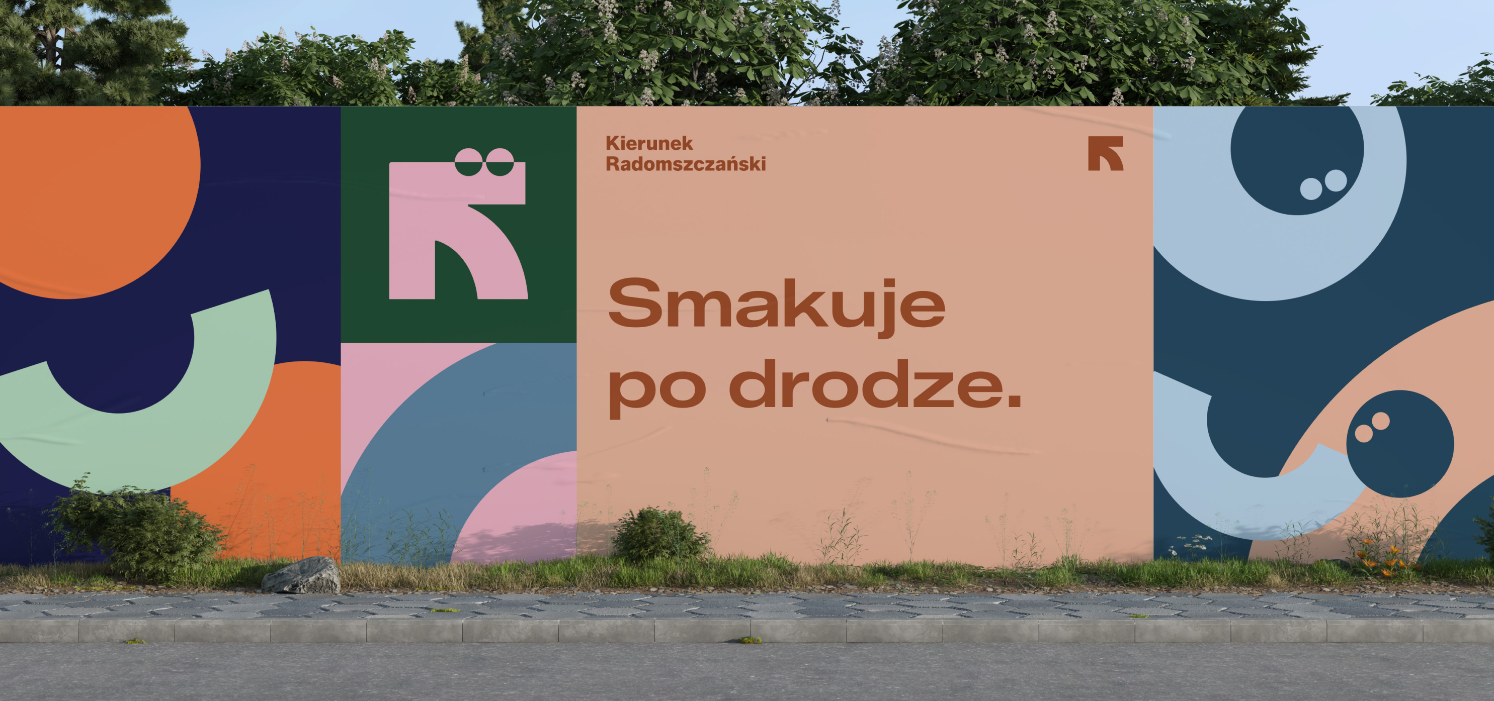
Meanwhile, Kierunek Radomszczański functions as the promotional place brand, bringing together tourism, local products, experiences, events and grassroots initiatives.
The distinction may seem simple. In practice, however, it solves one of the most common problems in territorial branding: forcing a single symbol to perform too many contradictory roles.
What is territorial branding?
Territorial branding, also referred to as place branding, regional branding or destination branding, is the strategic process of defining how a city, municipality, county or region presents itself to residents, tourists, investors, entrepreneurs and other stakeholder groups.
It is much more than a logo.
A well-designed territorial brand connects:
- the identity and character of the place,
- strategic goals,
- different audience groups,
- local government communication,
- tourism and promotion,
- culture and heritage,
- local businesses and organisations,
- visual identity,
- language and messaging,
- digital platforms,
- and the people and institutions responsible for implementing the brand.
In the public sector, there is an additional challenge: the brand has to work within an already existing institutional ecosystem.
This may include a coat of arms, official colours, local government departments, cultural institutions, tourism organisations and numerous independent communication systems.
The role of territorial branding is therefore not to erase this complexity, but to organise it.
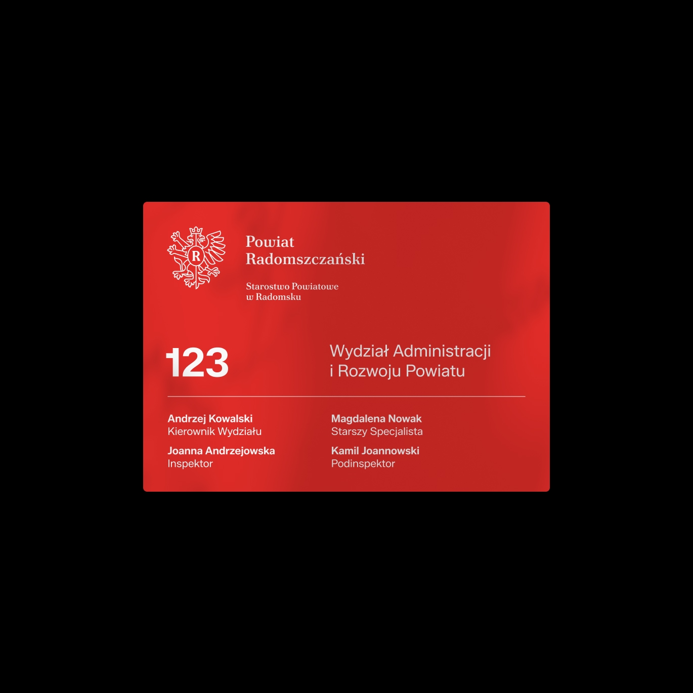
The challenge: one county, several communication roles
Local government branding often becomes unclear because three different concepts are treated as though they were interchangeable:
the official symbol, the institutional identity and the promotional brand.
They are three different things.
A coat of arms is rooted in heraldry and represents the authority, history and continuity of a territorial unit.
An institutional identity has to work across hundreds of everyday applications: documents, presentations, social media, signage, educational materials, events and digital communication.
A promotional place brand has a different role. It should attract interest, organise the experience of the audience, support local initiatives and give people a reason to visit, explore or engage with the region.
Trying to make a single symbol perform all these functions usually weakens each of them.
That is why, in the case of Radomsko County, we designed a system based on a simple principle:
Different communication roles require different tools, but all of them should belong to one coherent ecosystem.
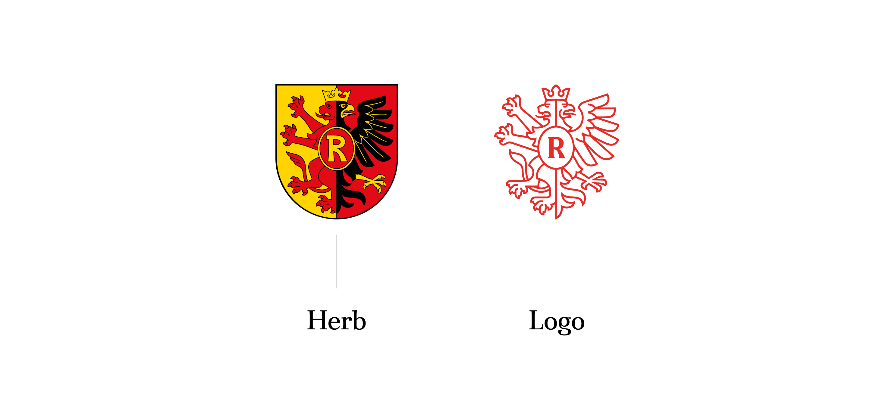
Coat of arms or logo: should a local government use both?
Yes, provided that their roles are clearly defined.
In Radomsko County, the coat of arms remains the symbol with the highest institutional status. It is appropriate for official and ceremonial contexts.
The county logo takes over in everyday communication, where a more flexible visual tool is needed.
It can be used across:
- information materials,
- digital communication,
- social media,
- presentations,
- educational projects,
- public events,
- promotional materials,
- documents,
- templates,
- signage,
- and other recurring applications.
The logo does not compete with the coat of arms.
It translates its visual heritage into a system adapted to contemporary communication.
This is particularly important in branding for municipalities, counties and other public institutions. A modern identity does not have to mean rejecting heraldry.
In many cases, a stronger solution is to determine where the coat of arms should retain its authority and where a contemporary visual identity system should take over.
How do you design a local government logo without cutting it off from heraldry?
The Radomsko County logo was derived from the existing heraldic symbol rather than created as a completely independent promotional mark.
This decision preserved continuity in communication.
It allowed us to build a contemporary identity while respecting the coat of arms and the history of the county. In territorial branding, continuity can be more important than novelty.
A local government visual system should survive changes in communication formats, technologies, campaigns and often successive political terms. Designing something simply because it looks current is therefore a weak long-term strategy.
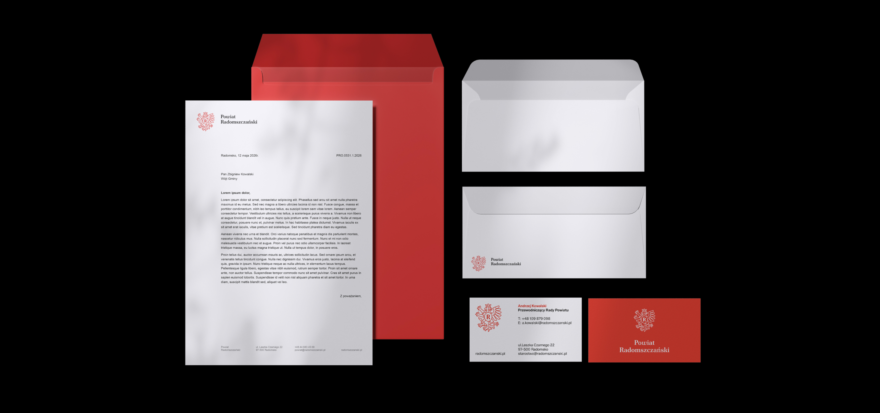
A logo only makes sense when it becomes a system
One of the most common problems in public-sector branding is treating the logo as the final product. This is also why public procurement briefs so often focus on a graphic mark and its documentation. In reality, a logo is only one part of a much larger system.
A territorial identity has to work in everyday use, often in the hands of many people with very different levels of design experience.
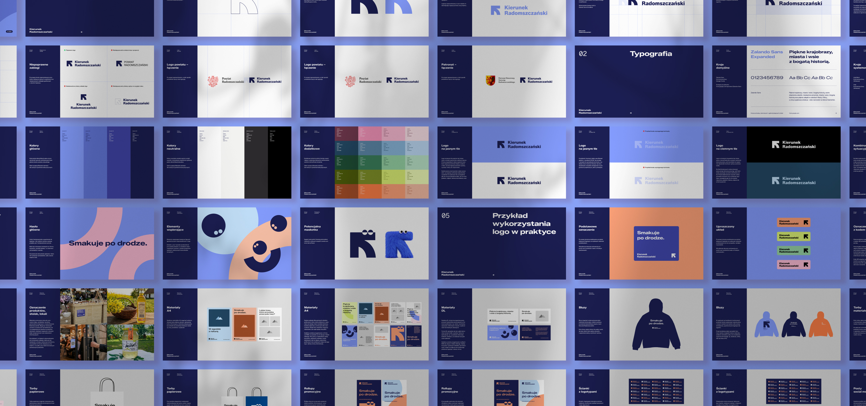
This means the system has to be both distinctive and operational. That is why the Radomsko County logo was supported by a complete visual identity system.
We organised and unified the identities of the county’s administrative units and established consistent principles for:
- typography,
- colour,
- layouts,
- institutional hierarchy,
- documents,
- templates,
- and recurring communication materials.
We also prepared guidelines explaining how the identity should be used correctly. The goal was to reduce visual chaos and make good communication easier to produce. In practice, this means fewer everyday decisions, faster and more efficient communication, and greater control over brand consistency.
Why is implementation part of public-sector branding?
A brand system for a public institution only works if people know how to use it.
This is one of the most important differences between designing a brand presentation and designing an identity system that actually functions.
Local government communication is created every day, often simultaneously across many departments, organisational units and external partners.
That is why the identity system has to answer very practical questions:
- Which logo should we use?
- When should the coat of arms appear?
- Which colours belong to which unit?
- What should a presentation look like?
- How should institutions associated with the county identify themselves?
- What happens when several organisations communicate together?
- How can consistency be maintained without involving a designer in every document?
These are also branding questions.
In the public sector, brand management is part of the design process.
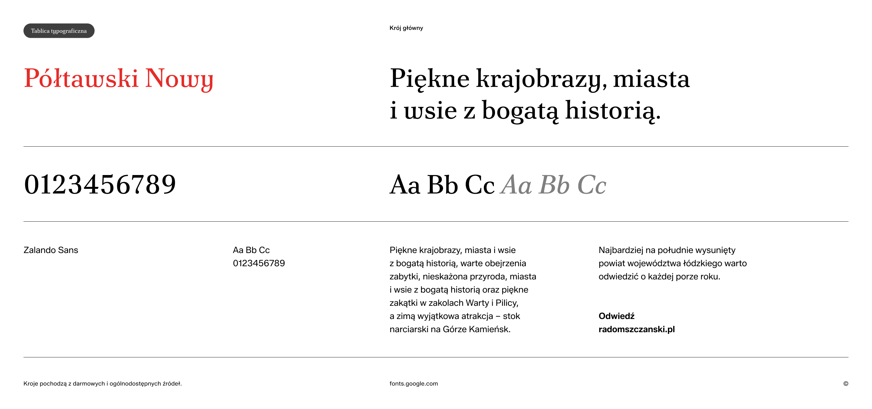
Typography as part of territorial identity
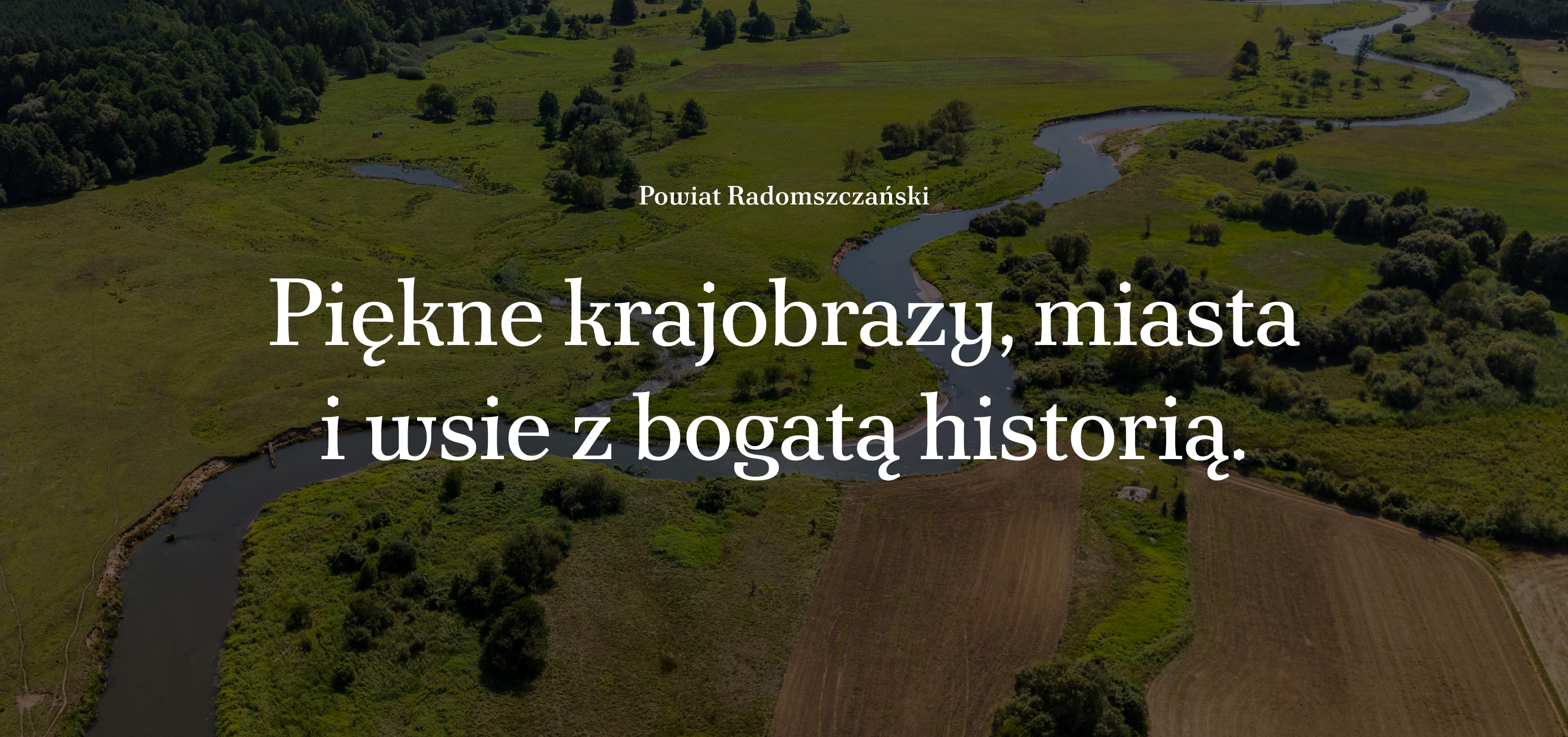
For Radomsko County, we selected Półtawski Nowy, a contemporary digital interpretation of one of the most recognisable Polish typefaces. This allowed typography to become part of the identity rather than remain a neutral technical layer. This is particularly relevant in place branding.
Local identity does not have to be communicated exclusively through literal representations of monuments, landscapes or folklore. The character of a place can also emerge through typography, language, composition, photography, materials and the way information is structured. This allows the system to feel rooted in the place without becoming decorative or nostalgic.
It is also significant that Półtawski Nowy is available through Google Fonts under an open font licence.
From institutional identity to place brand
The county identity is only one part of the broader branding system we developed for the region. In parallel, we created Kierunek Radomszczański. Smakuje po drodze., an umbrella brand designed to connect local experiences, products, events, businesses and initiatives.
The process began with analysis, surveys and public consultations.
These revealed a need for a shared platform that could connect activities previously communicated separately and help residents and visitors discover the county more effectively.
The result was a brand built around the idea of moving through the region and discovering its flavours, landscapes, people, initiatives and experiences.
The institutional identity answers the question:
- Who is communicating?
- The promotional brand answers:
- Why should someone become interested in this place?
Separating these two questions allowed us to create a much clearer brand architecture.
A territorial brand should eventually become infrastructure
We believe that a strong place brand should eventually become more than communication.
It should become useful infrastructure for the region.
In the case of Radomsko County, this approach led to the development of the Kierunek Radomszczański digital platform, which integrates:
- attractions and places,
- local events,
- walking and cycling routes,
- local products and producers,
- organisations and initiatives,
- people connected with the region,
- maps,
- and ready-made ideas for spending time in the county.
Instead of another short-lived tourism campaign, the brand received a digital environment that can continue to evolve.
For visitors, it functions as a guide and planner. For residents, it offers a way to rediscover their own region. For local producers and organisations, it creates additional visibility. For the county, it becomes a shared platform for organising and distributing regional information.
How we approach territorial branding and local government branding
At LNV°ST, we treat territorial branding as a combination of brand strategy, communication architecture, visual identity and implementation design.
Depending on the project, the process may include:
- Research and diagnosis
We analyse the existing identity of the place, strategic documents, communication, stakeholders, competing destinations and existing visual systems. - Stakeholder research and participation
A place cannot be treated in the same way as a conventional consumer product.
Residents, institutions, entrepreneurs, cultural organisations and local authorities are not merely audiences of the brand. They often become its participants and future users.
For this reason, the research process may include interviews, workshops, surveys and public consultations. - Brand architecture
We define the relationship between official symbols, institutional identities, promotional brands, tourism brands, initiatives and subordinate organisations.
This stage is particularly important in cities, counties and regions with complex organisational structures. - Positioning and brand strategy
We define what the place can credibly stand for, which audiences matter most and what role the brand should play in the region’s development and communication. - Naming and verbal identity
Where necessary, we develop the brand name, messaging architecture, claims, tone of voice and language principles. - Visual identity
We translate the strategy into a visual system that works across institutional, promotional, digital and physical environments. - Tools and templates
We create practical materials for the people who will actually use the brand. - Digital experience
Where relevant, we design websites, platforms, maps and other digital tools that transform the brand from a message into a useful service. - Guidelines and implementation
We define how the system should be managed so that it remains coherent even as more institutions and initiatives begin to use it. This is also the stage at which we provide training for the people responsible for managing the brand.

How is place branding different from commercial branding?
A company usually has a relatively clearly defined owner, management structure and business objective. A place does not.
Cities, municipalities, counties and regions consist of thousands of independent actors. Residents, entrepreneurs, politicians, institutions, tourists, cultural organisations and community groups may all have completely different interests and different ideas about what a place is.
Nobody owns the identity of a place in the same way a company owns a product brand. This changes the role of both the designer and the strategist.
Territorial branding requires more listening, more negotiation and much greater attention to implementation. Our goal is not to create yet another logo featuring a sun and a river. It is to build communication that is durable and authentic. Above all, it should be a useful system.
The most common mistakes in city, municipality and regional branding
Having worked with territorial brands and public-sector organisations, we see several recurring problems.
- Starting with the logo
Visual identity should express a strategic decision, not replace one. - Confusing the coat of arms with the promotional brand
Both can be valuable, but they serve different communication functions. - Designing primarily for tourists
Residents, businesses, institutions and local organisations are often equally important audiences. - Searching for uniqueness at all costs
A place brand does not need an artificially spectacular idea.
It needs a credible position that can be supported by reality. - Reducing local identity to landmarks and folklore
Territorial identity can be expressed through much more than illustrations of monuments, mountains, rivers or regional ornaments. - Creating a brand without an implementation model
If nobody knows who manages the system, how institutions should use it or how new initiatives can join it, consistency disappears very quickly. - Treating promotion as the final objective
A territorial brand can organise information, create partnerships, support local products, improve the visitor experience and strengthen cooperation between institutions.
Promotion is only one of its potential roles.
What should a good territorial branding project deliver?
A mature territorial branding process should answer at least five questions:
- What does this place want to be known for?
- Who are we communicating with?
- Why is this position credible?
- How should different institutions and initiatives communicate within one ecosystem?
- Who will manage the brand after the designers have completed their work?
Only after answering these questions does it make sense to ask what the logo should look like.
Radomsko County: one territory, three levels of identity
The final Radomsko County system was designed in layers.
The coat of arms preserves continuity, authority and ceremonial meaning.
The county logo and visual identity organise contemporary institutional communication.
Kierunek Radomszczański provides the external promotional narrative and a platform for discovering the region.
Together, they form an ecosystem rather than a collection of unrelated logos.
Our goal was to build a system and a way for the place to communicate clearly, consistently and effectively.
Frequently asked questions about territorial branding
- What is the difference between place branding and destination branding?
Place branding is the broader concept. It can address residents, investors, entrepreneurs, talent, institutions and visitors, not only tourists. Destination branding focuses primarily on building the attractiveness of a place as a destination for visitors.
A city, county or region may therefore have an institutional identity, a broader place brand and a separate tourism brand within a single brand architecture. - Does a municipality or county need a logo if it already has a coat of arms?
Not always.
The decision should depend on how the institution communicates on a daily basis and whether the coat of arms can effectively serve all required applications.
If both are used, their roles should be precisely defined.
A logo should not become an arbitrary replacement for the coat of arms.
It is also important to remember that we are not talking exclusively about a logo, but about an entire design system.
A complete set of communication materials can also be built around an existing coat of arms approved by the relevant heraldic authority.
The open question remains whether the institution wants to use a symbol of the highest official rank in everyday communication. - Should a territorial brand be based on local heritage?
Heritage can be an important source of identity, but it should not automatically determine the visual style of the brand.
Contemporary culture, the economy, landscape, residents’ behaviours, regional ambitions and everyday life can also provide sources of differentiation. - How do you create a regional brand?
A regional branding process typically combines research, stakeholder participation, strategic positioning, brand architecture, verbal identity, visual identity and implementation.
The exact methodology depends on the political, administrative and cultural structure of the territory. - Who should participate in the process of creating a place brand?
Depending on the project, participants may include representatives of local government, residents, cultural institutions, tourism organisations, entrepreneurs, NGOs, local leaders, educators, creators and organisations responsible for the later implementation of the brand. - Is territorial branding the same as territorial marketing?
The two concepts are related, but they are not identical.
Territorial marketing focuses on activities aimed at promoting and developing a place for specific audiences.
Territorial branding goes deeper into identity, positioning, meaning, reputation and the systems through which a place can present itself consistently over time. - What makes a good city, municipality or regional logo?
There is no universal visual formula.
A strong territorial identity should be distinctive, appropriate to the place, scalable, practical across different communication formats and supported by a coherent visual system.
Most importantly, it should emerge from a clear understanding of the function the identity is supposed to perform.
About LNV°ST
LNV°ST is a Warsaw-based brand strategy and communication studio working with companies, institutions and public-sector organisations.
In territorial branding projects, we combine research, brand strategy, stakeholder engagement, positioning, naming, verbal identity, visual identity, digital products and implementation systems.
We do not design place brands as individual logos.
We design systems that need to work across institutions, audiences and many years of communication.
The Radomsko County project included the county’s institutional identity, the Kierunek Radomszczański promotional brand and its digital platform.
.avif)

.avif)
.avif)
.avif)