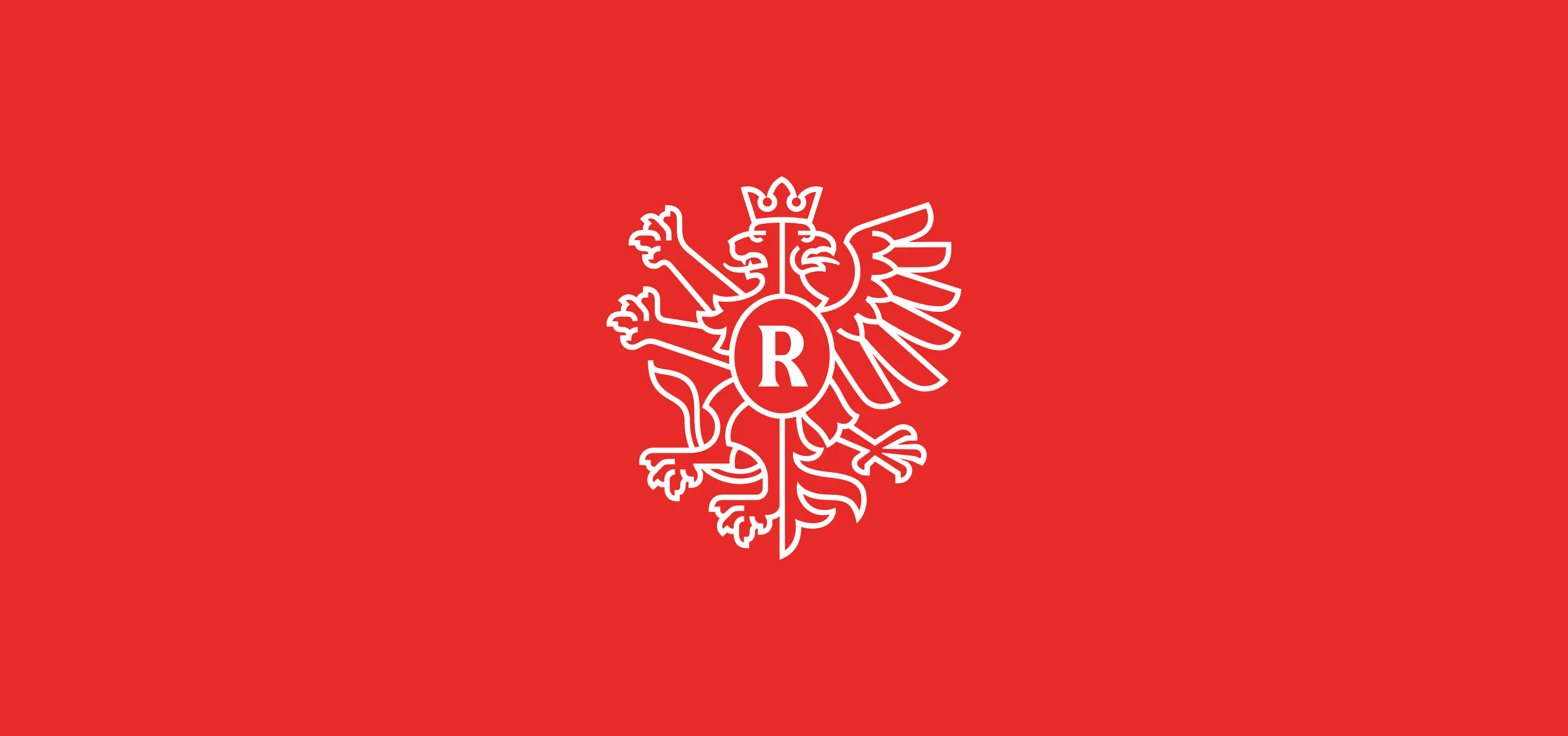
Radomsko County Logo
Overview
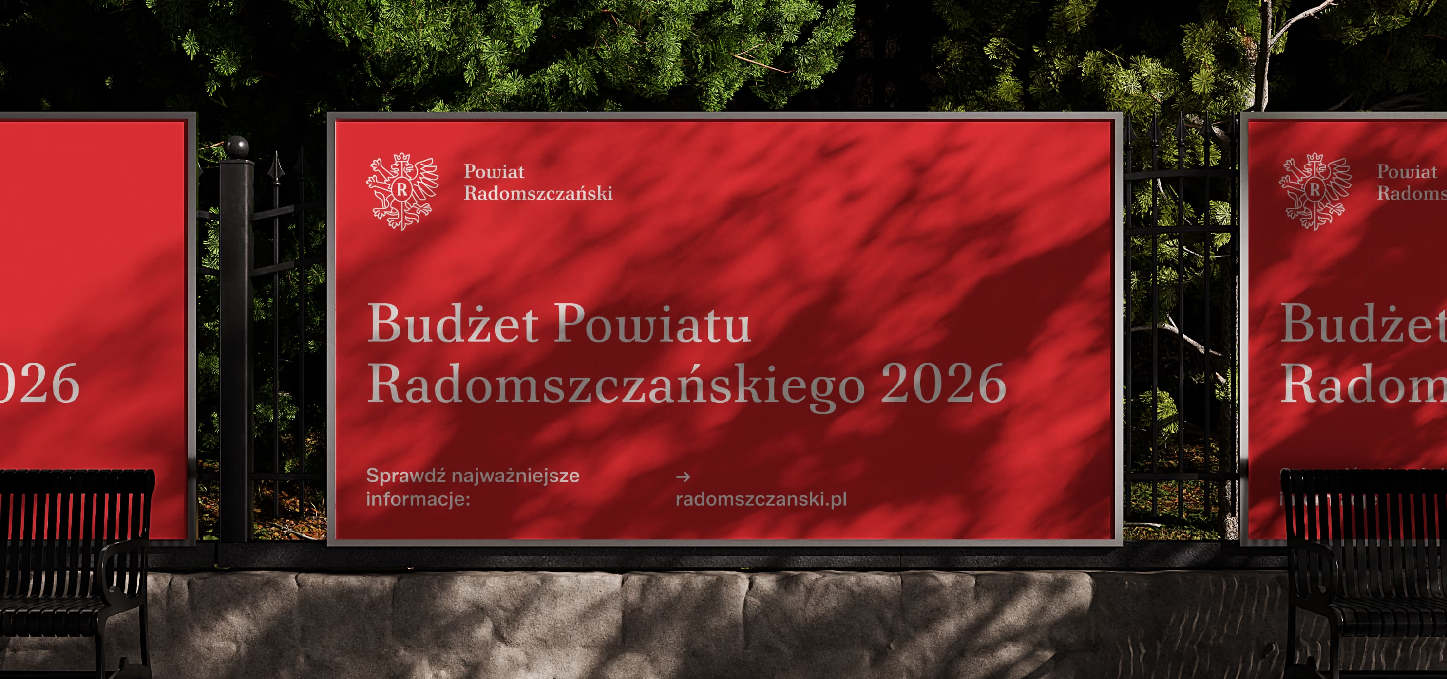
Sometimes, a coat of arms can feel like too much, while a logo can feel like too little.
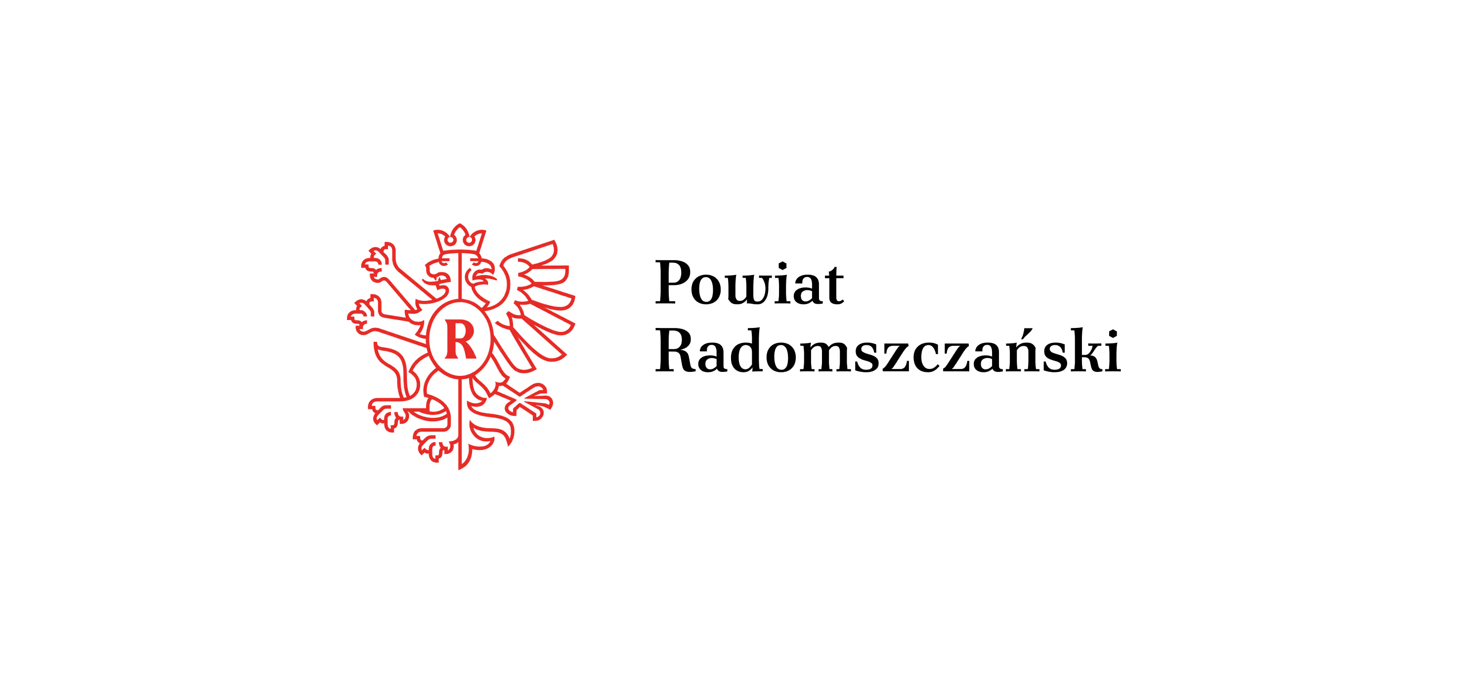
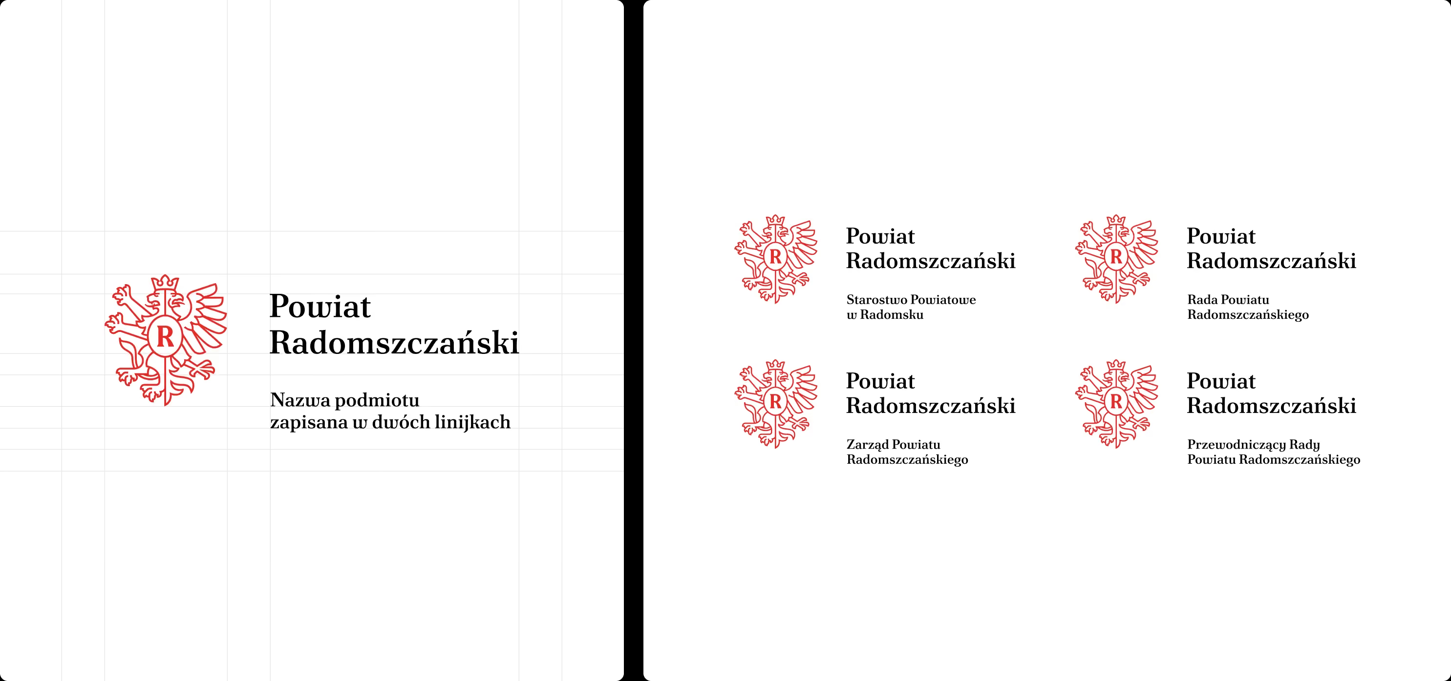
For Radomsko County, we created a system in which the official symbols retain their appropriate status, while everyday communication gains its own, more flexible tool. Developing the county logo was one of the elements of our work on the county’s promotional brand.
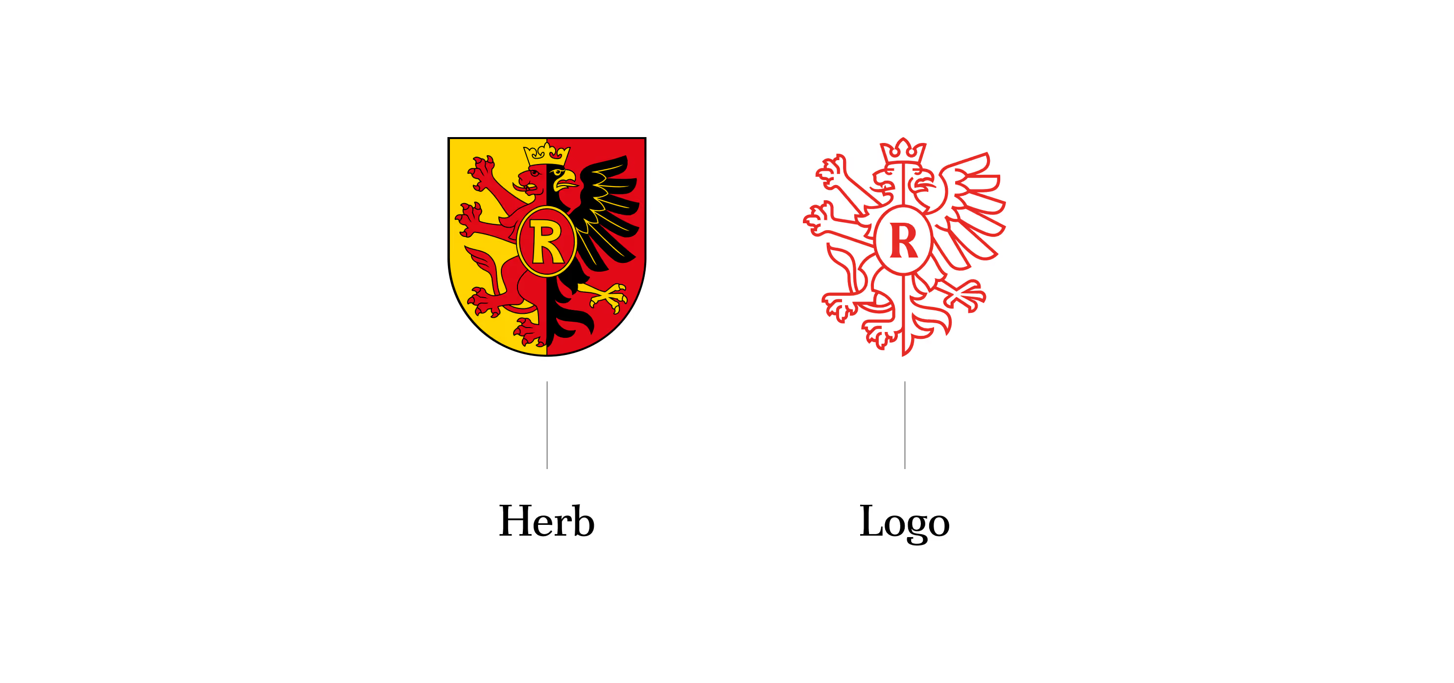
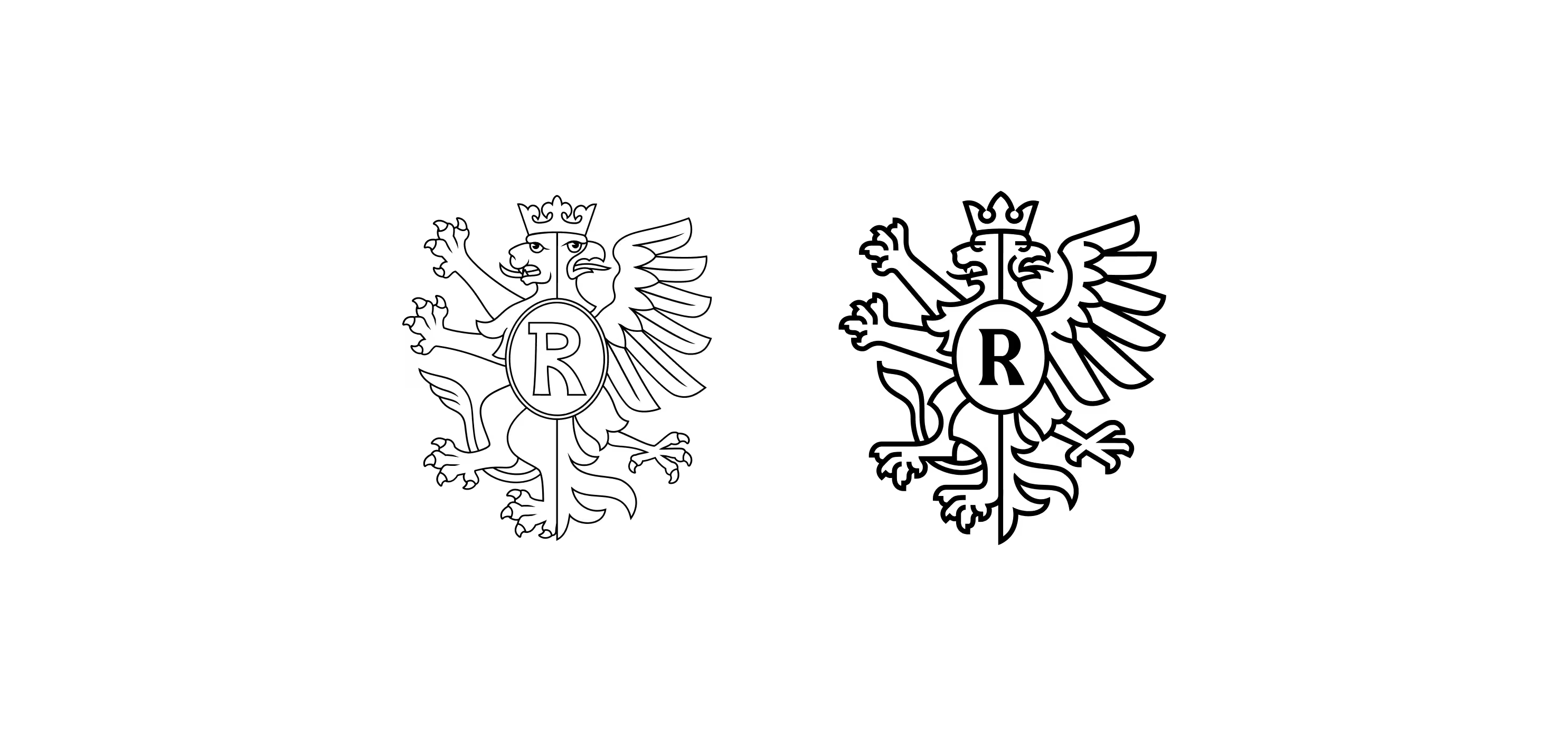
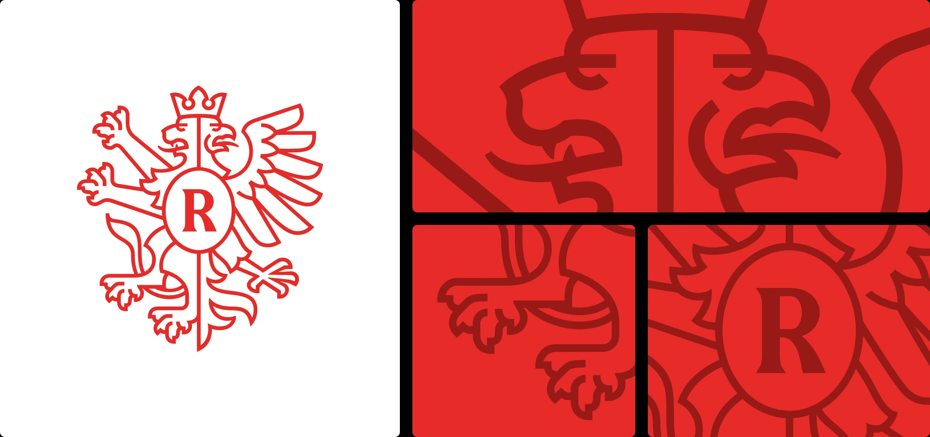
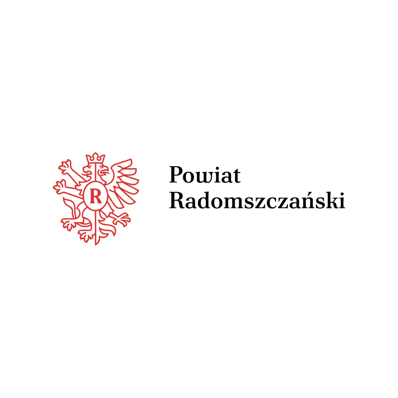
We opted for a solution designed to be lasting and sustainable. Between the symbol of the highest official rank, the coat of arms, and the promotional brand, Kierunek Radomszczański (Destination Radomsko. Taste it along the way.), we introduced a logo derived from the county’s heraldic symbol .
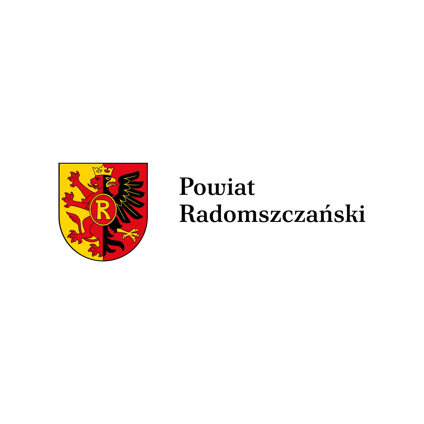
The coat of arms remains the official and ceremonial symbol.
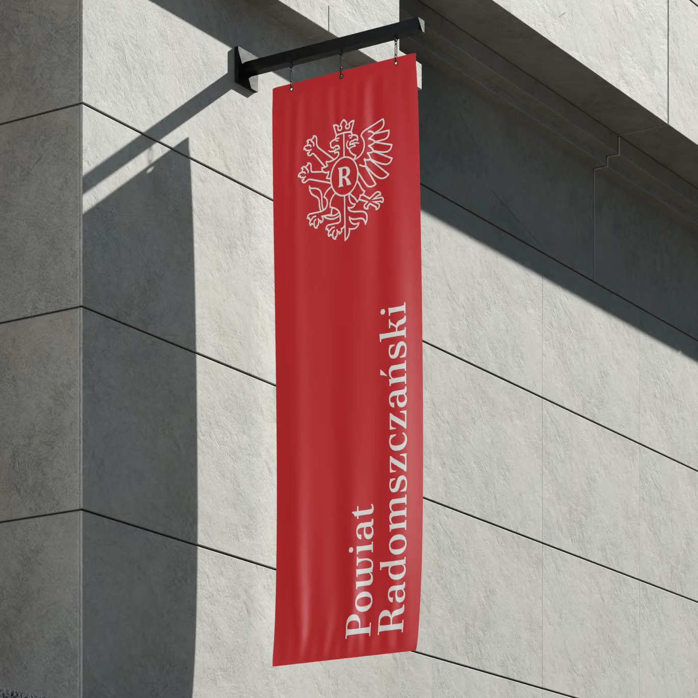
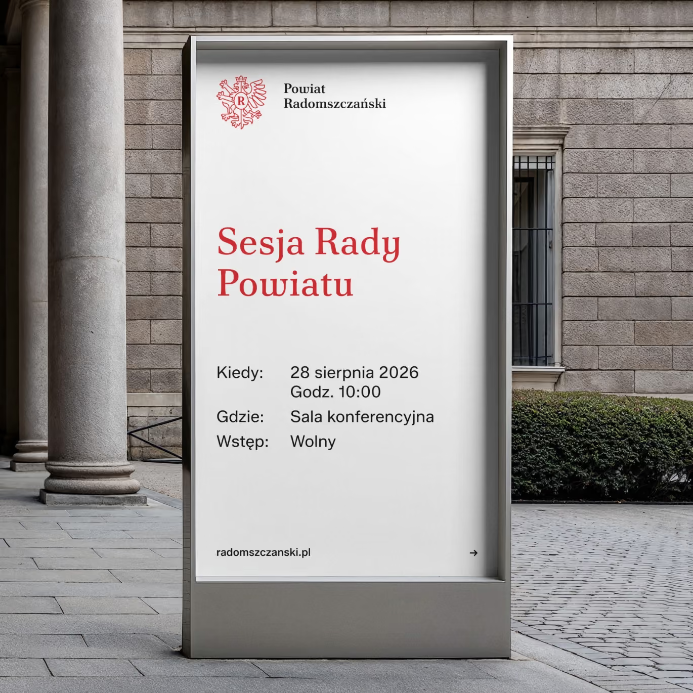
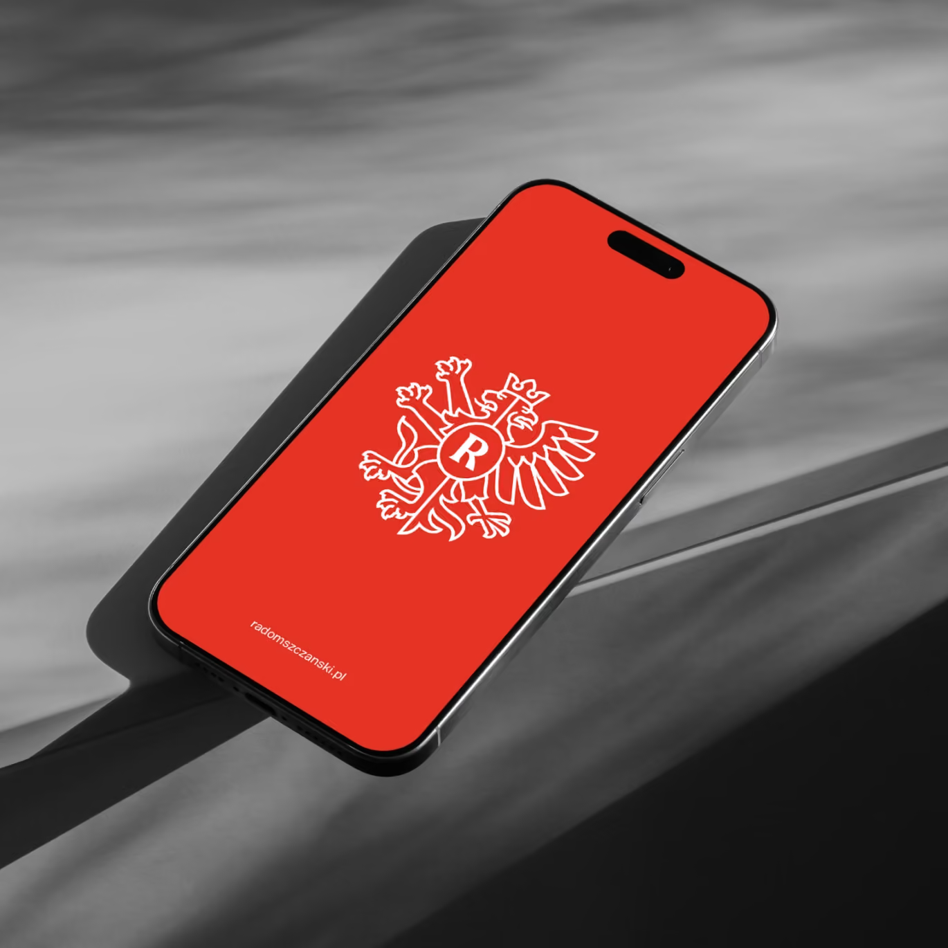
The logo derived from the county’s heraldic symbol takes care of everything else: informational and digital communication, educational and project-related materials, events, social media and promotional materials.
In practice, this means that the county logo is supported by a complete visual identity system.
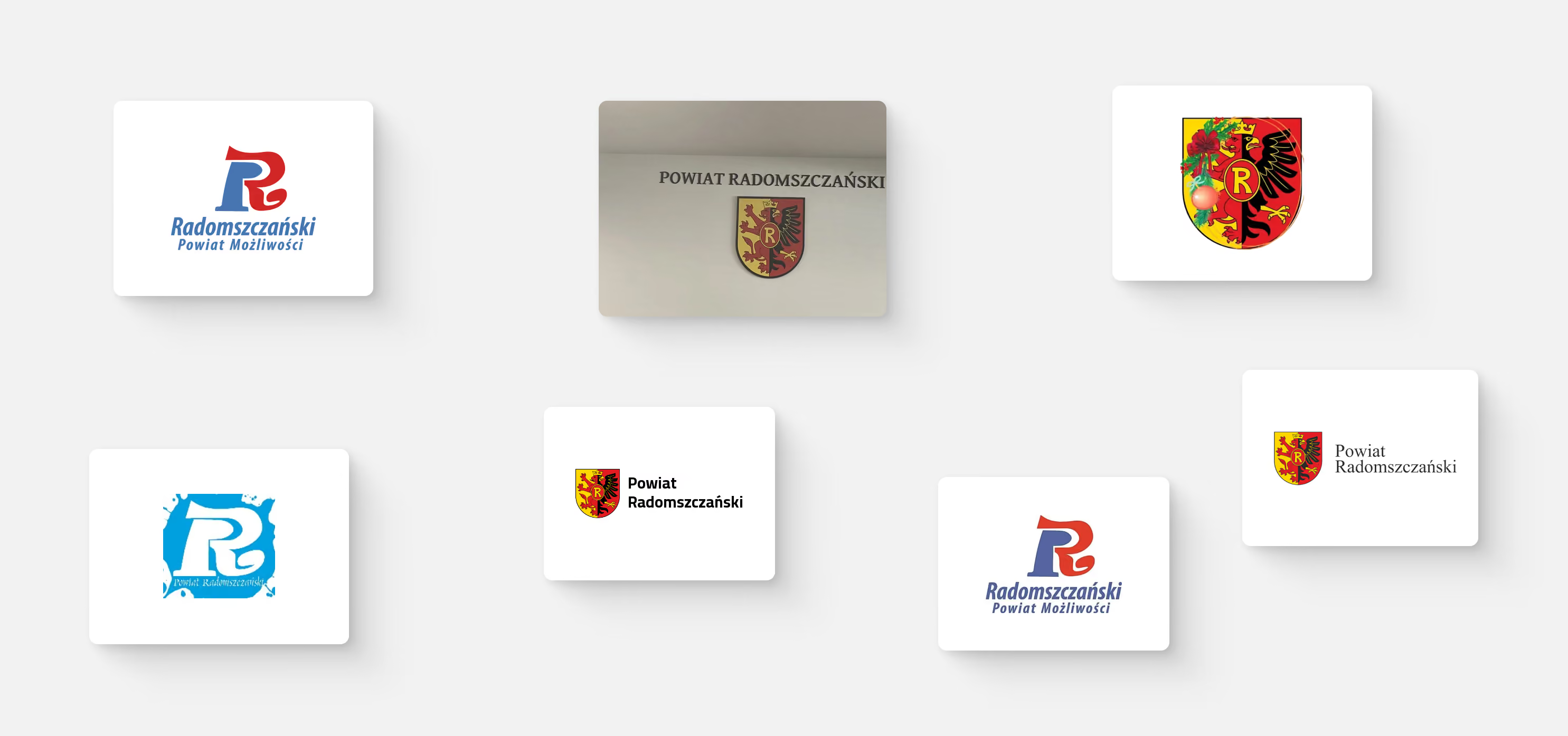
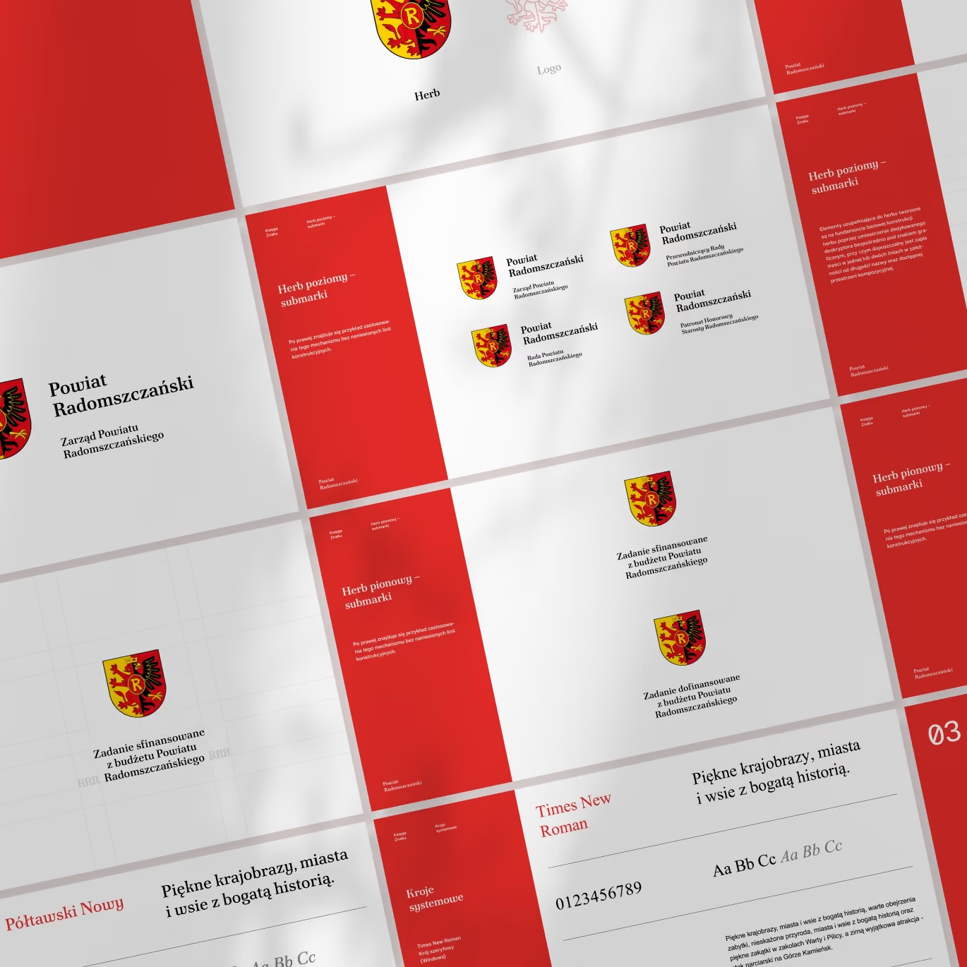
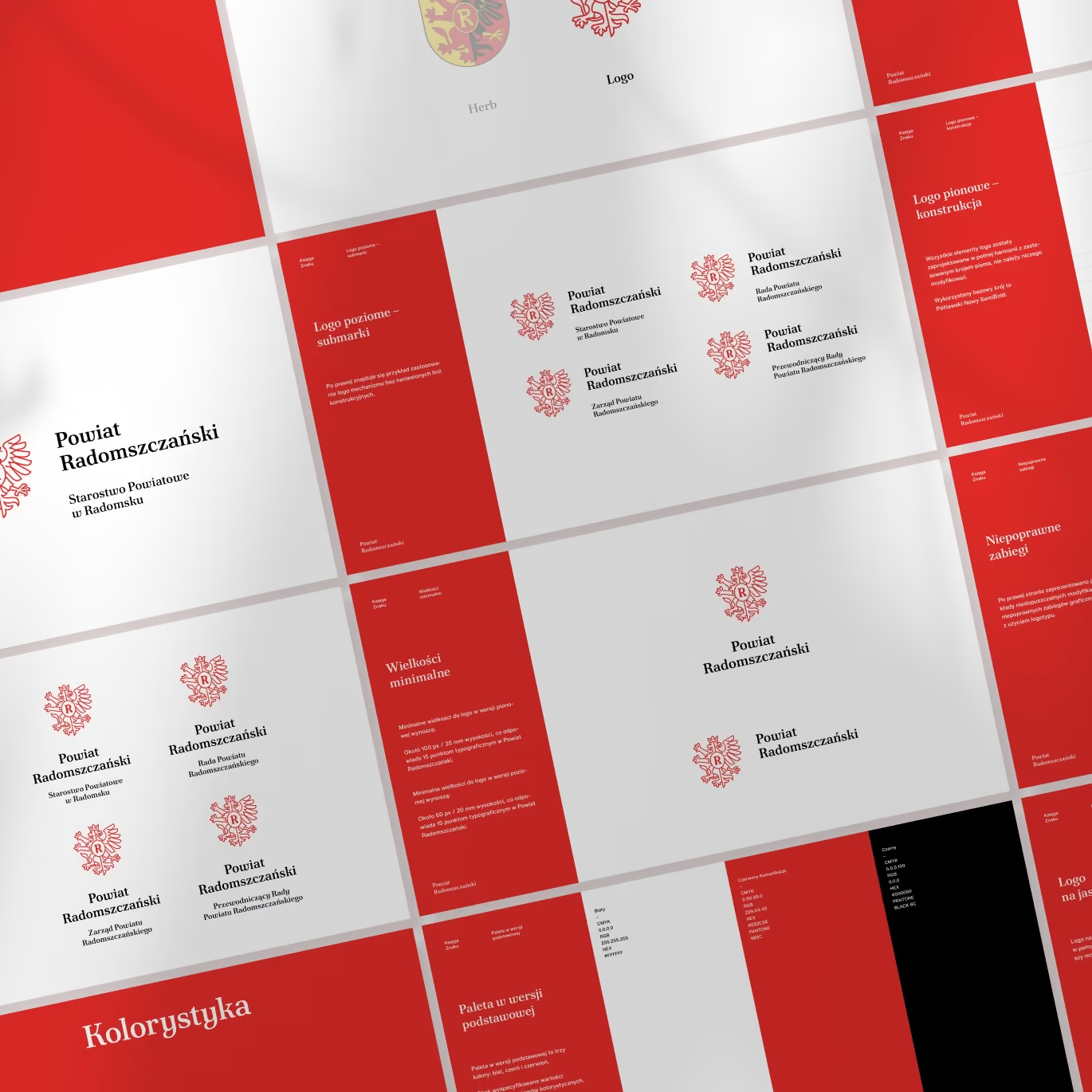
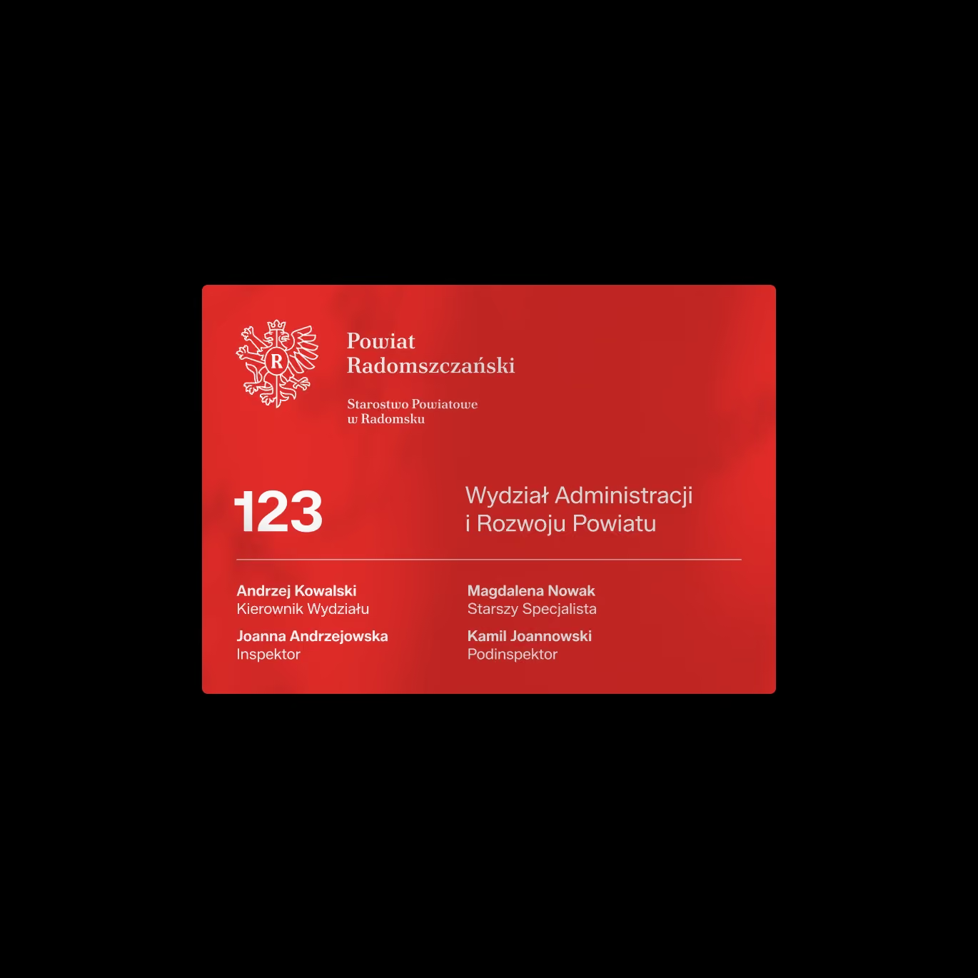
We structured and unified the logos of the county’s administrative units, as well as the use of colour and typography.
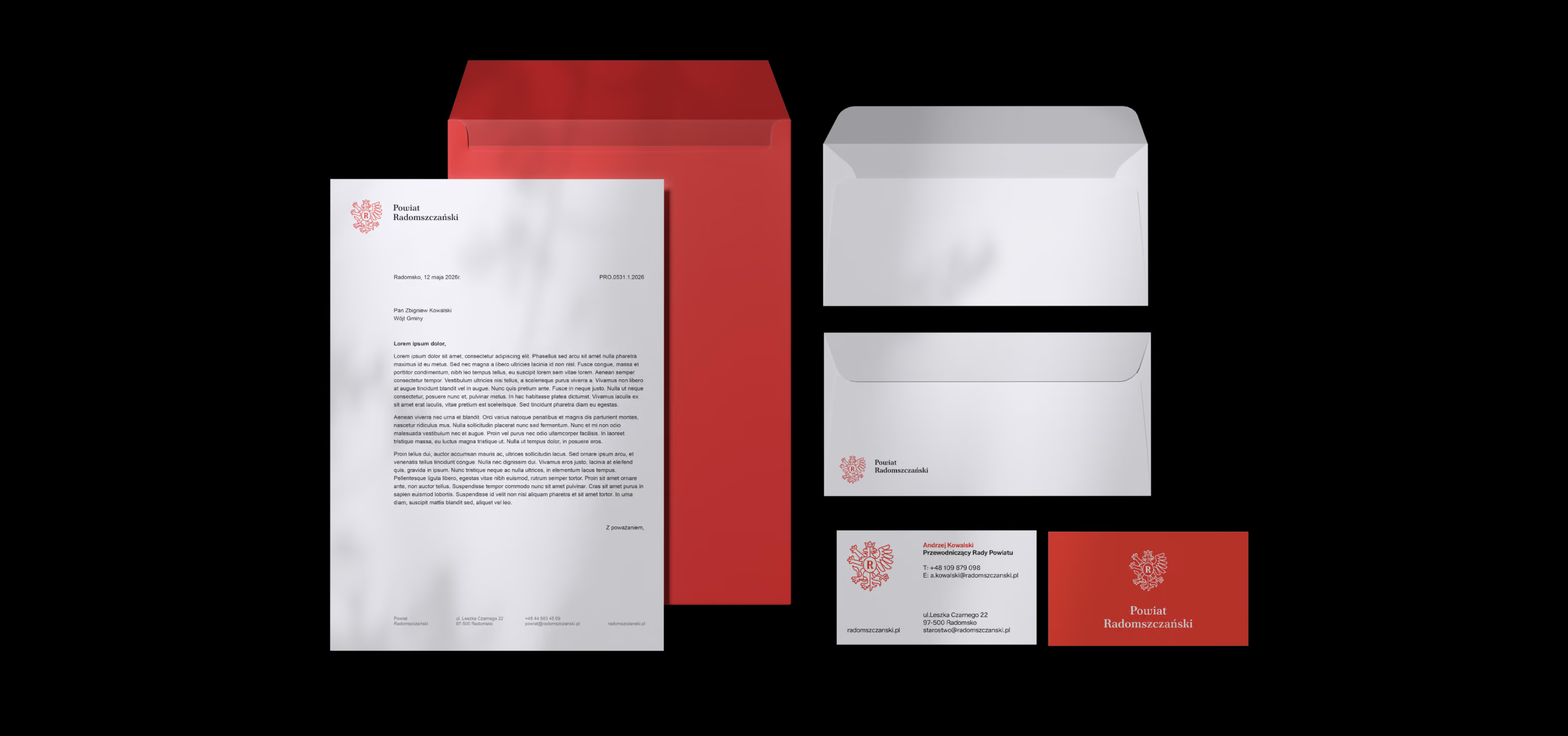
We prepared templates and documents for everyday use, together with clear brand guidelines.
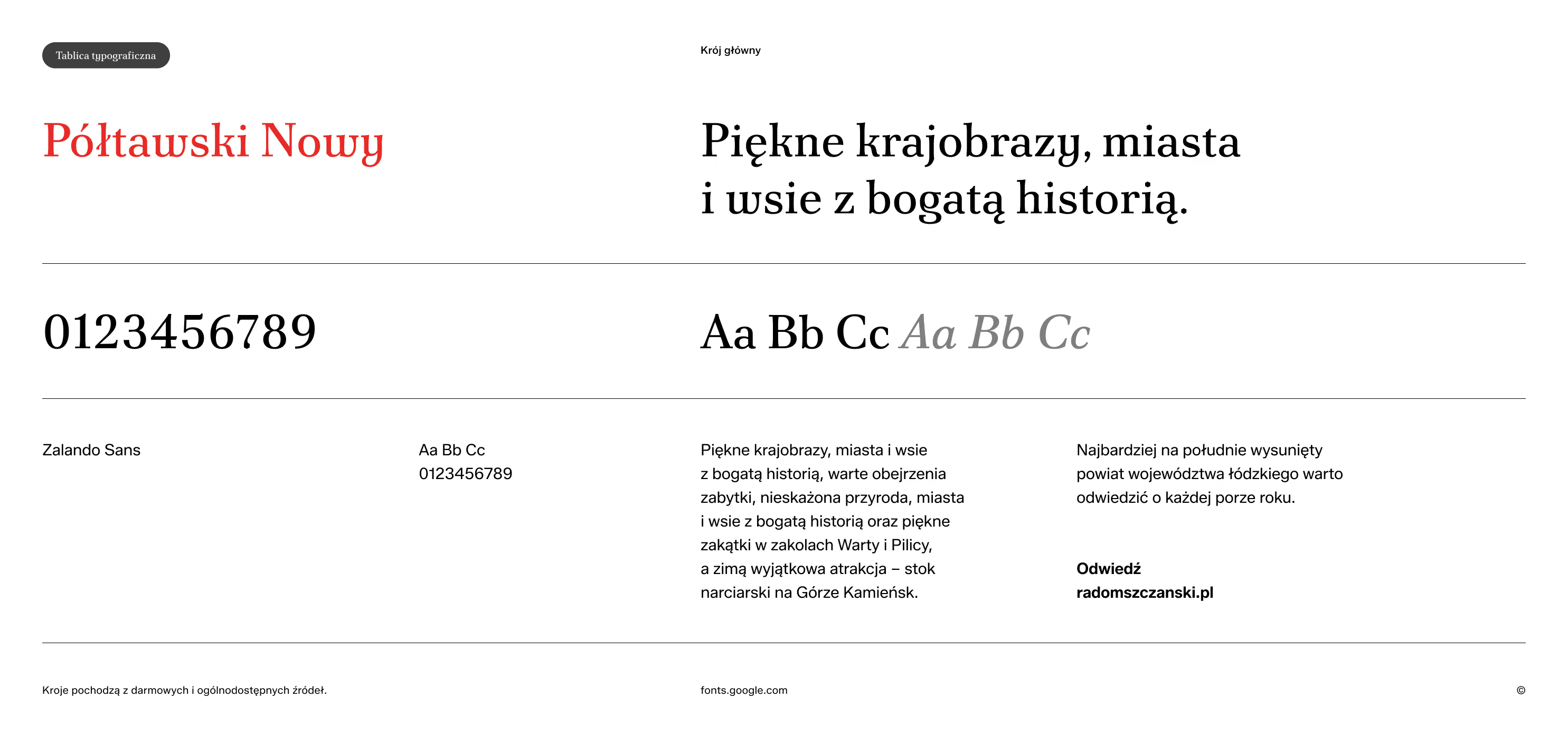
The typeface we selected is Półtawski Nowy, a contemporary digital version of one of the most recognisable Polish typefaces.
Simple, clear rules and a distinct separation between the institutional gravitas of the county authority and its everyday communication.

Here you can read more about the Kierunek Radomszczański brand.
And here you can read more about the Kierunek Radomszczański portal.
Project team
Want something like this, but different?
By the way, join our
non-intrusive newsletter
with quality content