Visual Coherence
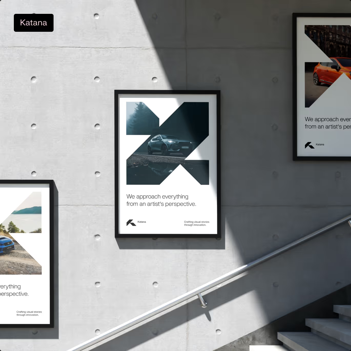
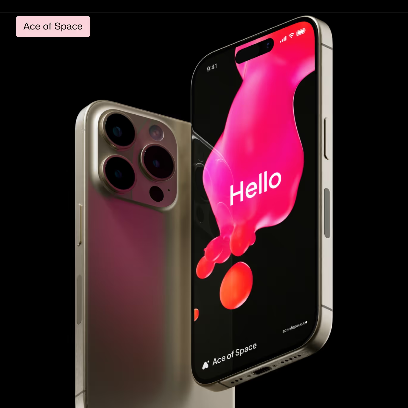
Let's start with what consistency is perceived with the naked eye. It is this awkward situation when the brand's communication materials differ from each other. They do not look like material from a single source. Sometimes they have common features — similar or even the same colors and, of course, logos, but they use a different graphic language — sometimes we use photos, sometimes graphics, other times icons or other supporting materials — their own, taken from graphic stock or generated by AI. All this creates information noise. We see a strong but often generic message (an illustration signaling the subject rather than its essence) — and certainly not indicative of the sender and its unique characteristics.
And then we feel that what the brand needs is consistency. Ideally, the messages placed side by side look similar, be readable as messages of the same brand and still convey its character.
How is this consistency created? Let's look at the possibilities
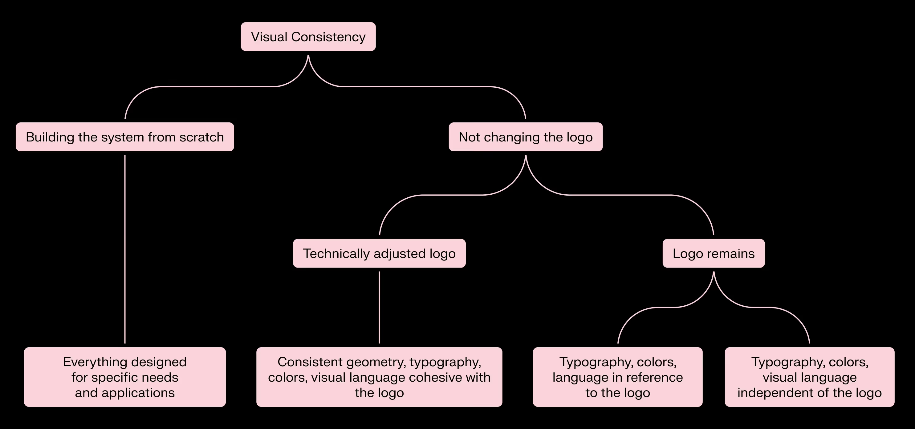
We leave the old logo
The decision to leave the current logo unchanged must be well motivated. Most often, these motivations are purely budgetary, that is, replacing the logo is too laborious or expensive.
Sometimes we treat leaving the logo as a temporary effect, eventually replaced by a coherent communication and a coherent design system. Then — for rational reasons, it is better to design a new, internally consistent system and leave the existing logo for a fixed period of time.
Why?
Firstly, thanks to a coherent system, we immediately have the ability to act on templates, we begin to communicate coherently visually.
Secondly, we familiarize the audience with the new visual communication without surprising them with the new logo. Between us speaking — this supposed shock and outrage associated with the logo change is not as frequent as marketers would like it to be. If you are not a global product brand, you have nothing to fear here.
Third, an old logo (often designed as an adventure) combined with a professional design system will either disappear (i.e.: its change will not seem like such a big decision) or it will stand out visually like a weak stamp attached to a good design — that is, it can accelerate the decision to change it in the organization, even among those decision-makers who previously had sentimental approach to the case. To put it bluntly — such a statement can be an additional argument for change.
Correction/lifting logo
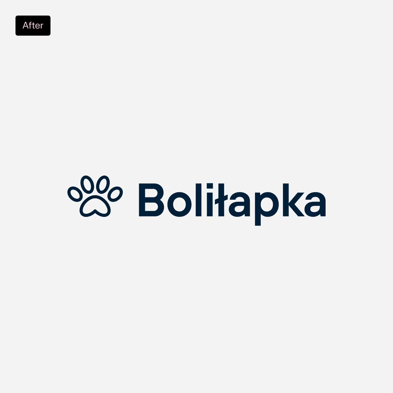
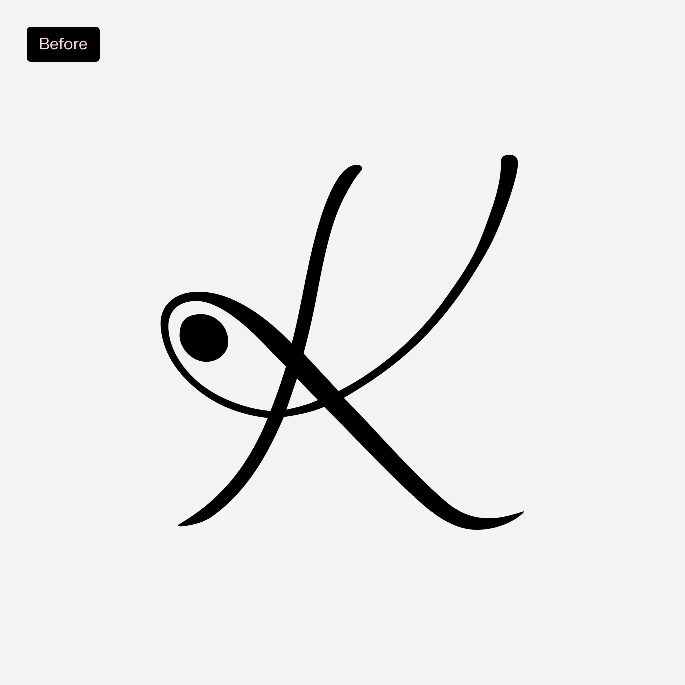
Often, optical and qualitative correction of the logo is enough. Sometimes it is cosmetic, sometimes it goes further, but retains the guidelines and edges that guided the original design assumptions. In other words — it is not a simple cover of the current logo, but a reflection: how, with the same guidelines, we would design it today, today. I emphasize — today, not in line with trends. In this modernization, we usually talk about the rejection of ornamentation and naive imagery (puns) used in the early market economy in Poland. Another aspect is the adaptation of the logo and its scalability to the digital world, as well as to specific applications. The final touch is the improvement of optics and proportions.


We are building a new system from scratch
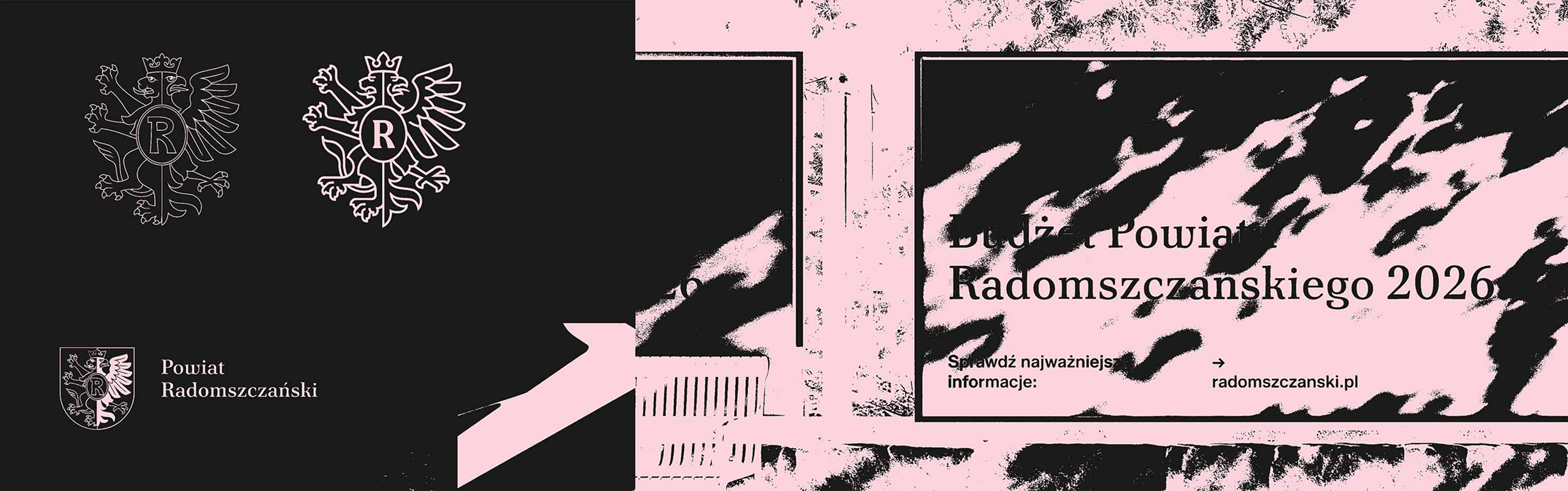
Building a new system from the beginning is a different approach to work — not from the functional and aesthetic side, but above all from the strategic and communicative side. When building the system and logo as part of it, we work not on aesthetic, but substantive guidelines — what the brand is and what it wants to communicate. This reflection is part of our work — not only in the design of the new brand, but also in the rebranding. In the case of building a new system from scratch, we redesign the brand — not copying what the predecessors tried to convey in the logo (“we want the color X and reference to the symbol Y”), but reflecting the spirit of the brand. And here we only move on to substantive consistency.
Brands built from scratch
Consistency
substantive
All the real fun with the brand begins when we do not scratch the surface with a claw, but want to reflect holistically what the brand is. So — attention — it will be lofty — we want to convey the truth about the brand. This is Brand Coherence.
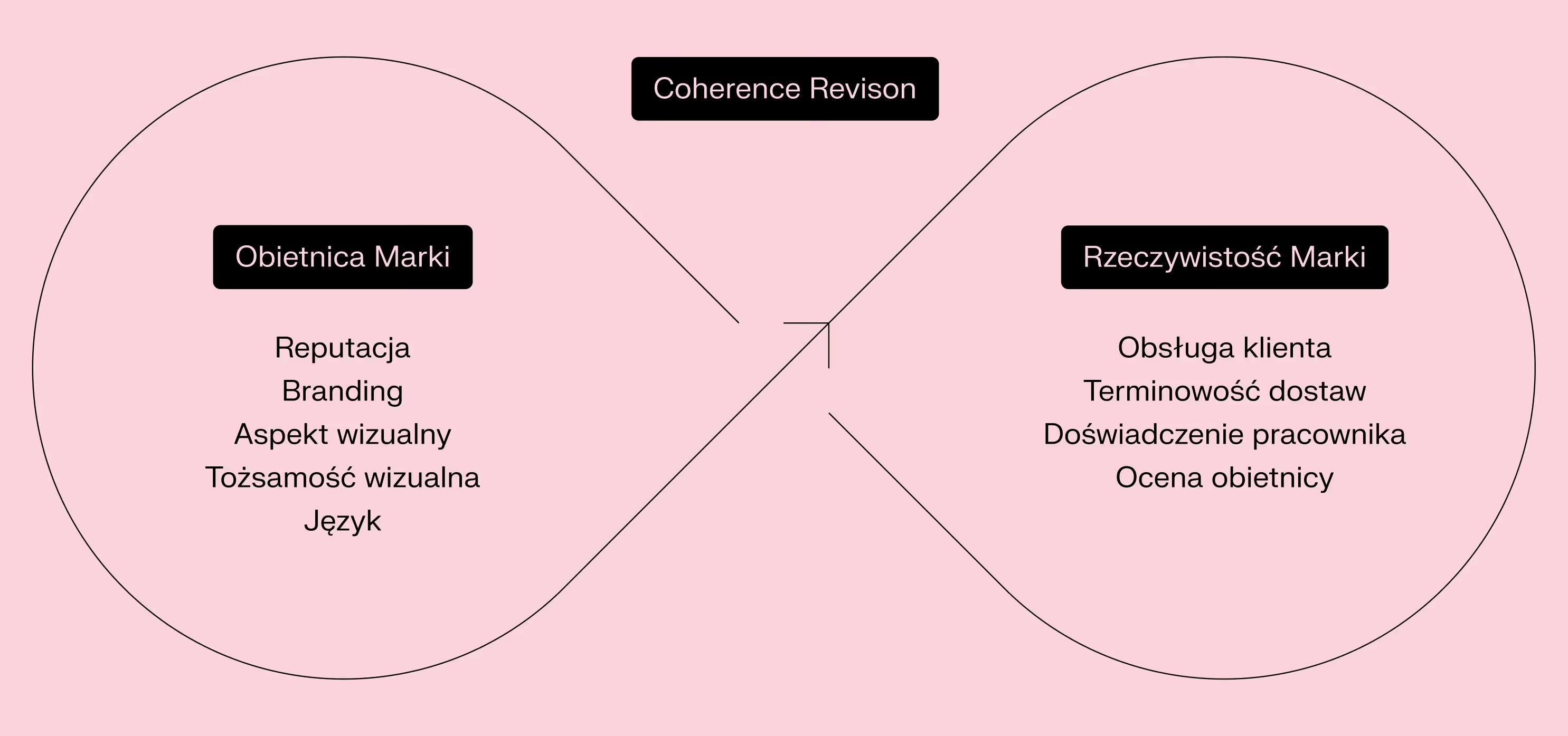
The story that good branding will make you a love brand is — to put it mildly — a big simplification, a promise without cover, and sometimes just plain nonsense. What we really want is brand consistency. The substantive coherence of a brand is, in simple terms, maintaining a worthy balance between the promise of the brand and what the brand conveys — that is, the reality of the brand. And this is what makes building a brand different from advertising it. Advertising can promise, hyperbolize, abstract everything. It can ignite reward areas in the brain.
And the modest communication of the brand? Is it to promise or inform? Again, everything should be in balance. It can promise, but it has to be emphasizing strengths, not inventing them. This promise is made at the level of contact points of the customer (or potential customer) with the brand. The key aspects here are branding and visual and textual materials designed in accordance with it. In the case of a product — its packaging and placement on the shelf, but also pricing policy or availability. In the case of B2B activities — the quality of sales materials. In each of these cases — online communication activities, including social media (including the selection of influencers for cooperation). Our task is to develop such a coherent communication strategy, brand positioning and, as a result, branding, so that the experience of the brand promise is readable and consistent. The recipient must understand the message and recognize the repeated signals of the brand.
What about verification? This is done at the level of real interaction with the product, service. In other words, it's just the user experience. But also the experience of the employee. And they must be consistent with what the brand promised at the beginning. Verification of consistency occurs automatically. The customer feels, sees, understands — whether the brand is authentic, sincere, or promises more than it can deliver. There is no need to mention how strongly and critically this employee feels.
How to build substantive coherence?
Not every organization needs transformation. Not every organization has the time and resources to carry it out at any given time. In contrast, every organization should understand its customer path, know its strengths and weaknesses. Many potential problems can be solved in a process, e.g.
- Analyzing the client's path and their potential ailments and fixing the places that are to be fixed
- Streamlining processes and document development within the organization
- Harmonizing internal communication — in a human way — by talking to employees about their ailments and solving solvable problems
Recognizing problems and solving even 10% of them gives tremendous relief and a sense of listening and development of the organization. Facilitation is also one of our tasks.
.avif)

.avif)
.avif)