Warsaw Pride
.avif)
Fight the system with design system.
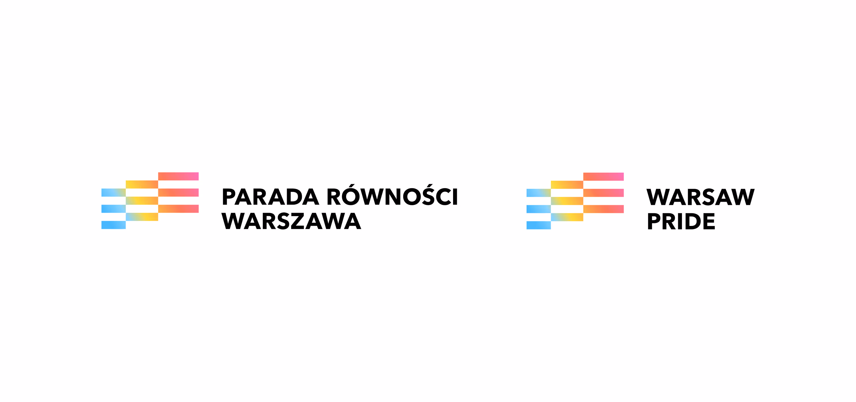
An NGO brand built in the spirit of co-creation. This brand makes us proud. Warsaw Pride (Parada Rowności – literally means Equity Parade) invited us to collaborate on the rebranding for the 25th anniversary of the event.
This was not designed to be a visually pleasing identity, but rather a system intended to function within a real social movement, used by many different people. Yes — in Poland in 2026, the spirit of resistance, disagreement, courage, and pride is still very much needed.
The starting point was the need to create a brand that would be inclusive, resilient to the dynamics of grassroots organization, and visually bold, while also being easy to use without constant designer supervision. In short, the design objective was to build a system that remains consistent regardless of who uses it.
The organization operates with a changing team, materials are created in different tools, often under time pressure, so the identity had to be robust, mistake-tolerant, and resistant to improvisation and varying skill levels, while still accurately expressing the spirit of the movement. This is energy. This is authenticity. This is real momentum.
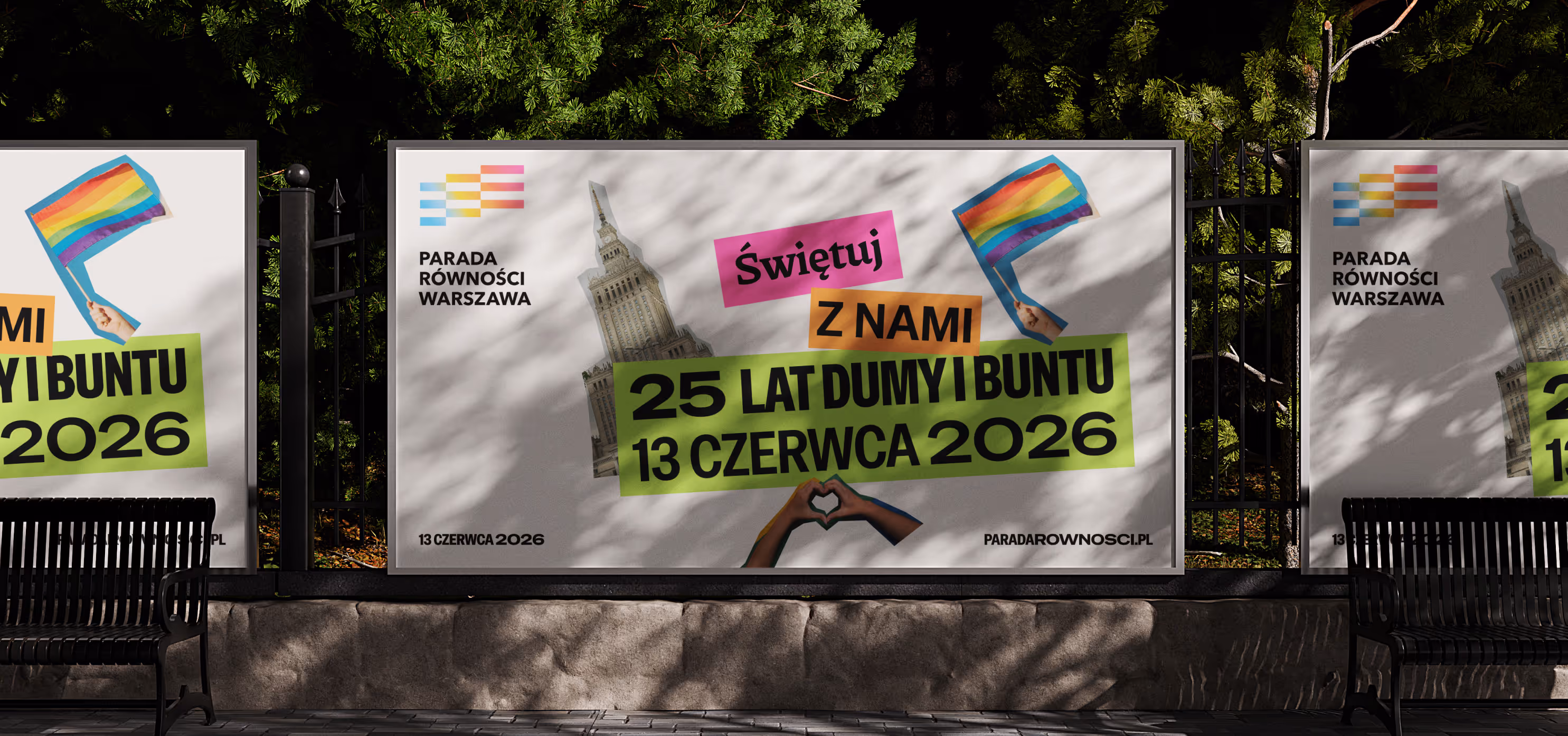
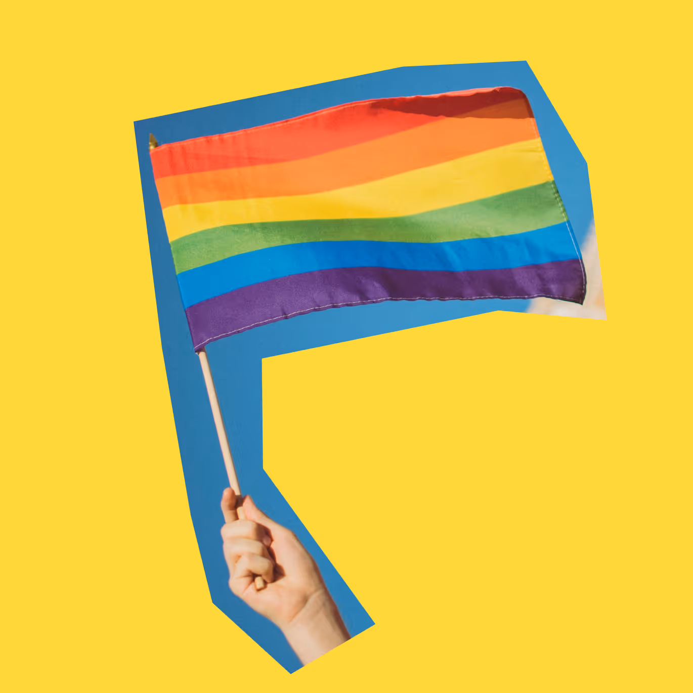
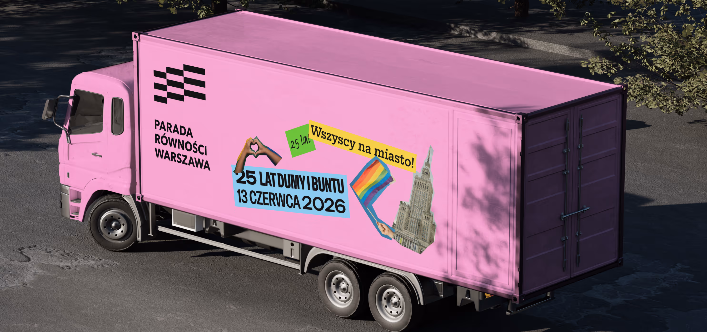
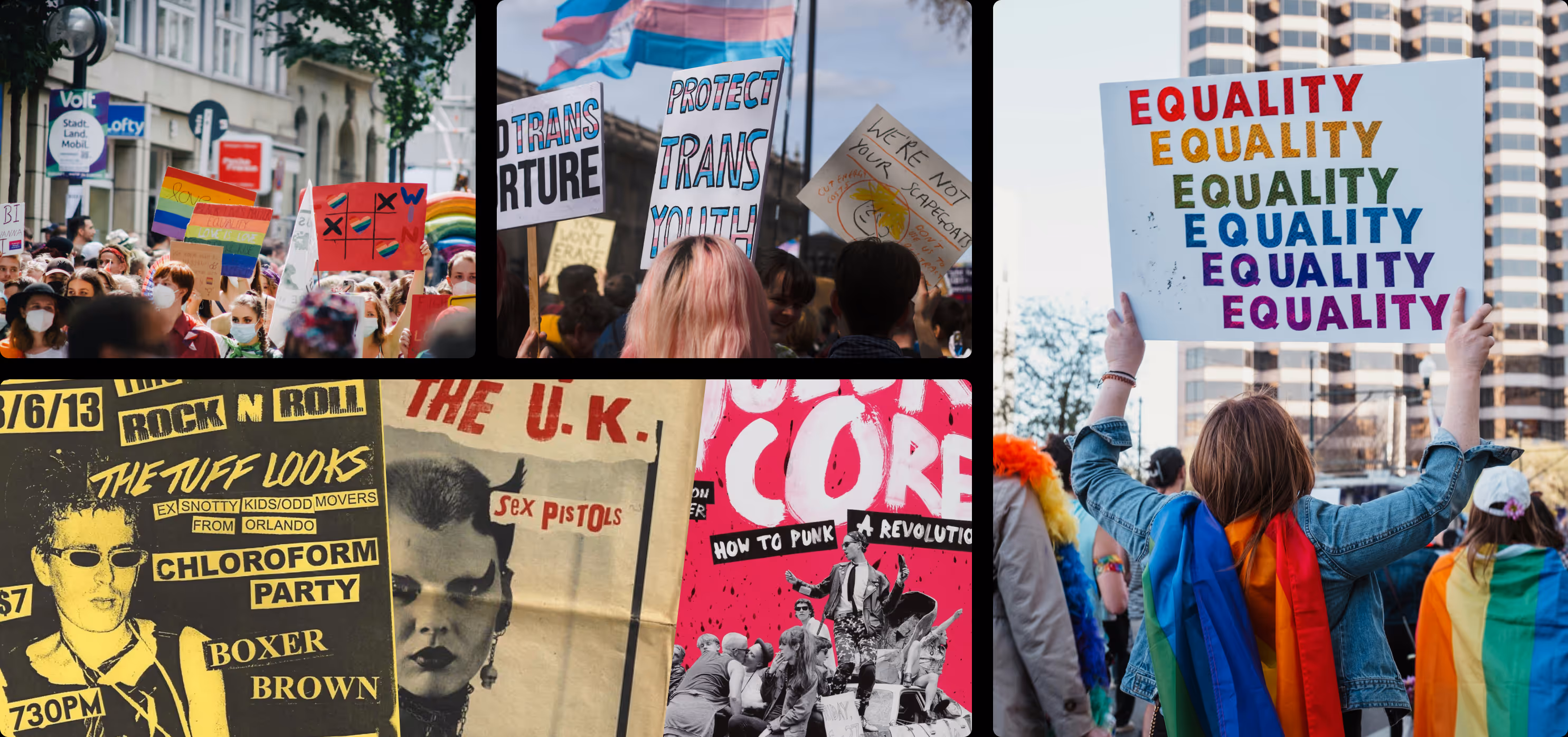
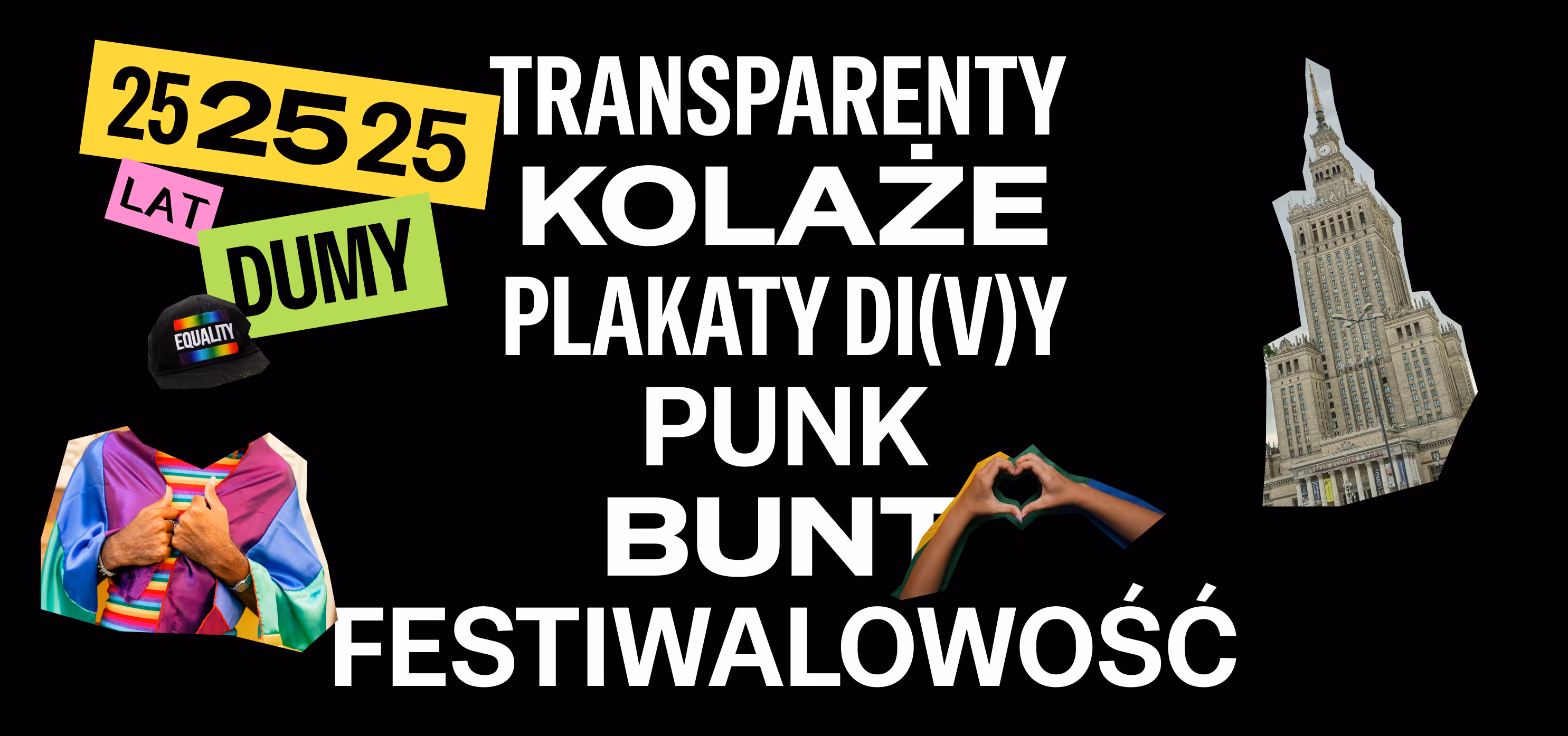
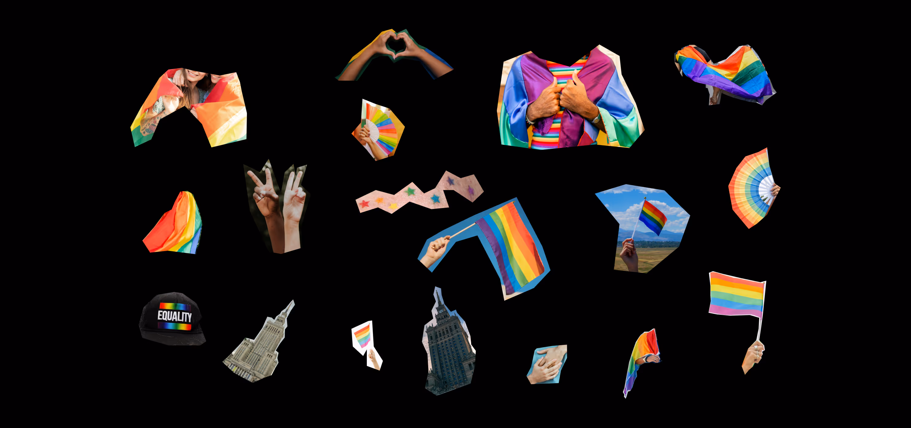
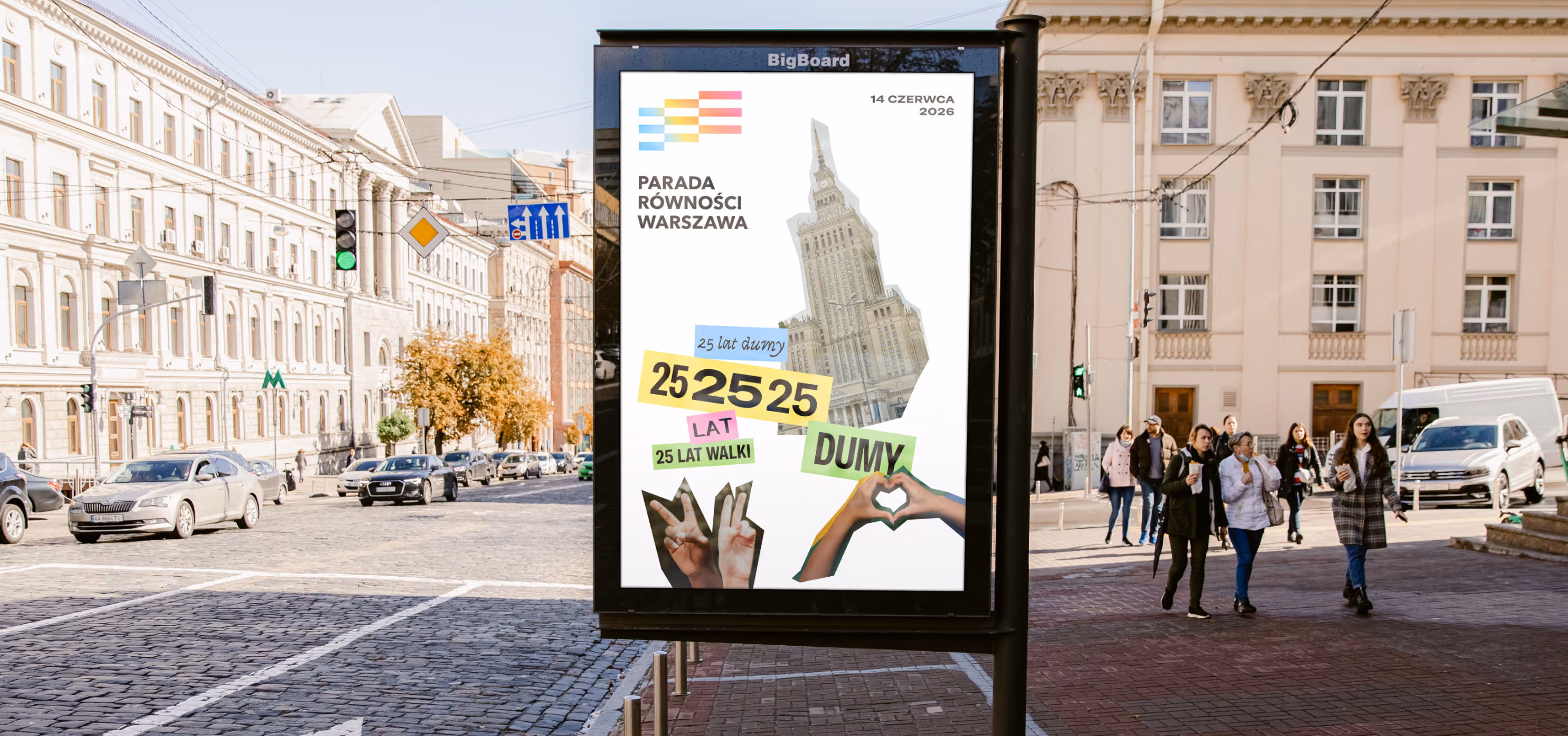
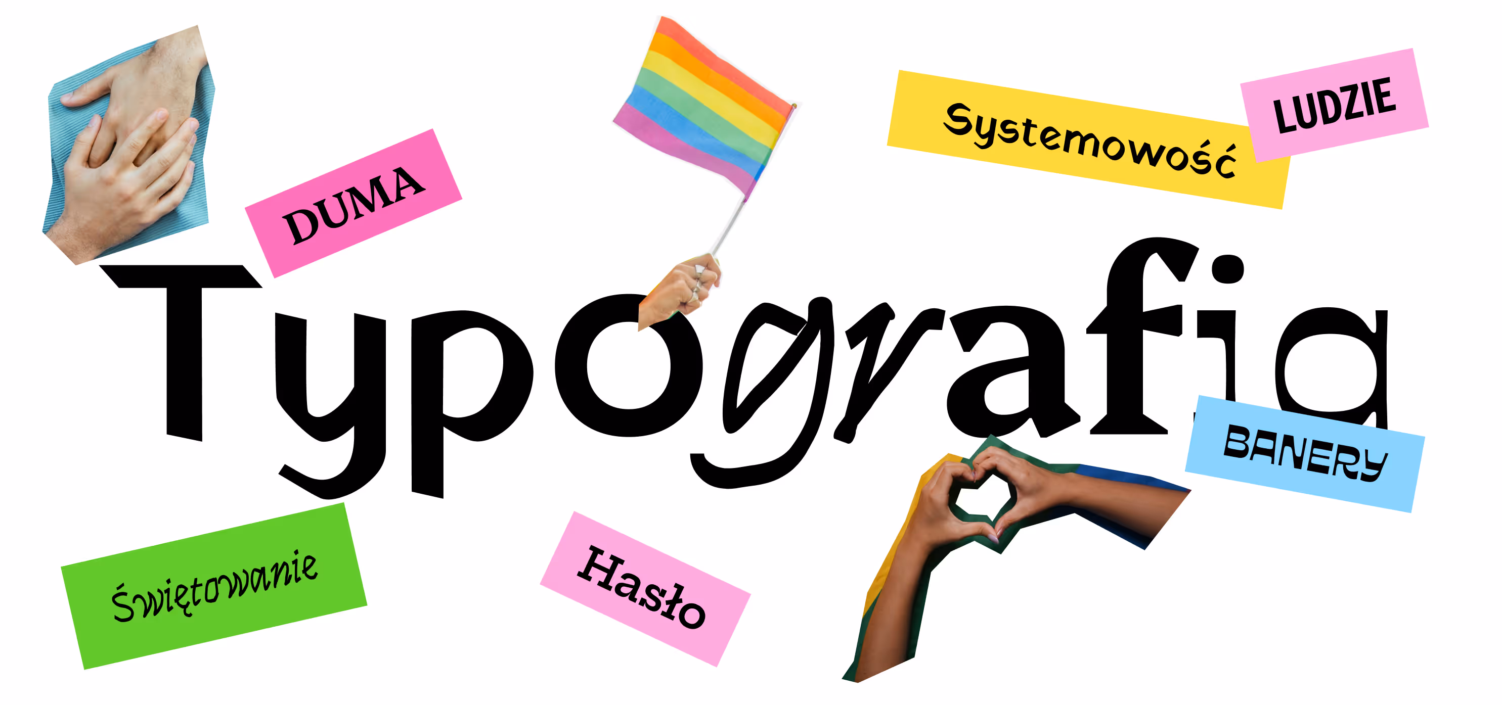
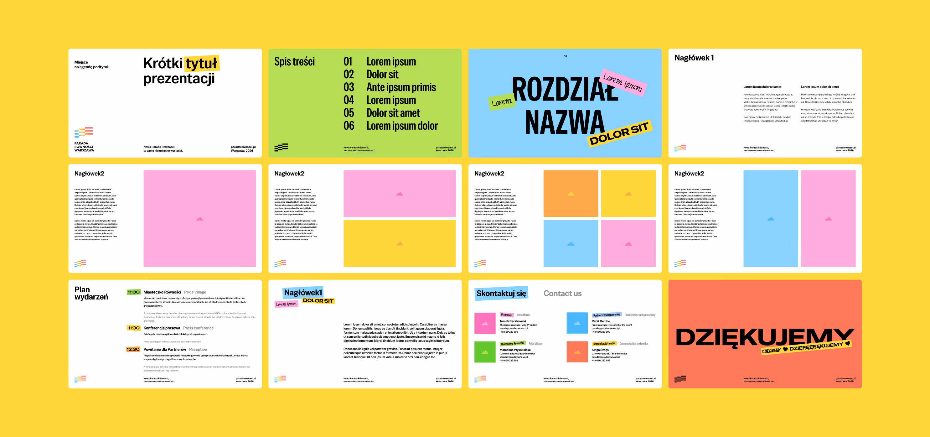
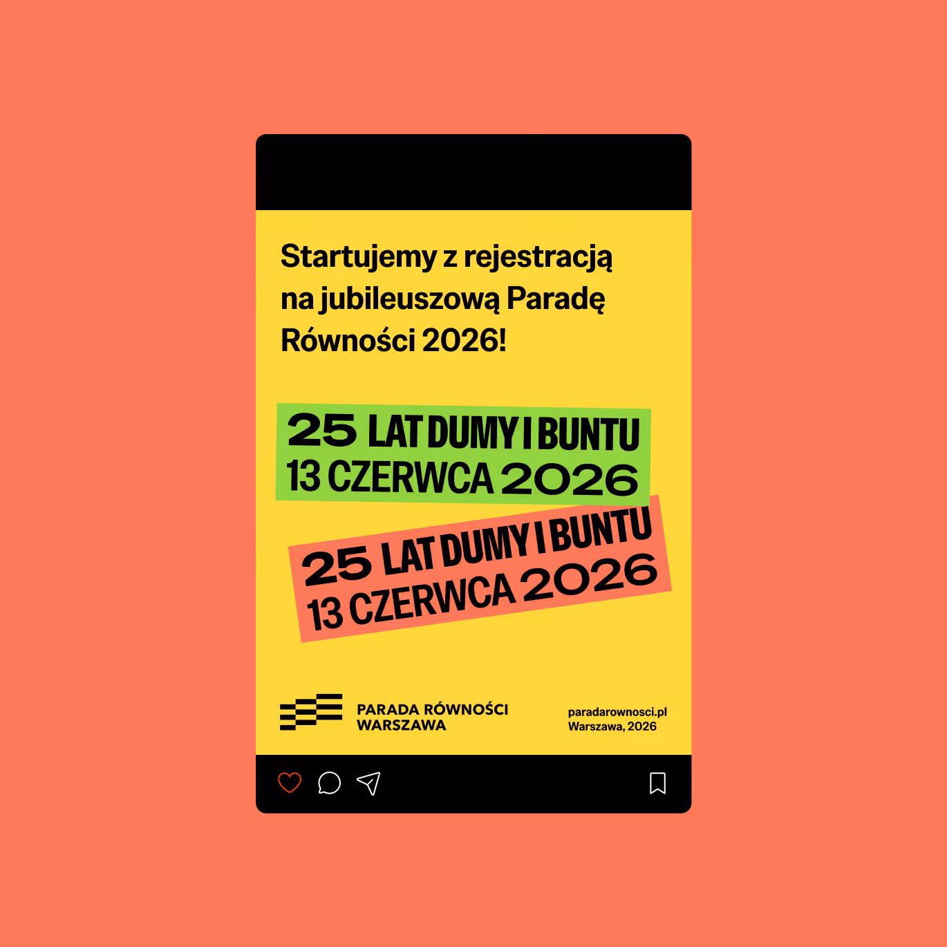
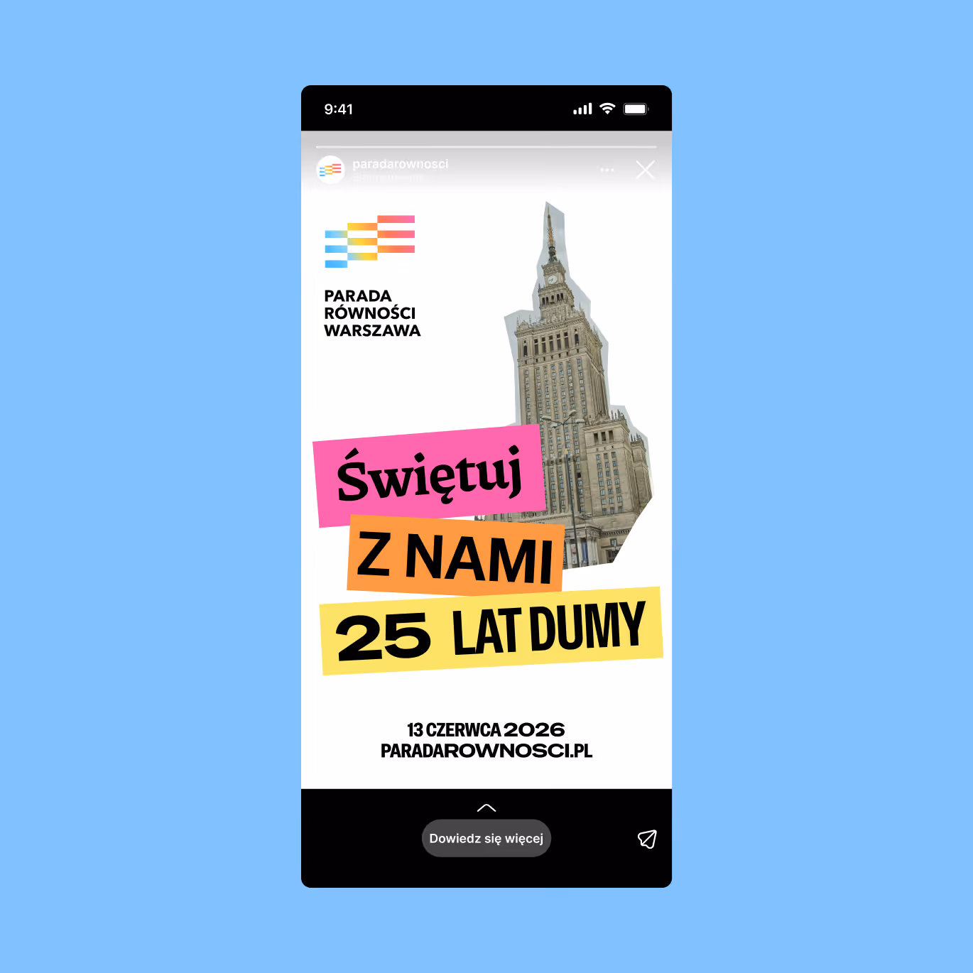
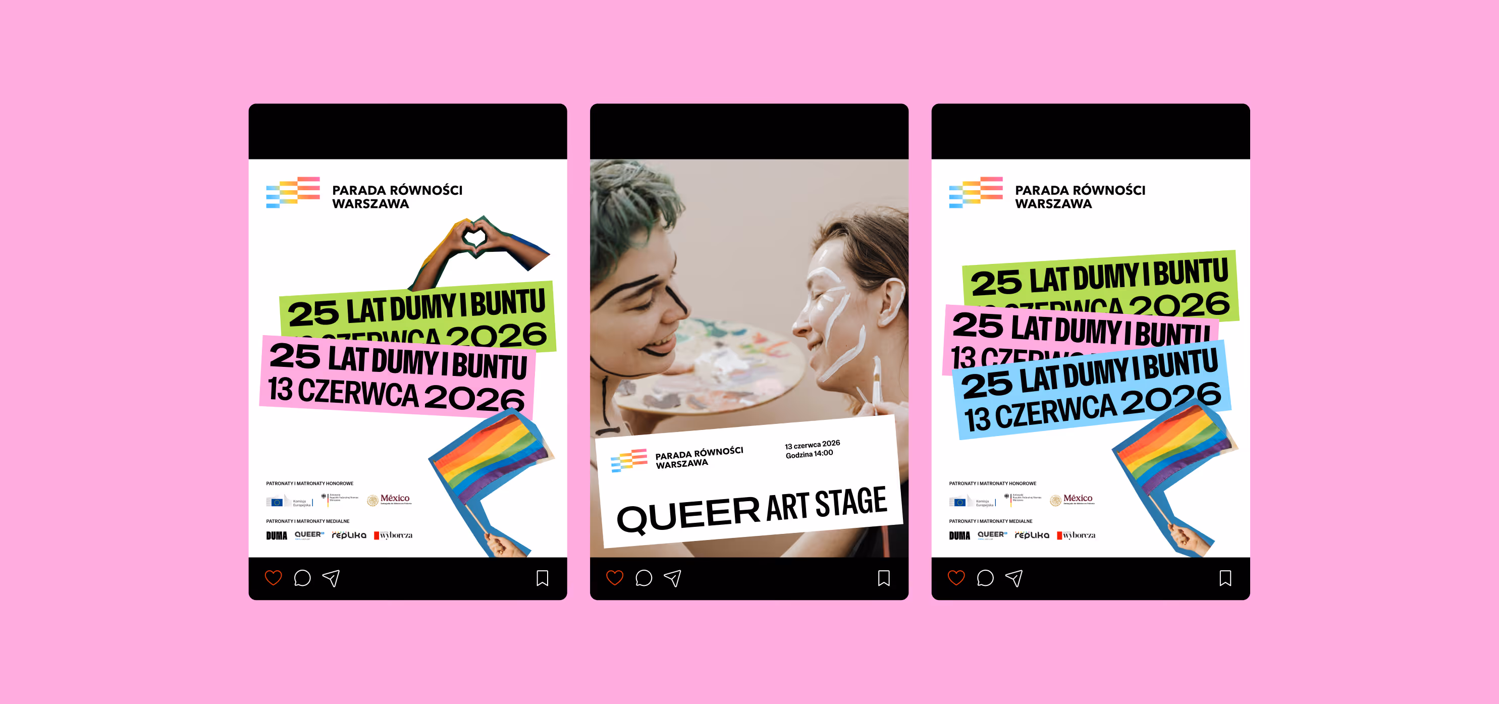
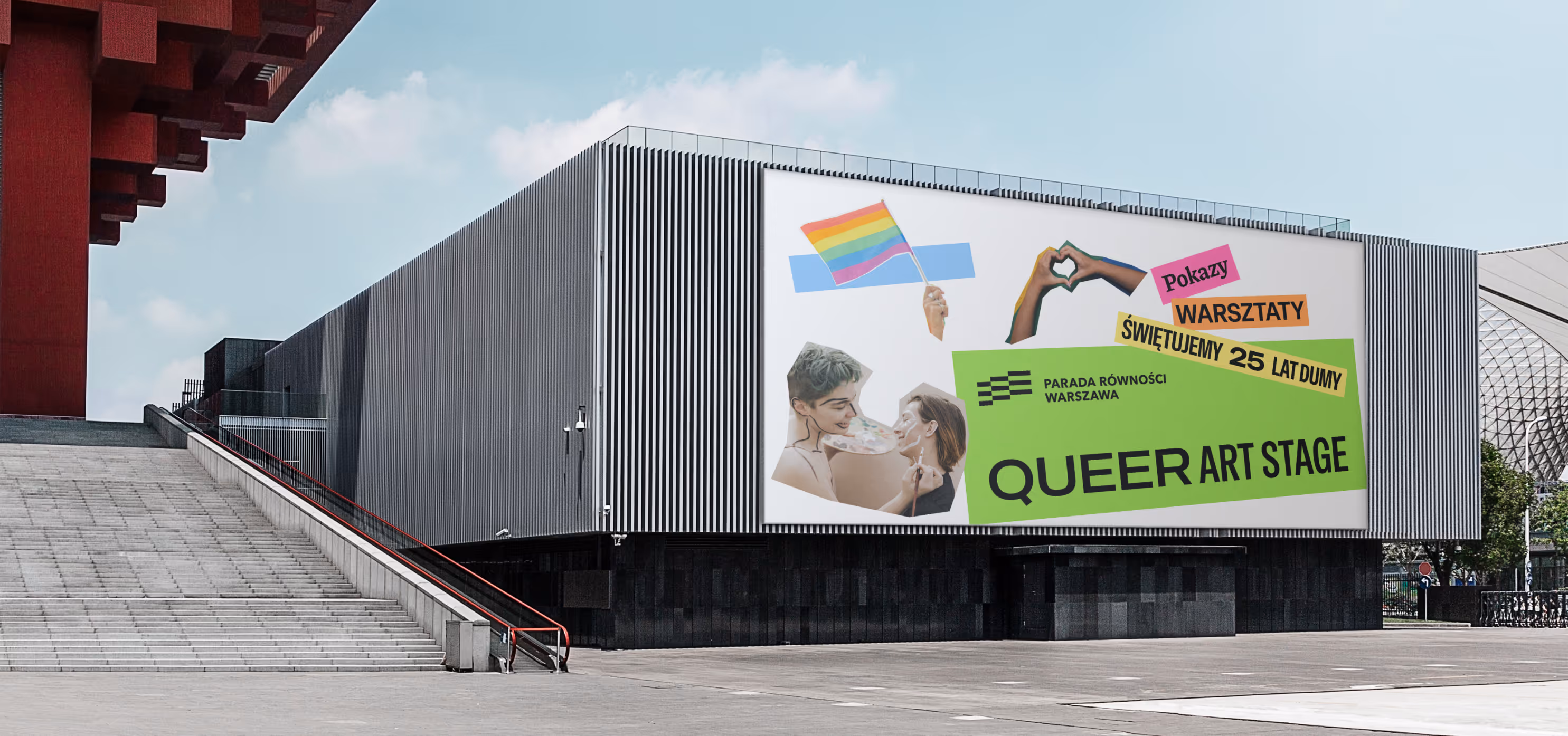
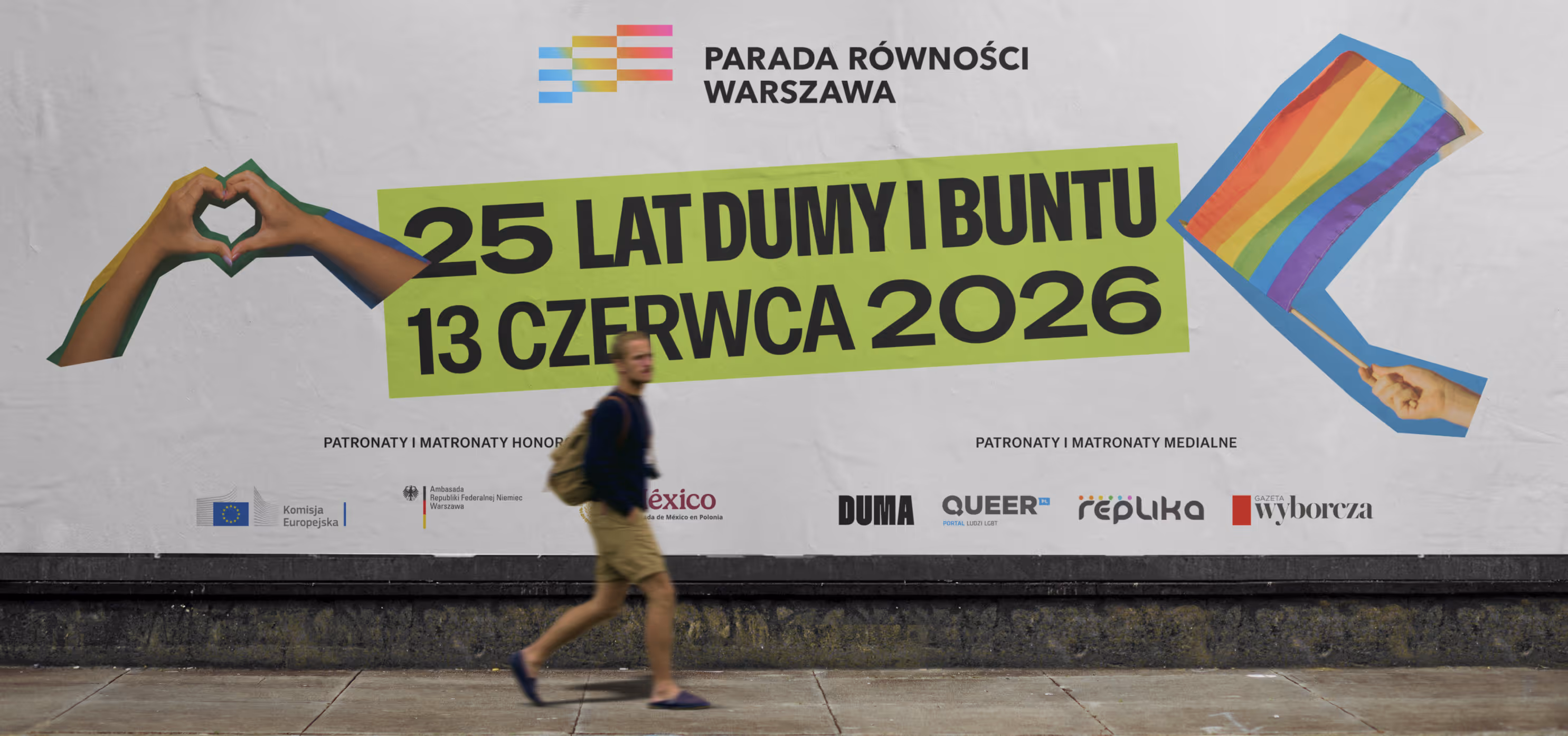
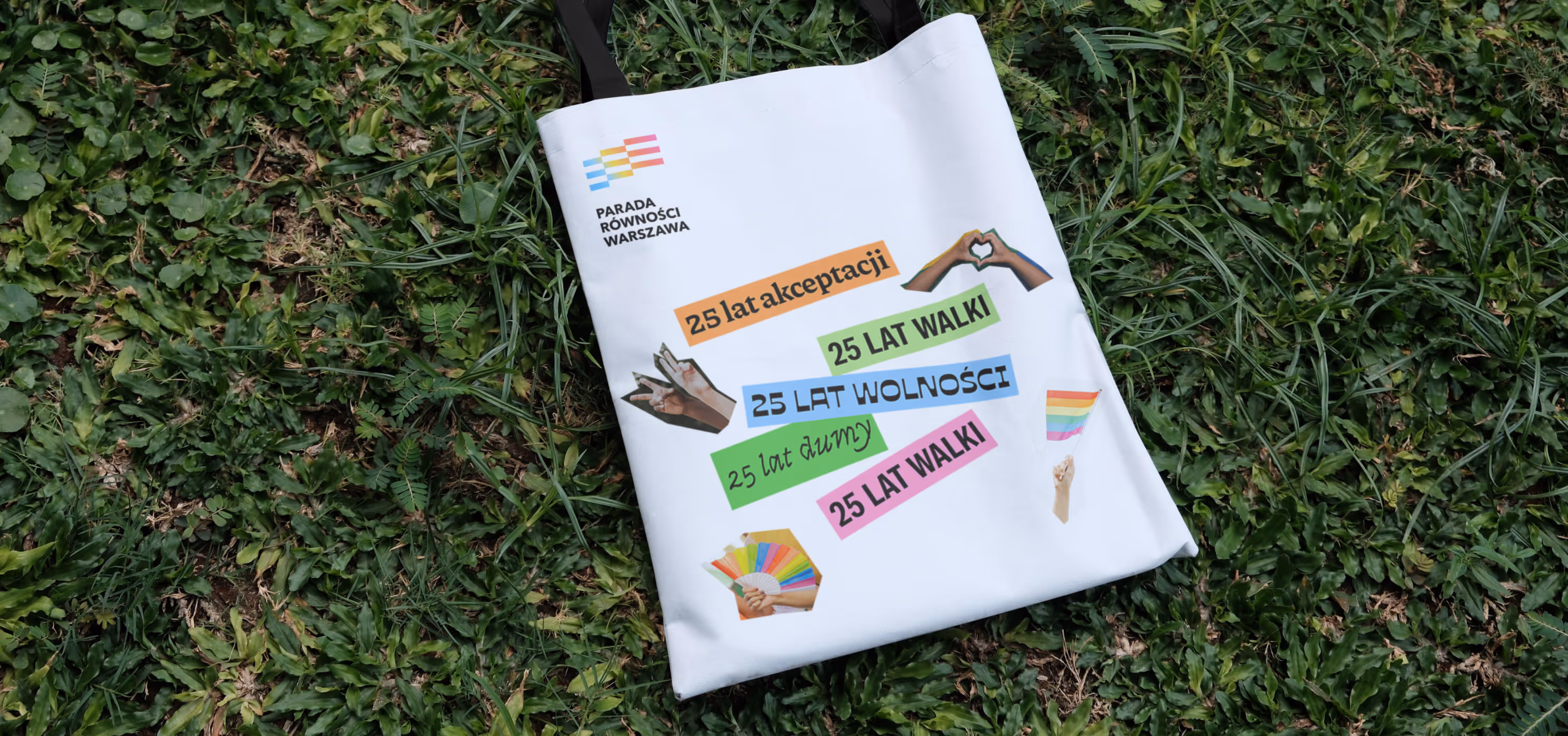
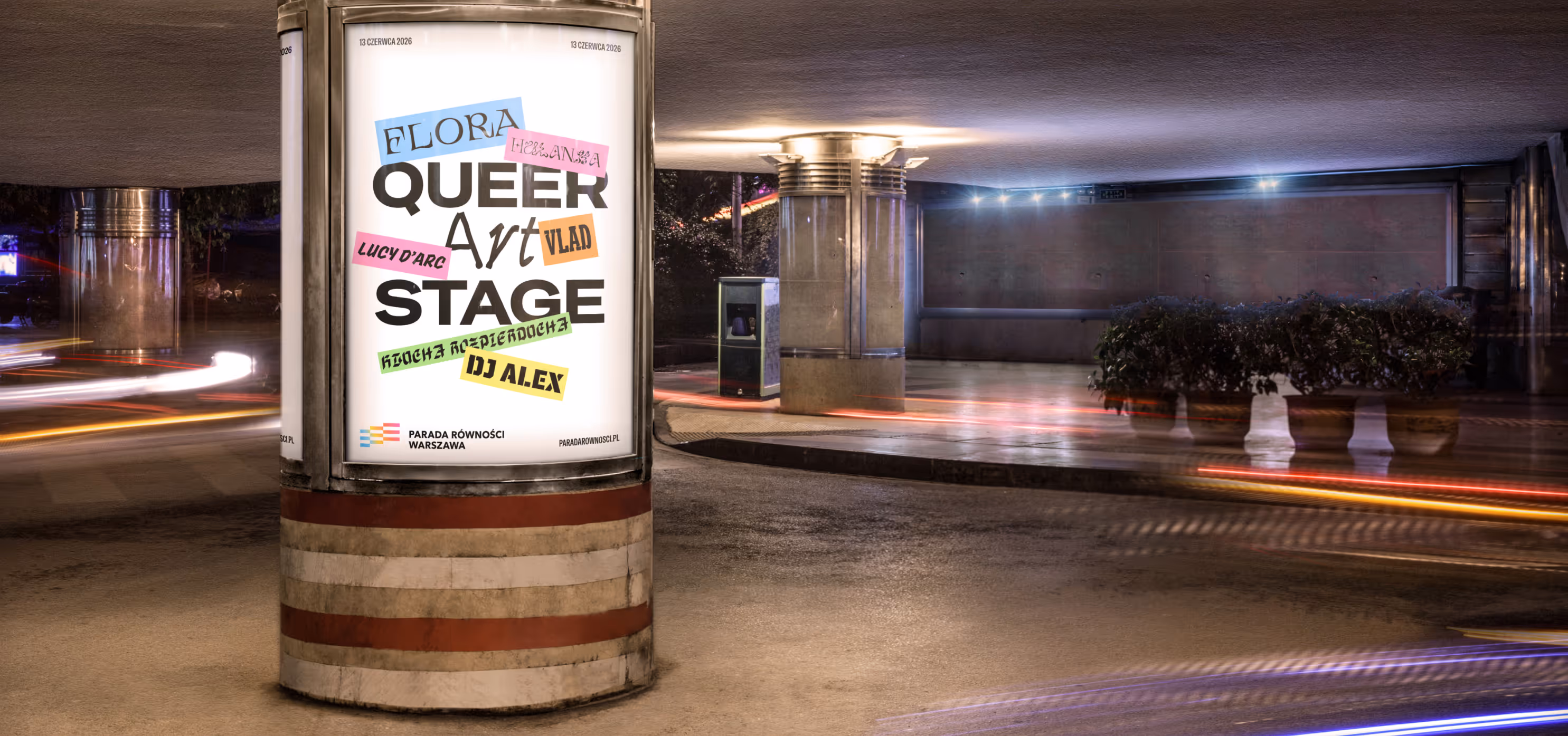
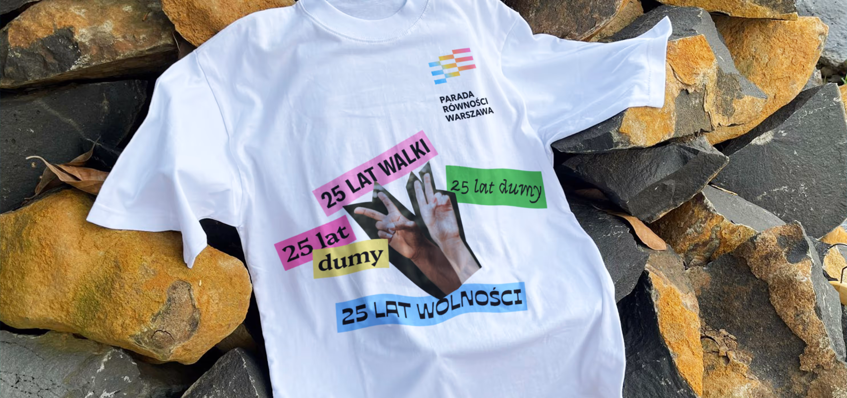
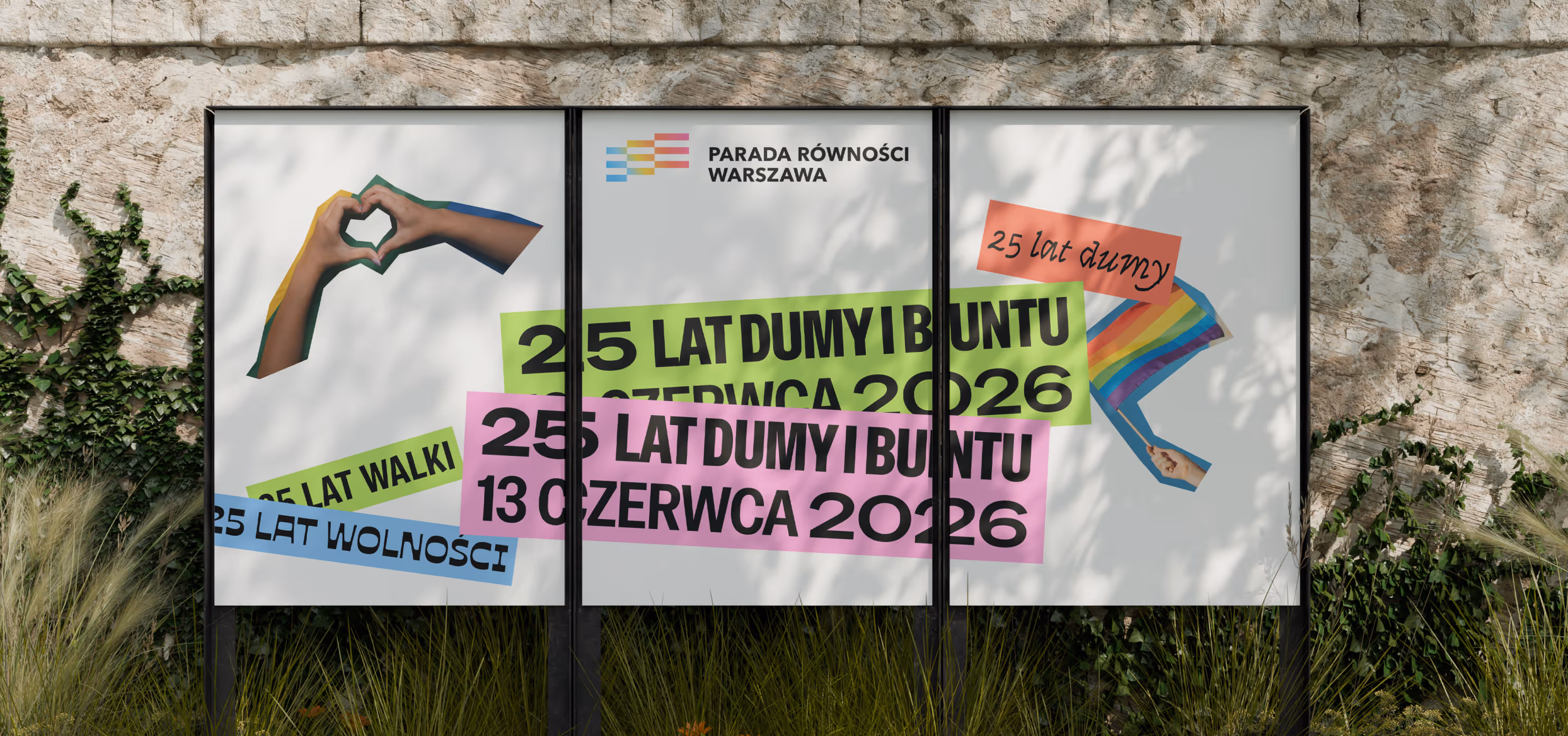
The key inspiration came from protest banners carried during marches and demonstrations. The entire communication mechanism was built on this reference. Intentional imperfection was preserved to maintain authenticity.
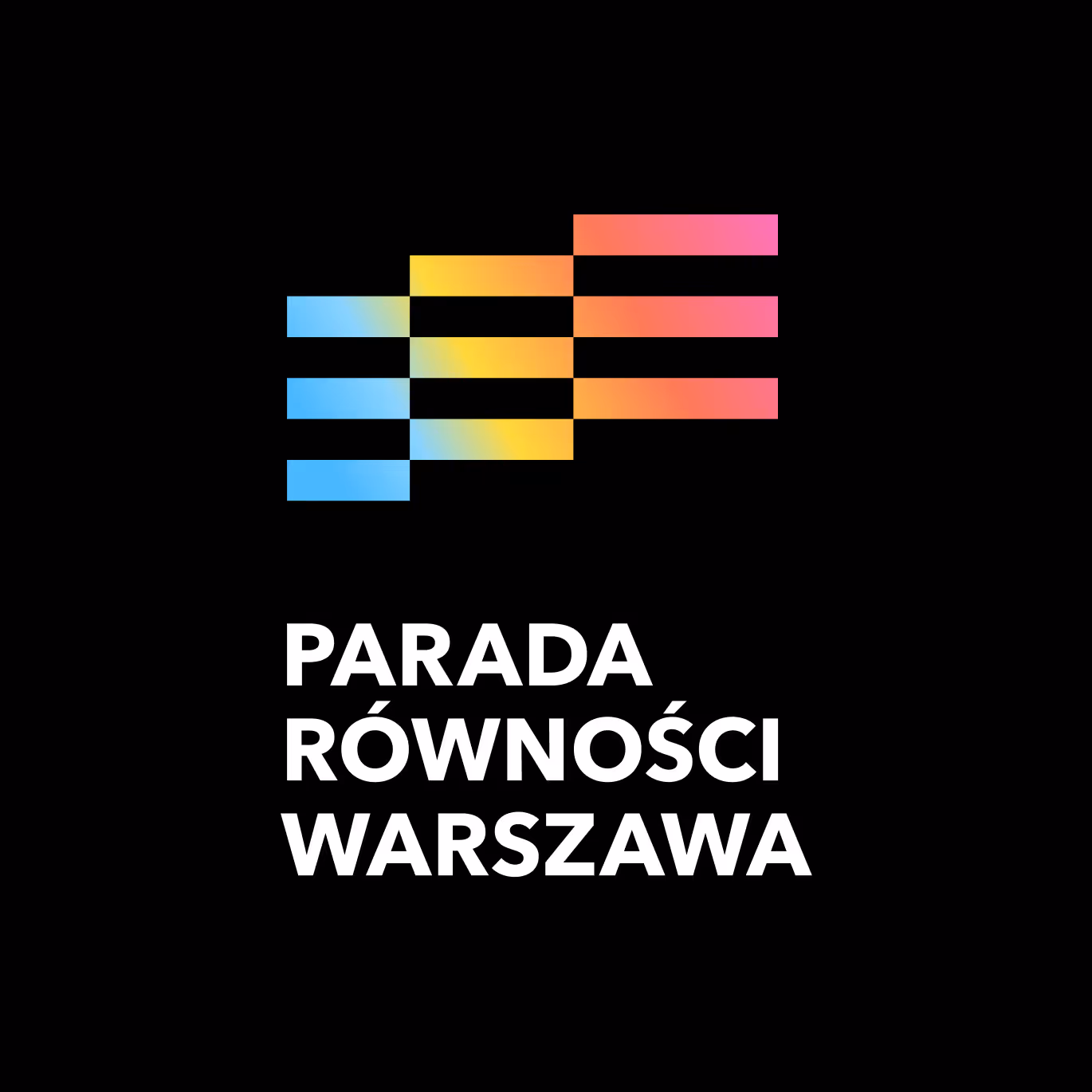
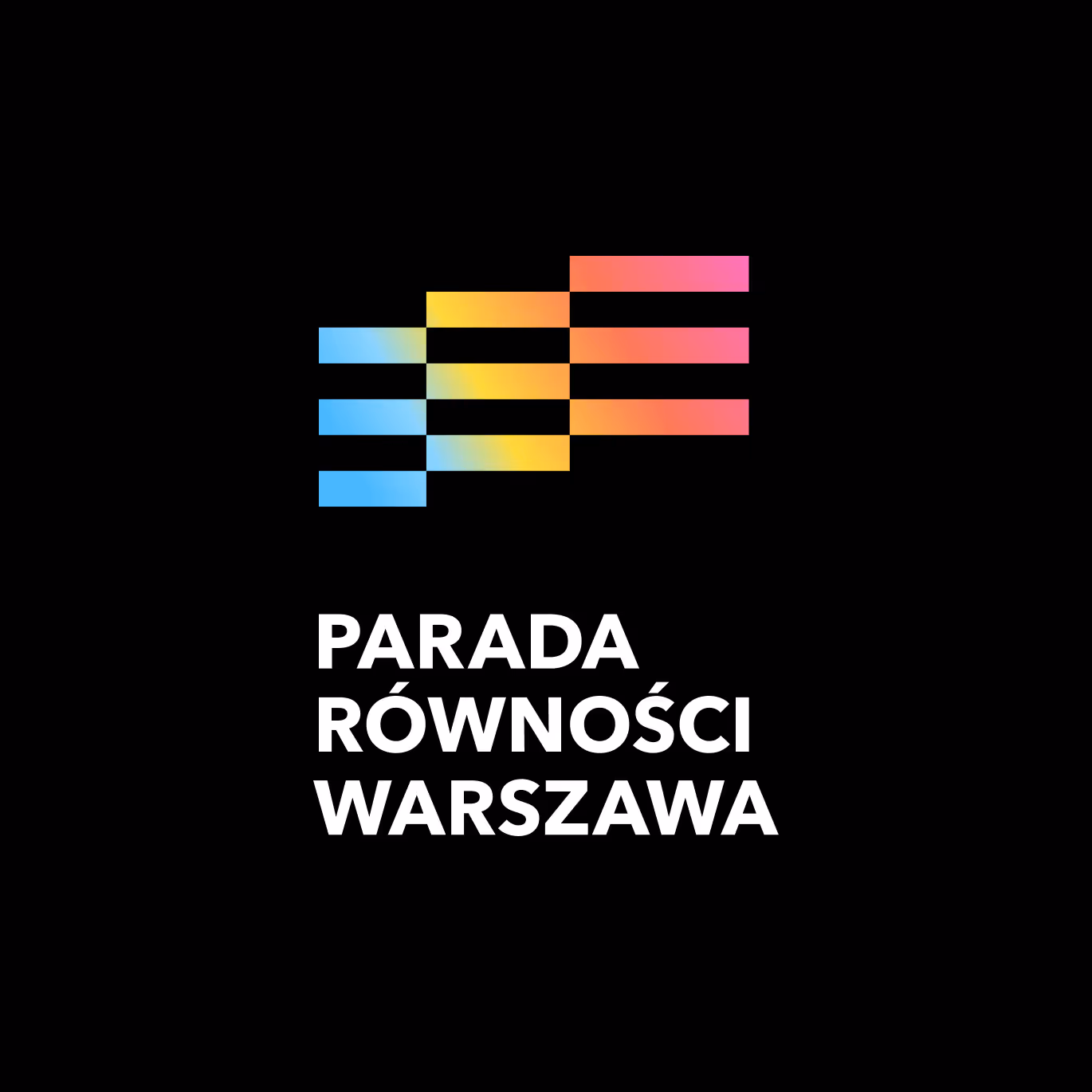
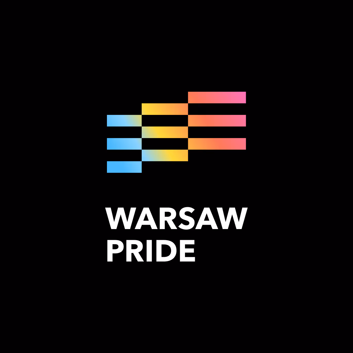
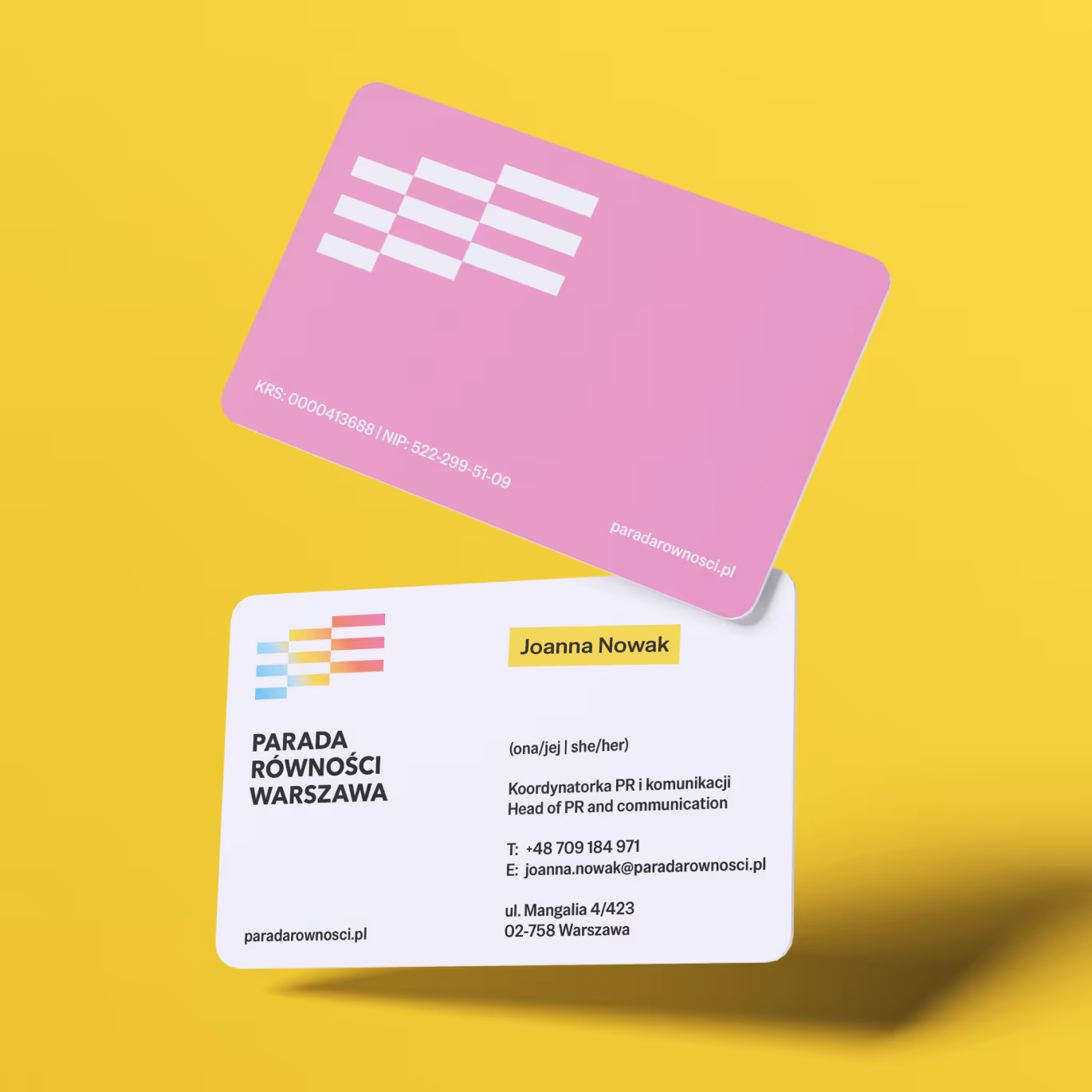
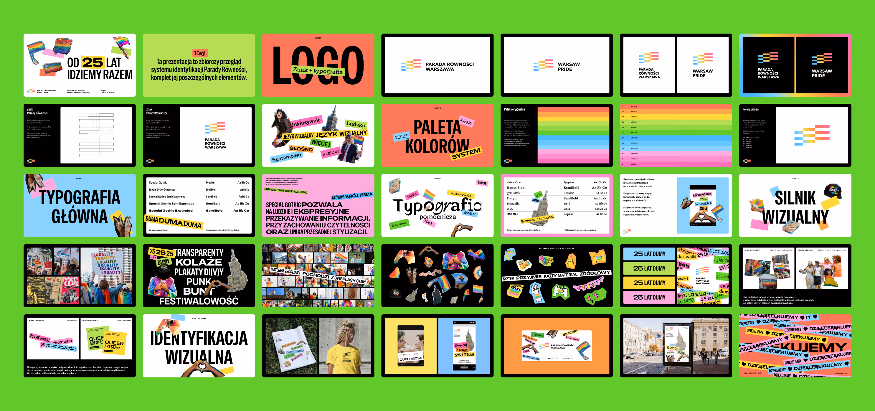
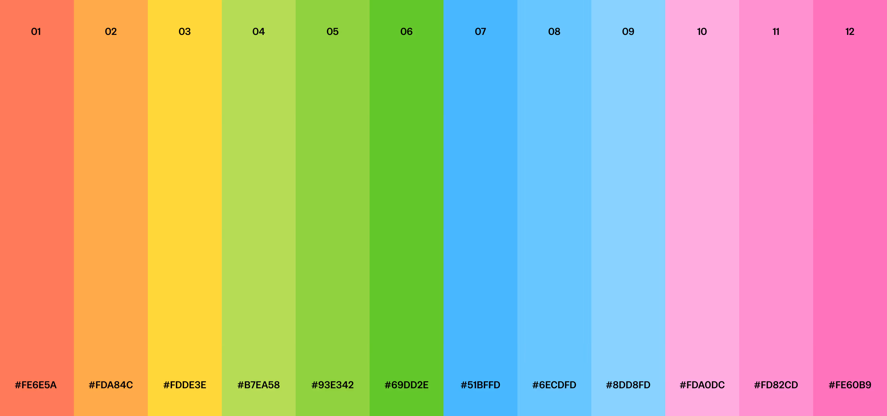
The logo was designed as a form resembling a flag / checker pattern / ribbon carried by a crowd.It has a geometric, modular structure combined with a gradient rainbow — a symbol of movement.We deliberately avoided a classic rainbow, replacing it with a dynamic flowing gradient that blends multiple tones and nuances.
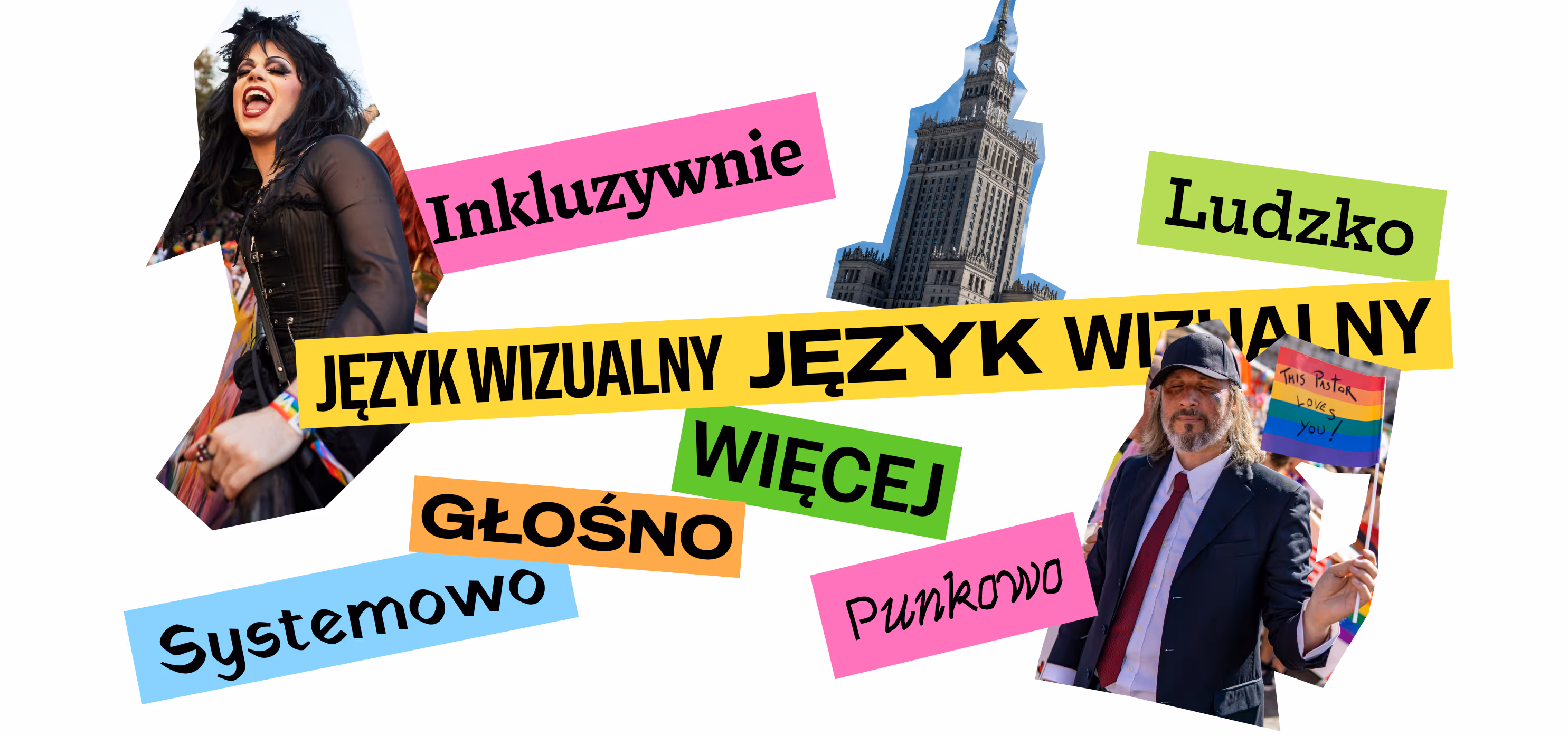
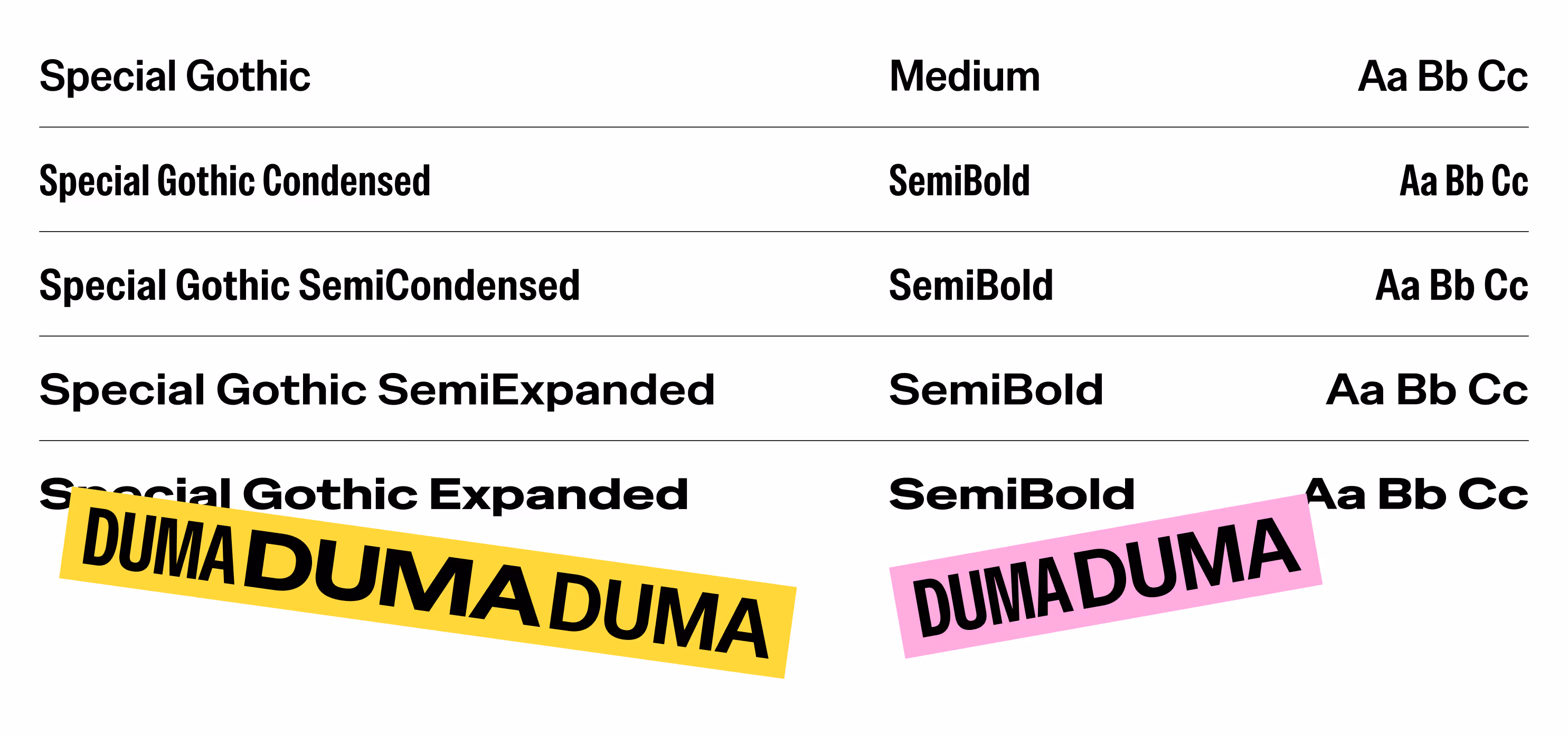
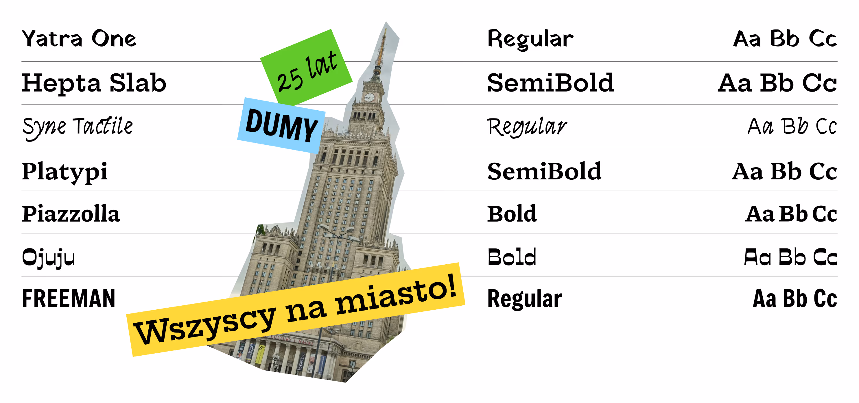
The real intensity happens in typography. This brand speaks with many voices.The typographic system was designed to support two communication modes:a formal / structured mode and an expressive / protest-style mode.We selected as many as twelve typefaces, allowing for consistency within diversity — both in typography and in the visual language.
The system is complemented by rough-cut photography and colorful slogan stripes. Everything is allowed. Are there many elements? Absolutely. But they are supported by clear compositionl rules and a fully defined system that enables expression without losing coherence.
There is space for protest, chaos, and rebellion.But also — a clearly defined place for the logo.
Although the identity was created for an anniversary, it was designed from the beginning as a long-term system that can evolve over the years.Slogans may change, events may change, but the mechanics of the identity remain.
Fight the system with a design system.
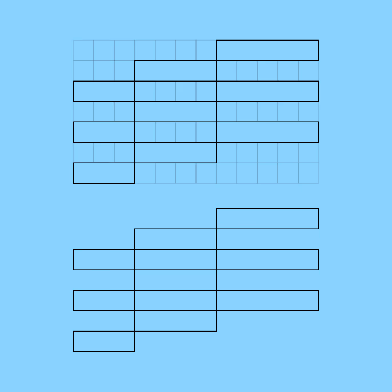
The key inspiration came from protest banners carried during marches and demonstrations. The entire communication mechanism was built on this reference. Intentional imperfection was preserved to maintain authenticity.

More LGBTQiA+? See folio entries: Queerszawa, Lambda
Project team
Want something like this, but different?
By the way, join our
non-intrusive newsletter
with quality content