Szybex
Overview
When a system built around an existing logo changes everything.
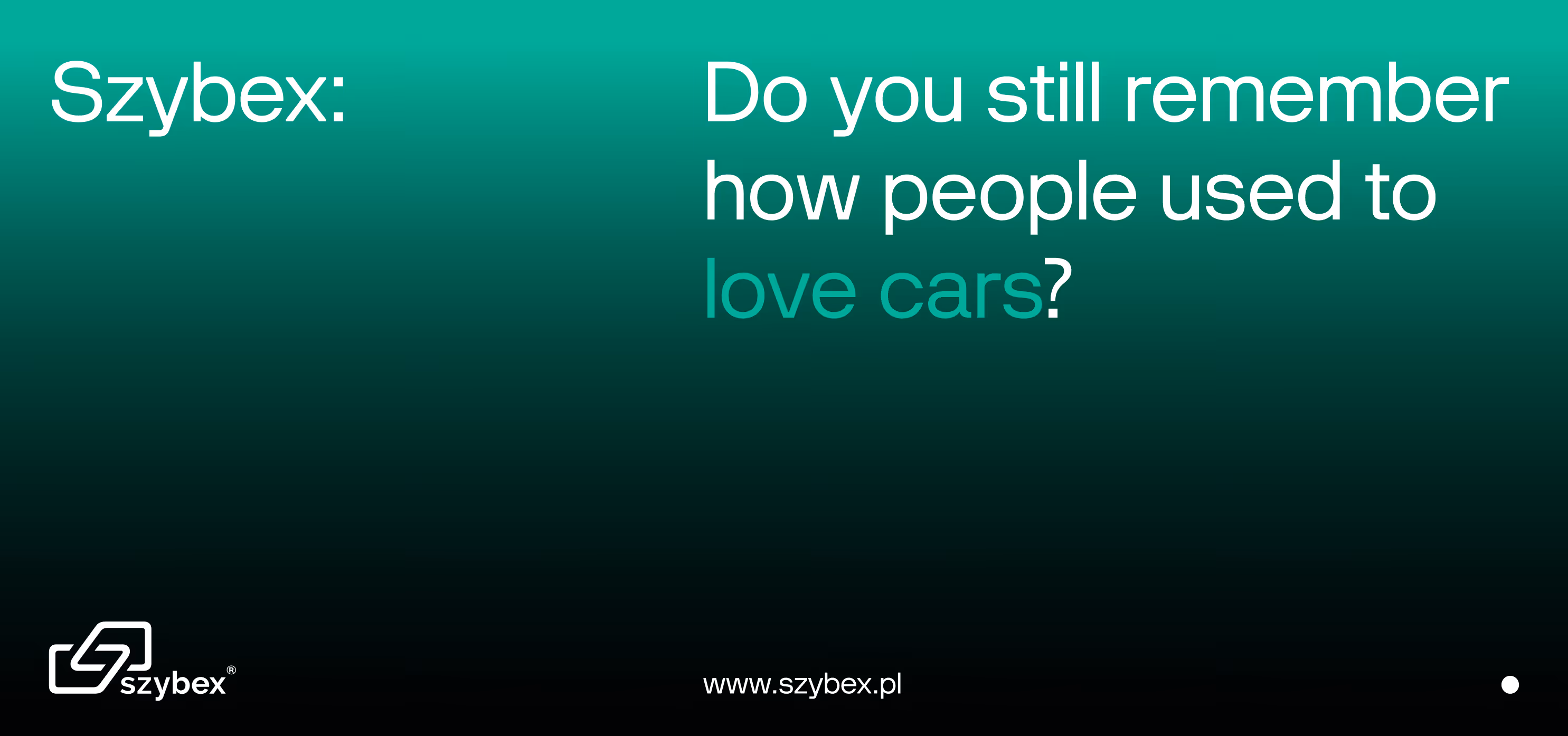
A name that sounds like it comes from another era. And that is exactly the point. [explanation for English-speakers: The name sounds old-school because it follows a naming style that was common in the late 80s and early 90s, especially in Central and Eastern Europe, where many companies used short, technical-sounding names ending with "-ex", "-pol", or "-tech"].
Szybex is a brand with over 30 years of history, well recognized in its industry, but visually and communicationally stuck in the past. In a typical rebranding process, the natural move would be to replace the name with something more contemporary. We did the opposite. Instead of changing it, we used its equity and built a new, coherent system around it.
We started with strategy and repositioning. Over the years, the company had grown significantly, structured its processes, and begun operating at a much larger scale, yet the communication still looked like it came from the days when everything was done in a single workshop. We needed a line that would express this shift, while also reflecting the openness of the management team. That is how the tagline was created: Sounds like 1992. Works like 2030.
We did not redesign the logo. Instead of creating a new mark, we built a comprehensive identity system that allows the existing name to look like the brand the company has already become.
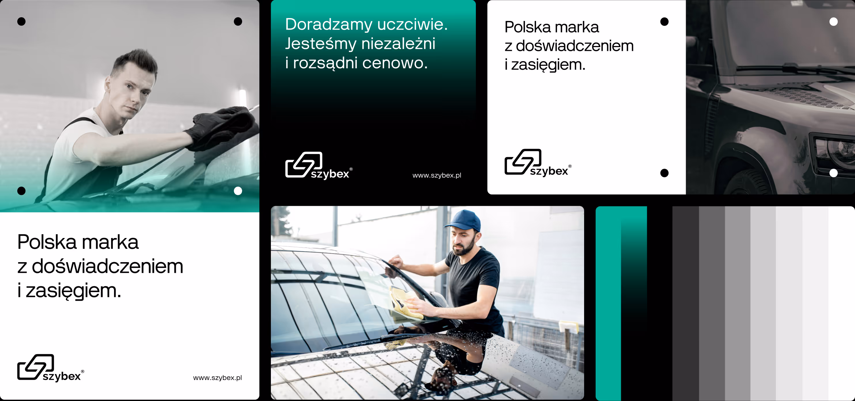
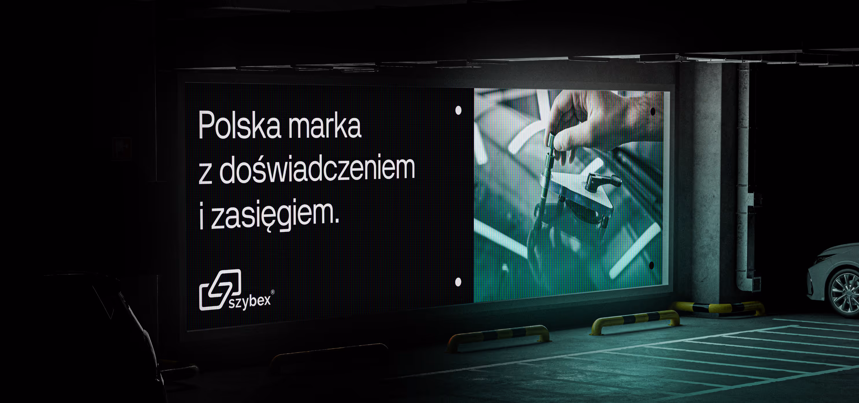
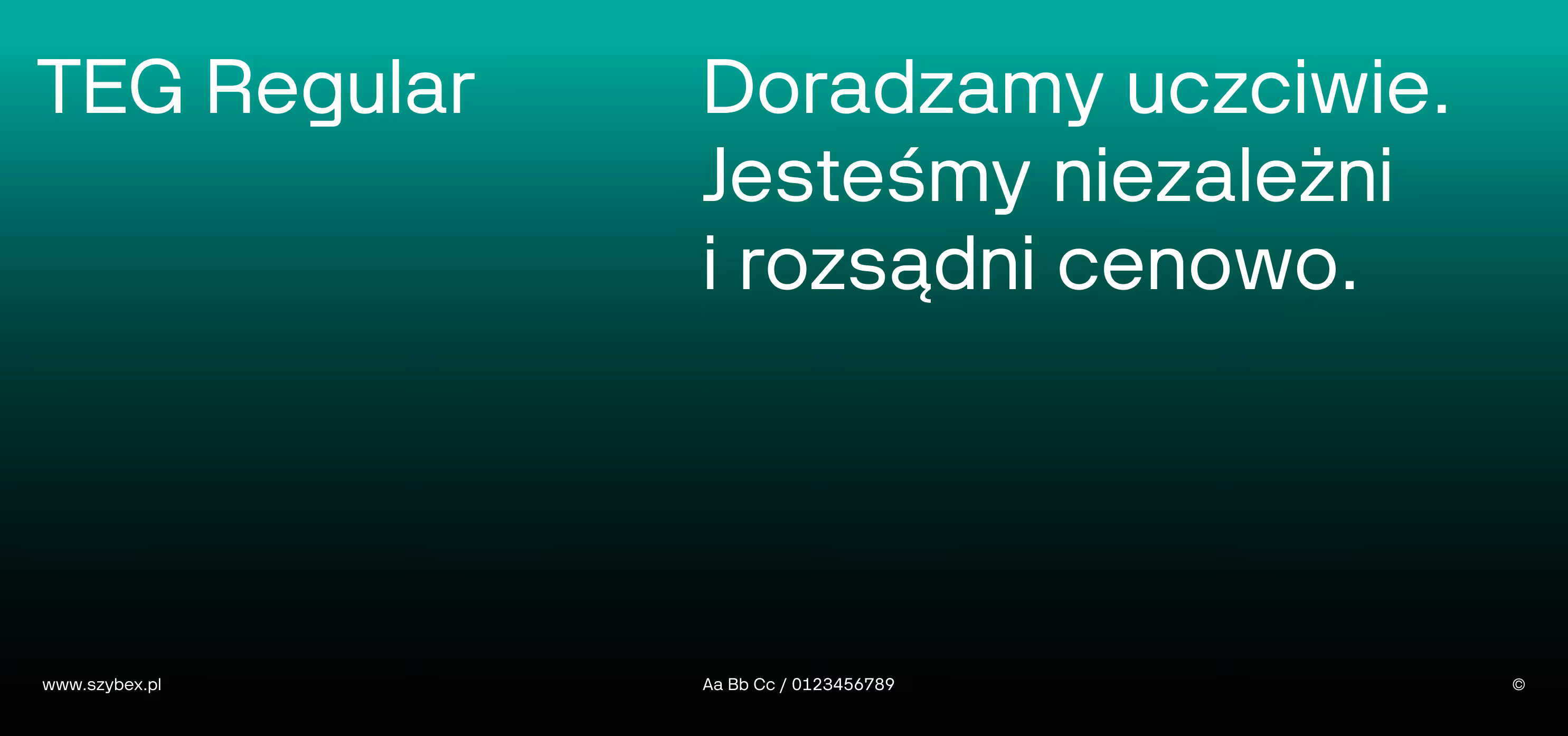
The new identity is based on minimalism, strong contrast, and a technical aesthetic.
The color palette relies on black, white, and greys, complemented by an energetic green accent and a gradient that became a distinctive element of the system, inspired by the look of old-school automotive glass.
The most important part, however, was the implementation in real materials.
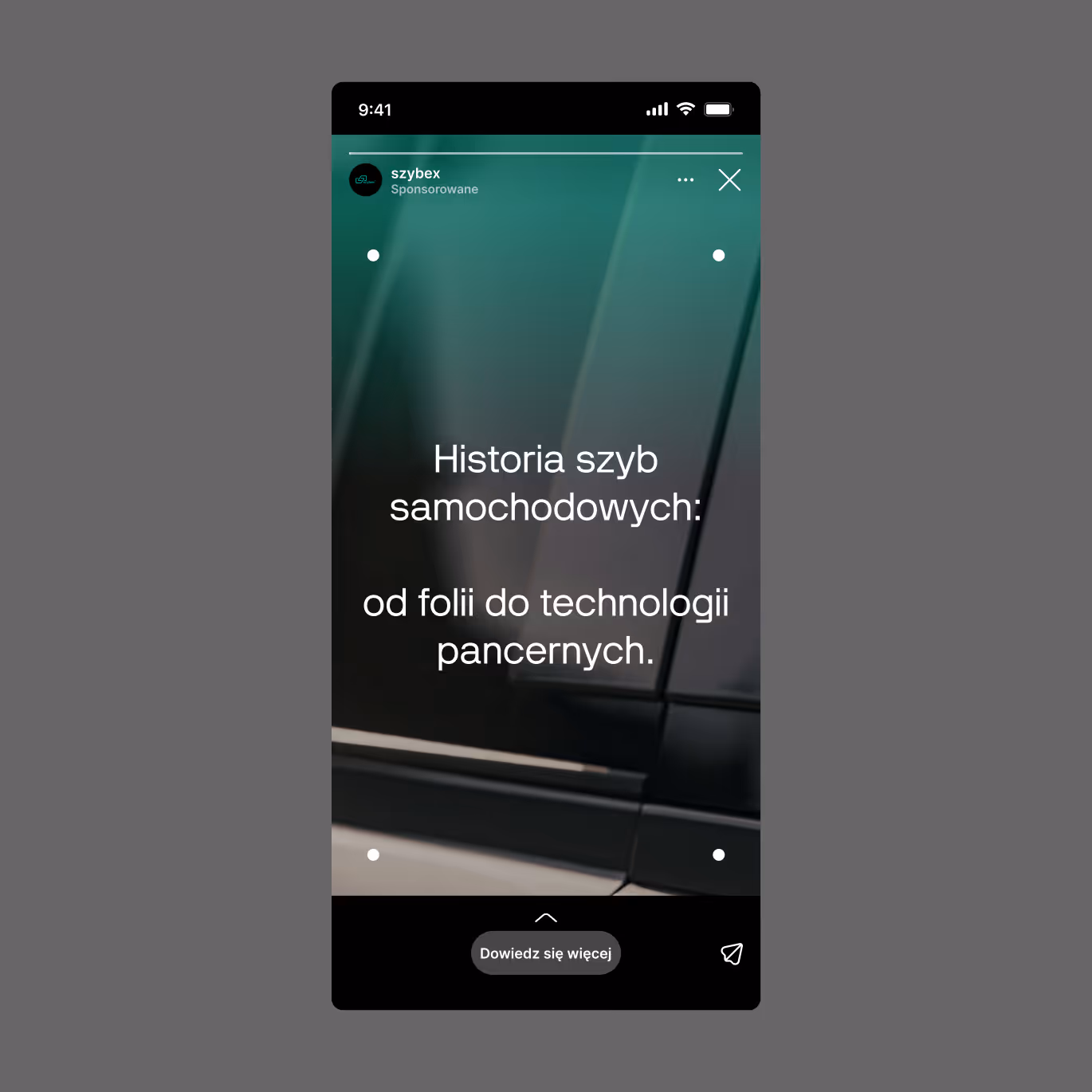
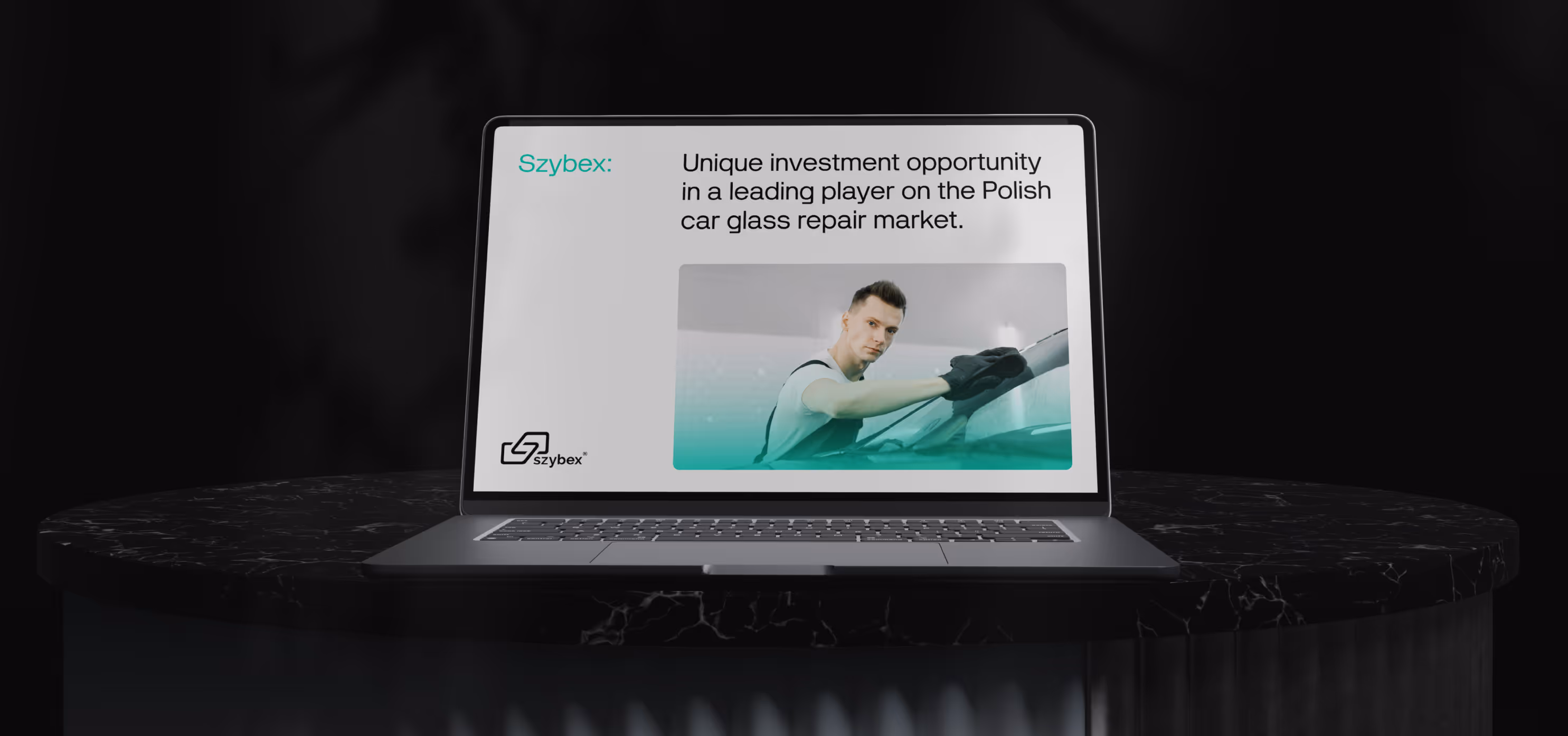
We created new layouts, typography rules, sales materials, signage, digital communication, and guidelines for future development, so that Szybex can appear consistent in advertising, at service locations, online, and in B2B communication.
This is one of those projects where rebranding is not about changing the name or the logo.
It is about making the company look as large as it actually is.


We did not redesign the logo. Instead of creating a new mark, we built a comprehensive identity system that allows the existing name to look like the brand the company has already become.


This is one of those projects where rebranding is not about changing the name or the logo. It is about making the company look as large as it actually is.


More about what rebranding can be here: Rebranding.
Project team
Want something like this, but different?
By the way, join our
non-intrusive newsletter
with quality content