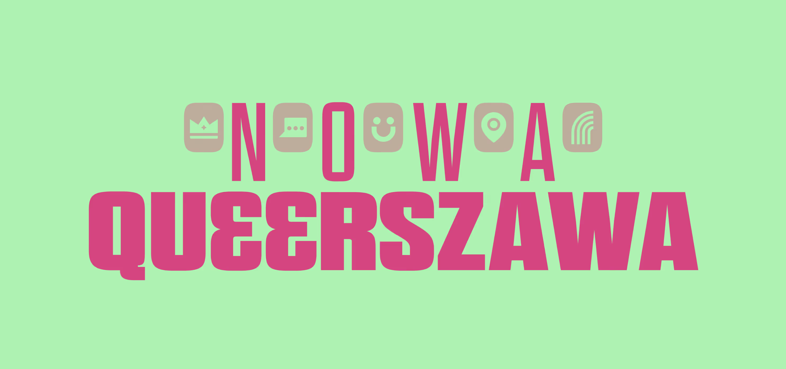
Queerszawa
Overview
A digital micro-brand with a twist.
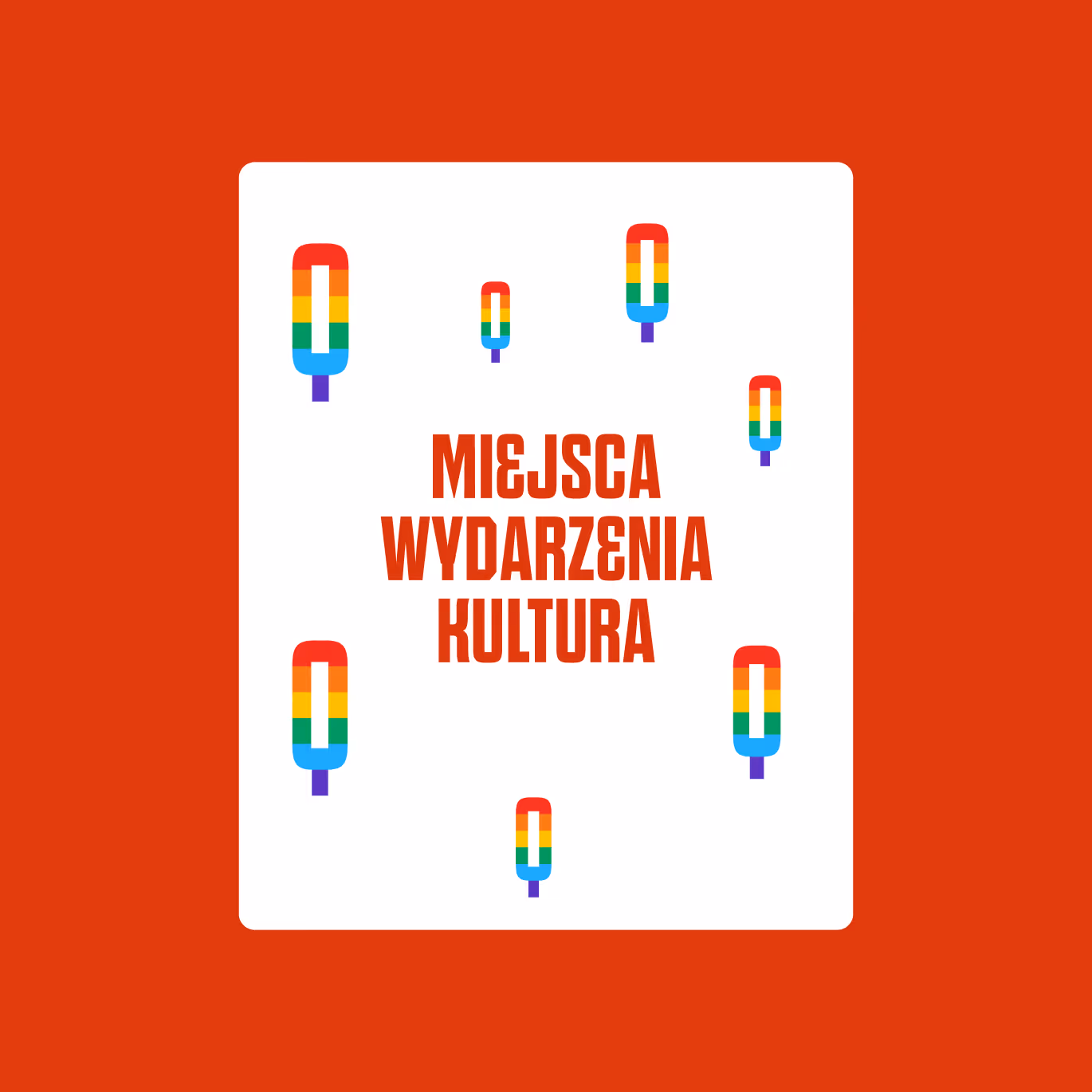
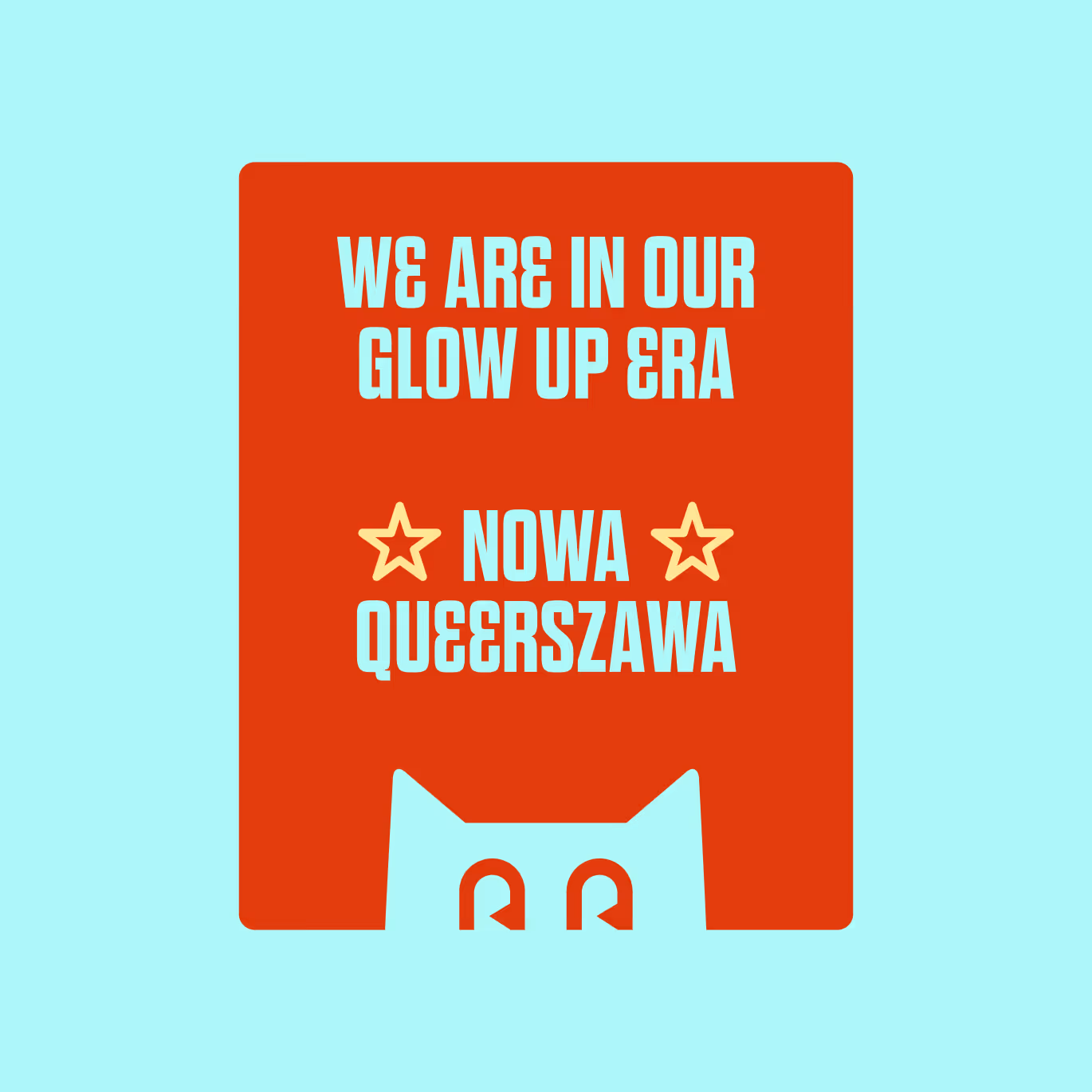
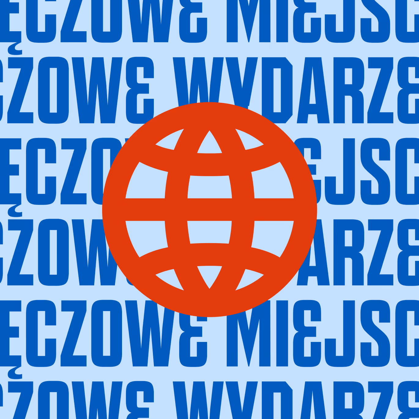
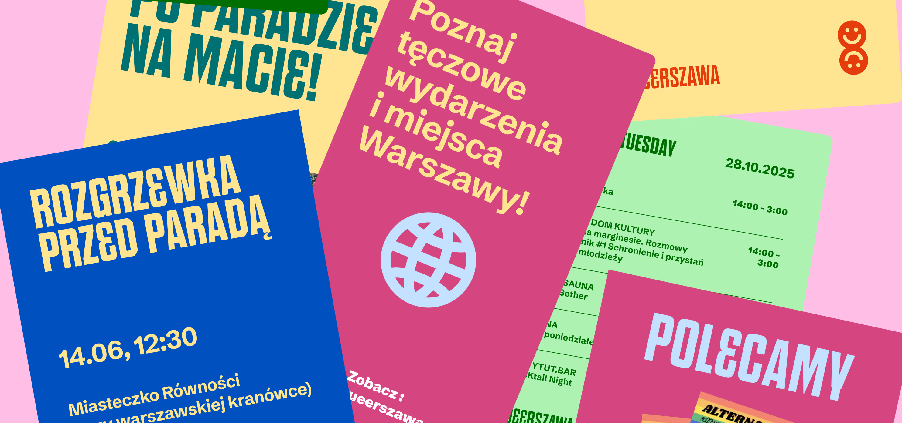
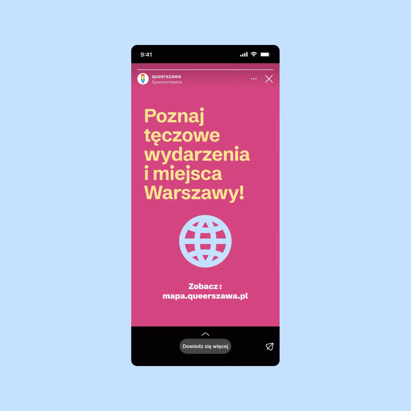
Queerszawa (combination of Queer and Warszawa / Warsaw) is a map of queer-friendly places in Warsaw and a local information hub on social media. We had the pleasure of delivering a full glow-up of the brand.
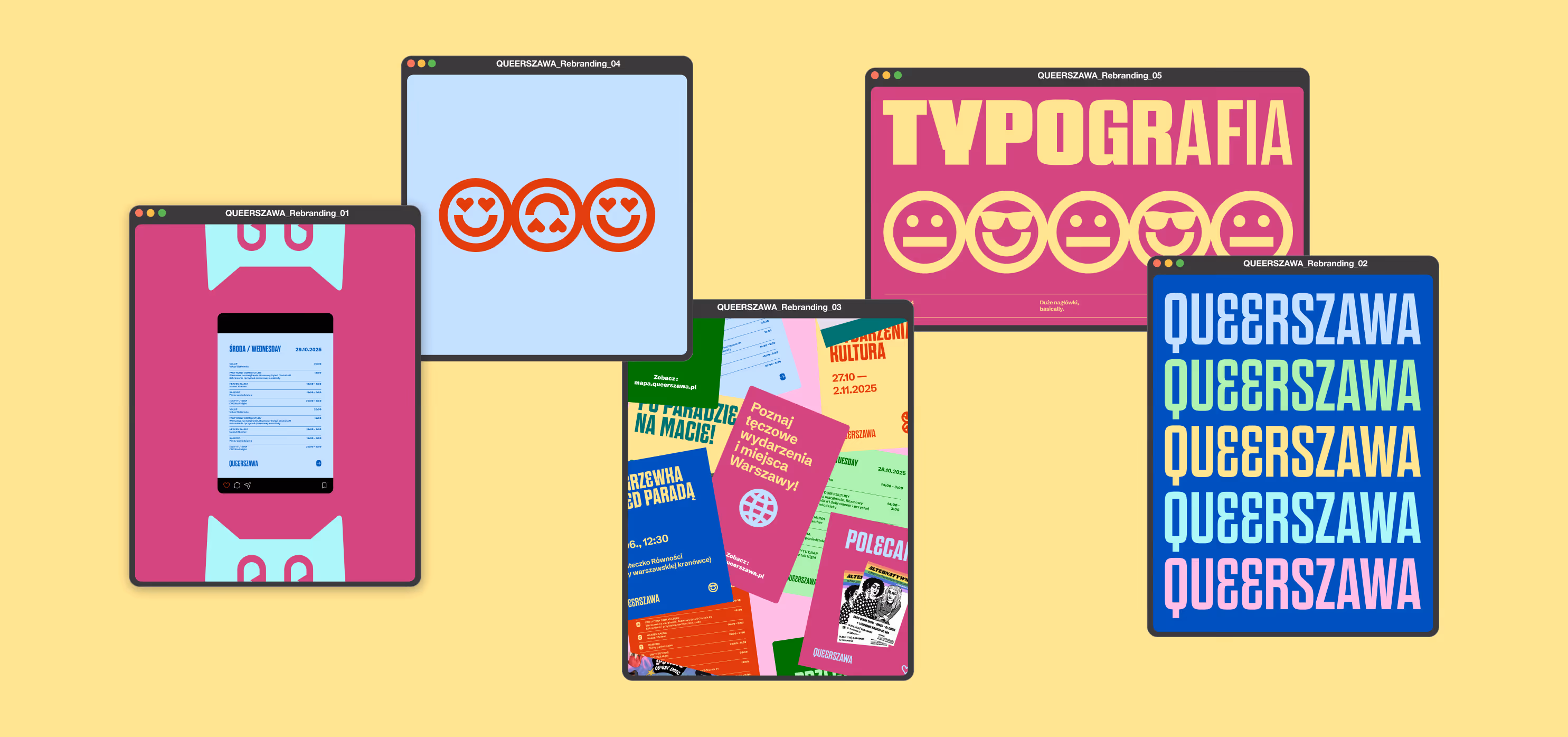
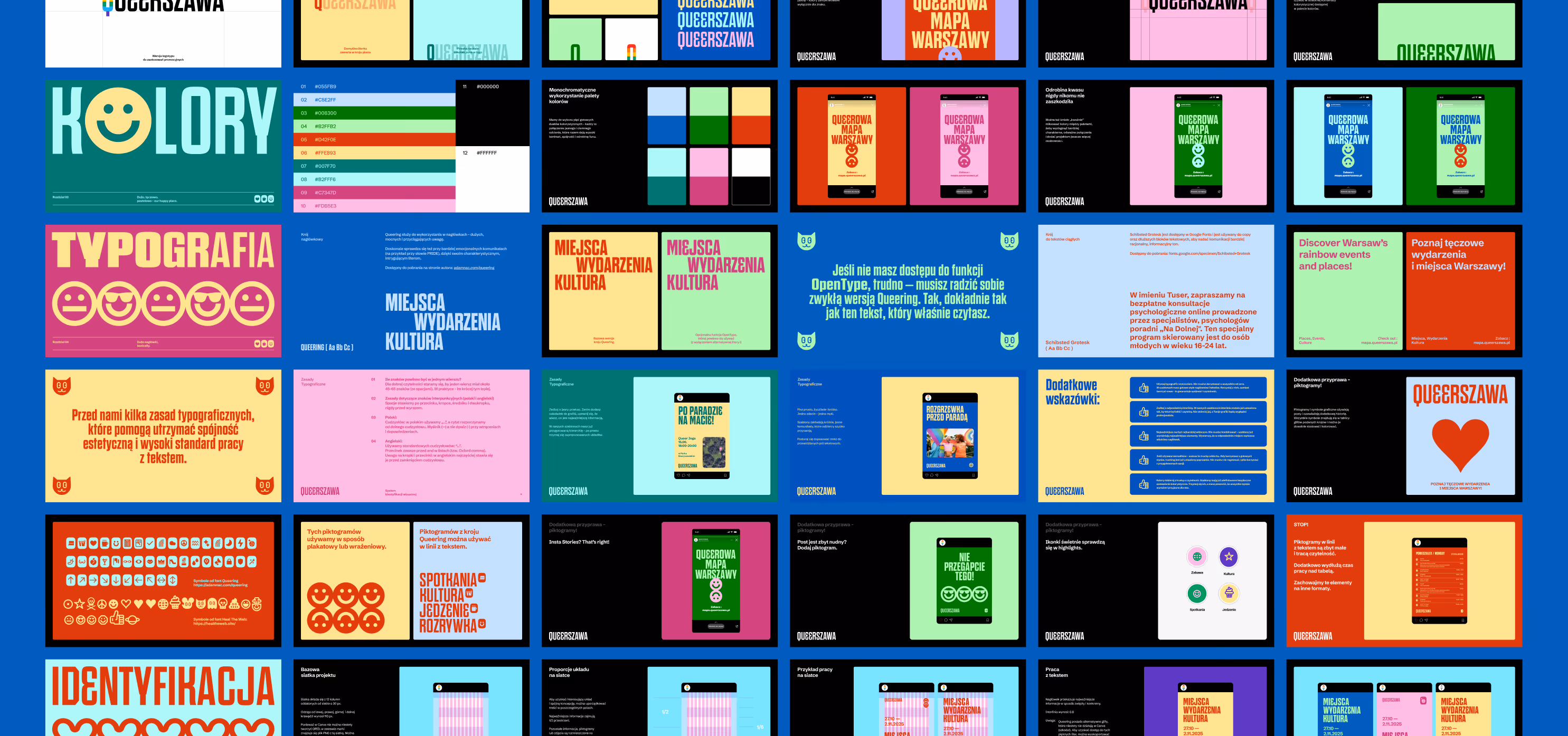
Our work included logo design, a social media identity system (concept and templates), as well as documentation and training on how to use the system.
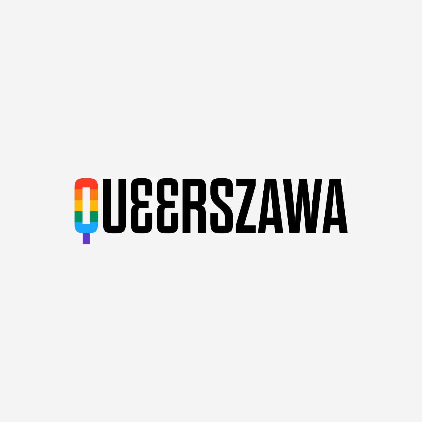
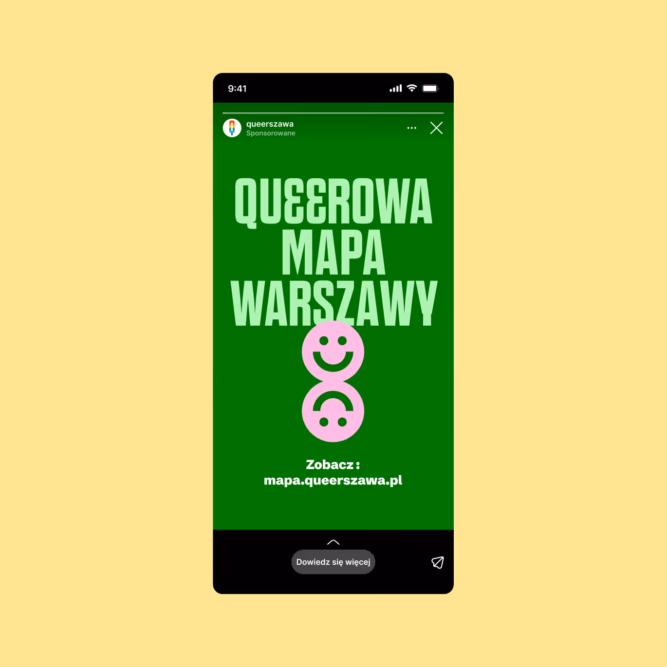
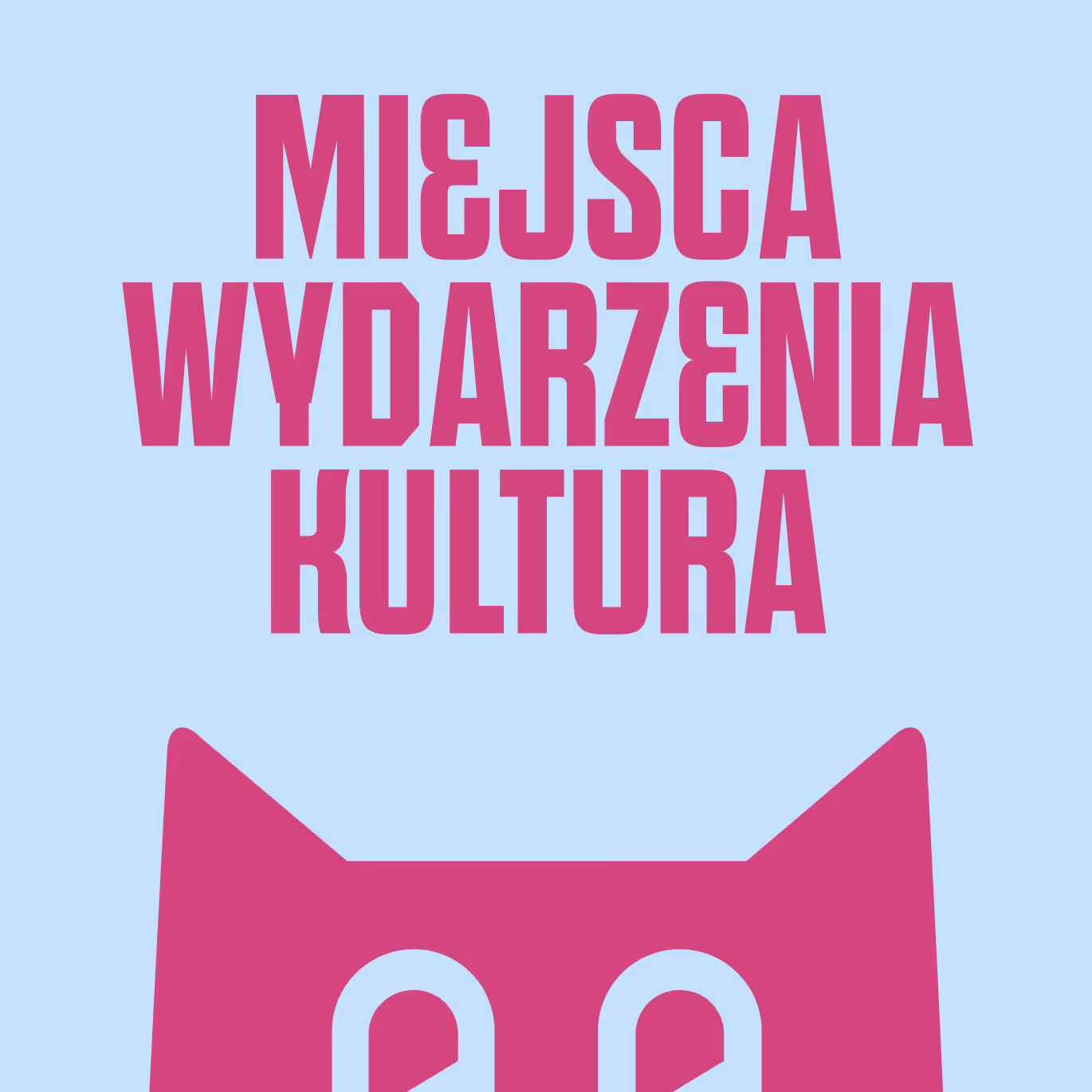
The logotype is based on the letter Q, designed as a map pin symbol, naturally presented in rainbow colors. But are they really rainbow colors?
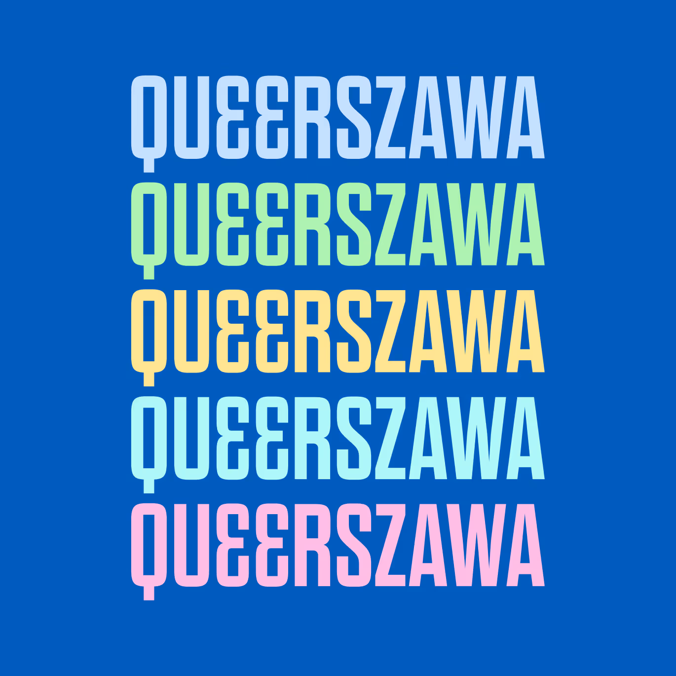
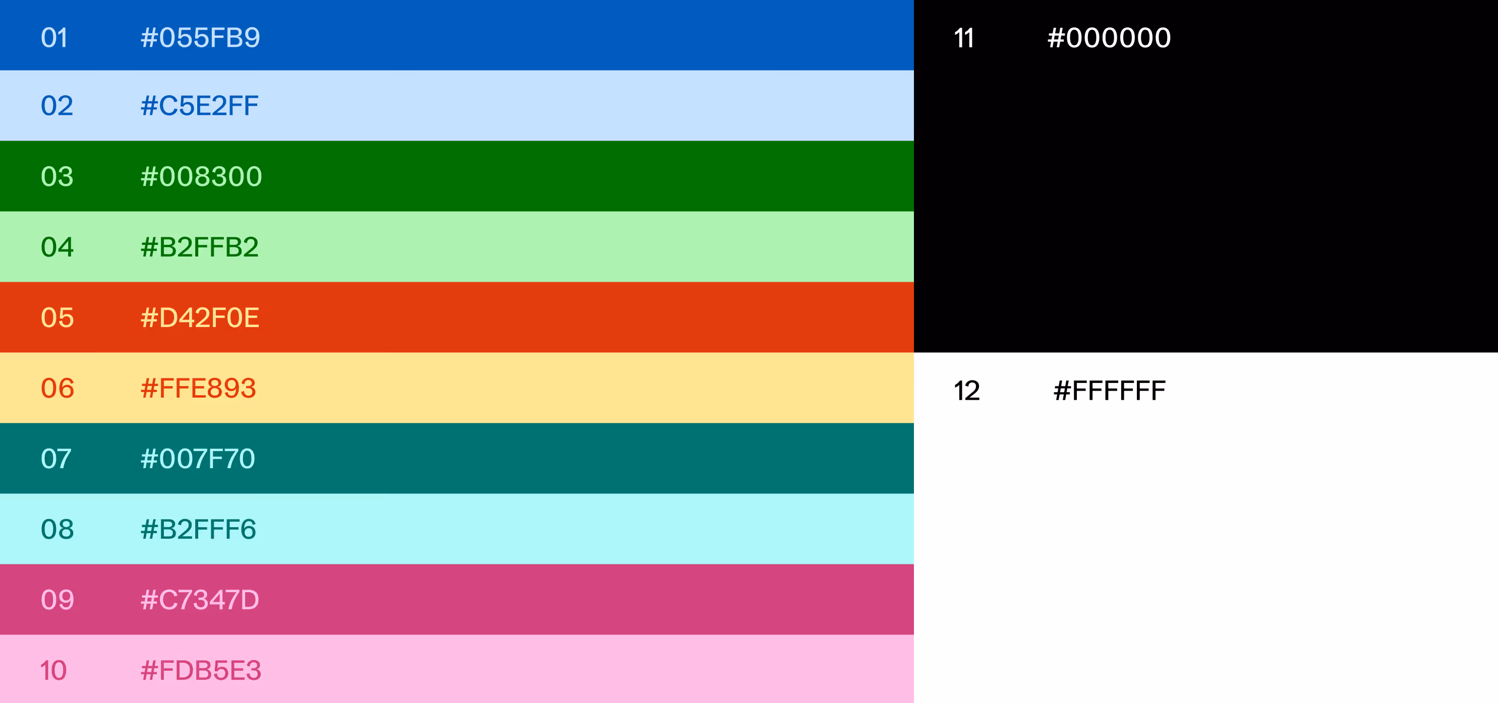
Our palette acknowledges and honors the LGBTQIA+ color spectrum, while subtly shifting the hues toward more muted, slightly desaturated tones — clearly recognizable as a rainbow, yet distinctive enough to create a unique and ownable visual language for the brand.
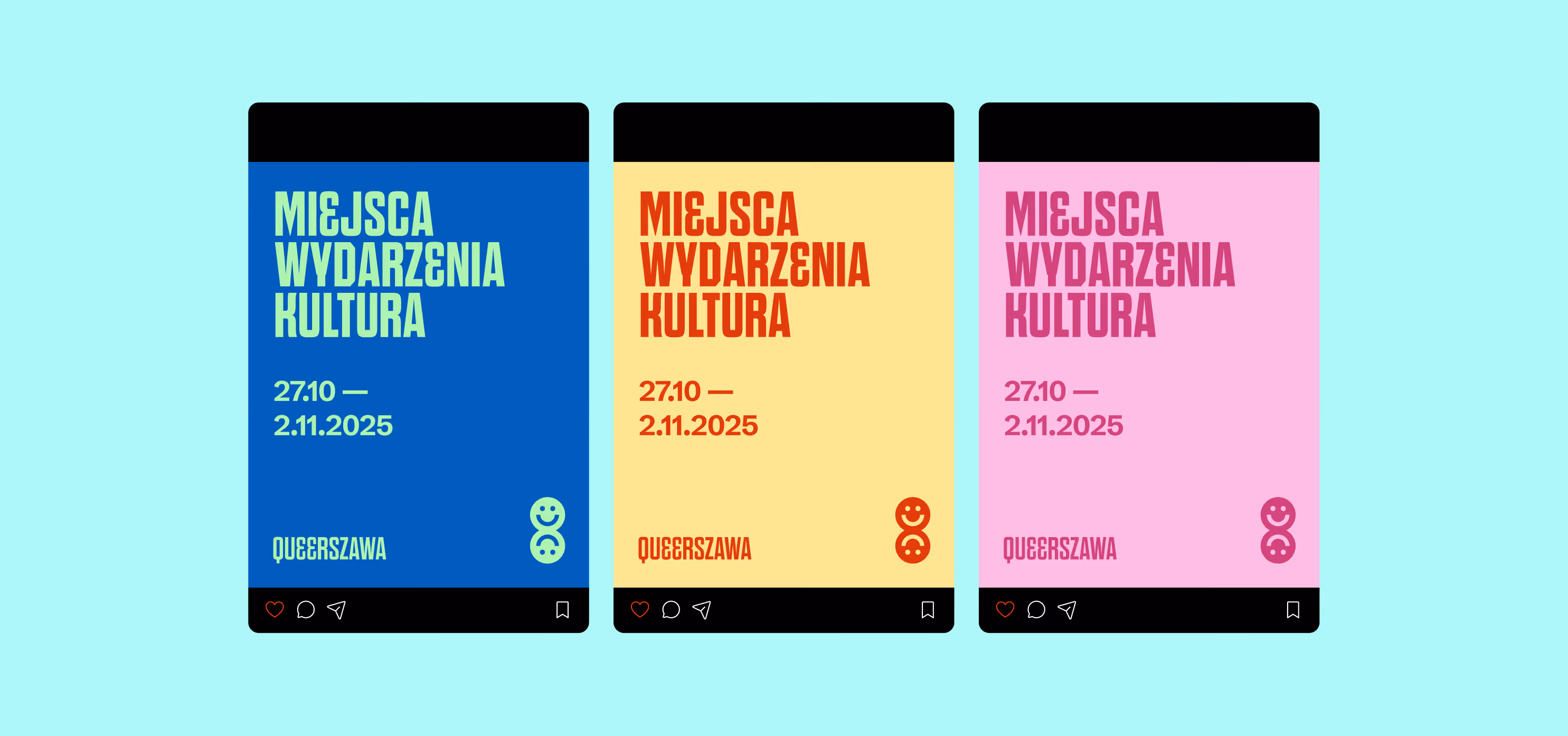
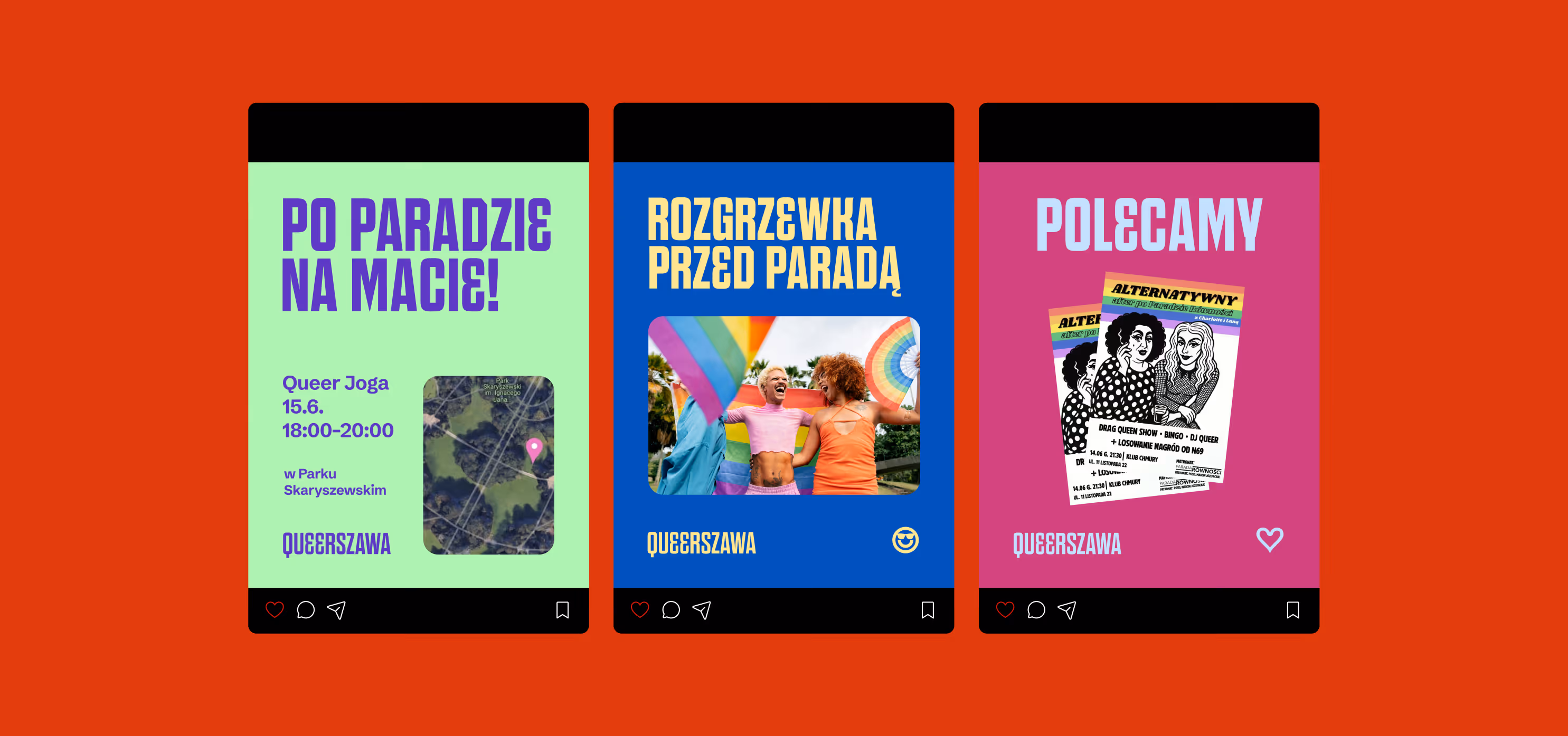
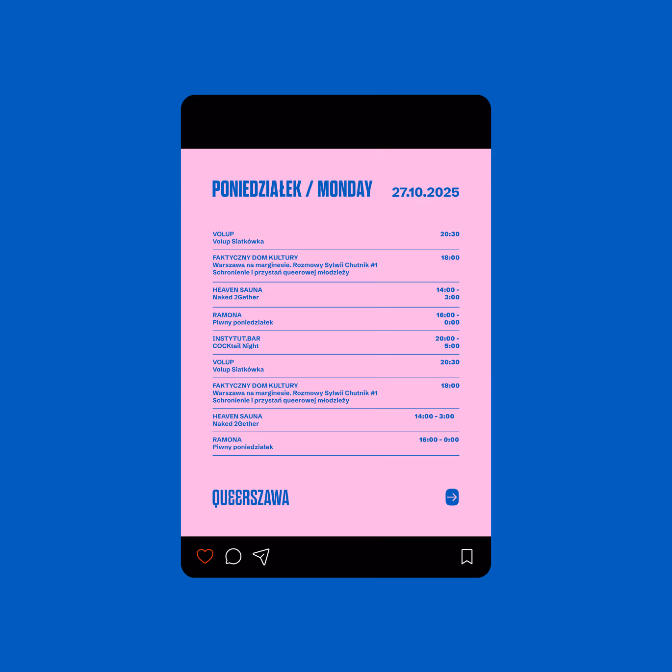
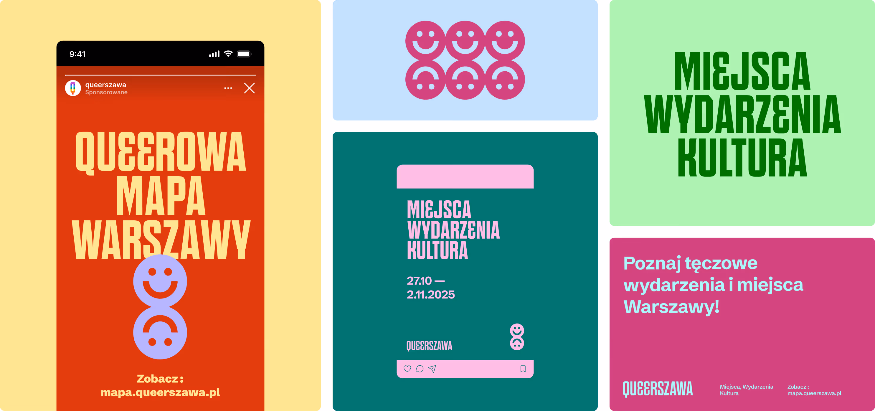
The color system was designed to work in two primary modes, which can be used interchangeably depending on the tone of communication.
The first mode uses high-contrast combinations built on bold, unexpected color pairings, such as blue with lime green or yellow with red.
The second mode relies on tonally consistent compositions, based on a single color used in multiple saturations — for example dark pink on light pink, or green on mint.
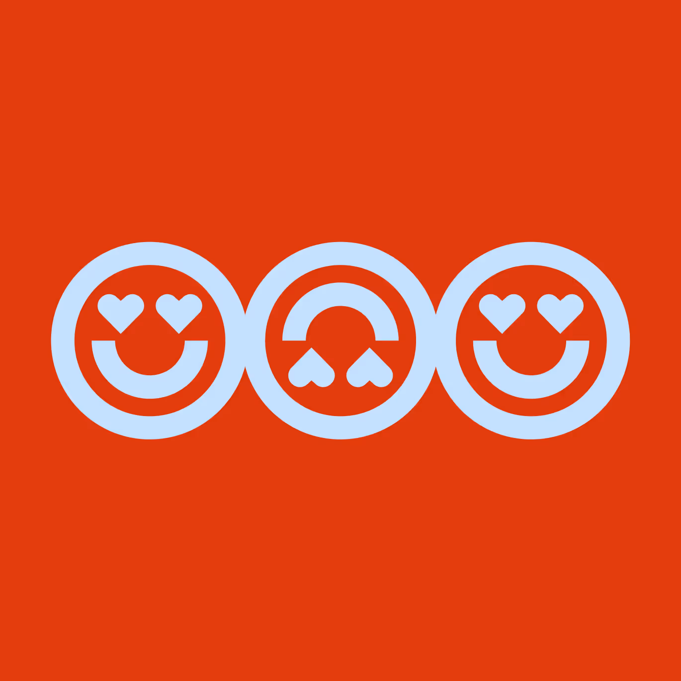
The real personality of the brand emerges in the typography. Instant recognizability — a Queerszawa post should be identifiable in the Instagram feed at first glance — is achieved primarily through lettering, supported by a carefully selected icon set.
The result is clear, legible, and straightforward. It is important to remember that Queerszawa communicates about events and places, while the brand itself remains a recognizable but neutral communication frame.
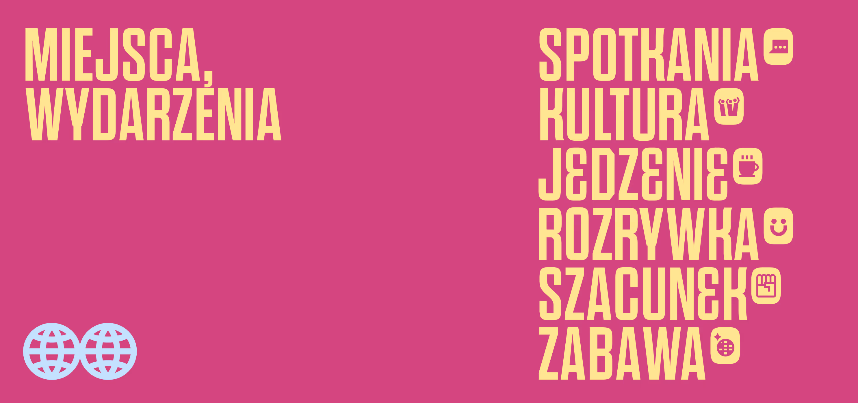
More LGBTQiA+? See portfolio entries: Warsaw Pride, Lambda
Project team
Want something like this, but different?
By the way, join our
non-intrusive newsletter
with quality content