KLAR
Overview
A brand for advisors who think — and see — differently.
When the Klar team approached us for a visual identity and website, we were genuinely excited. Why? First, because we had the opportunity to create the name. The working name for the brand was Perpetuum.
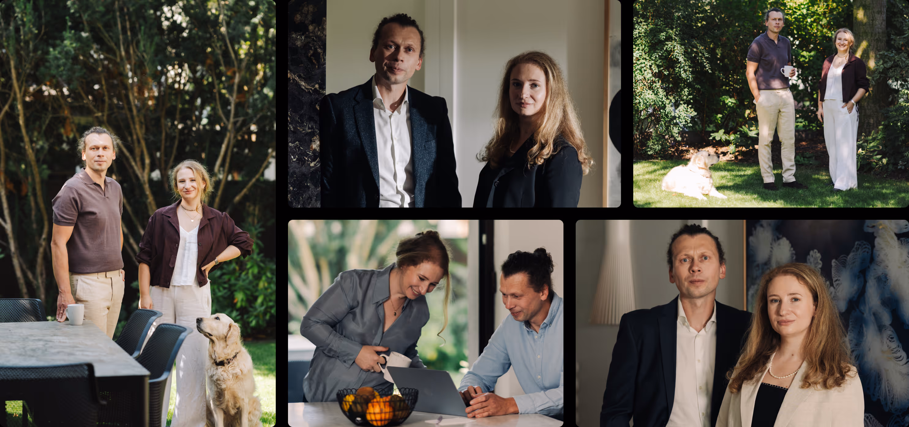
We started with positioning and with understanding the personalities of the founders. With brands built around their creators, this is always the key starting point. The way a business operates inevitably reflects the people behind it — regardless of the business plan, the tone and direction will follow the character of the owners. In this case, we had an ideal situation. Łukasz and Olga Pupek are not only excellent business advisors, but also humanists with a deep sensitivity to art and aesthetics. That spirit set the direction for the entire design process.
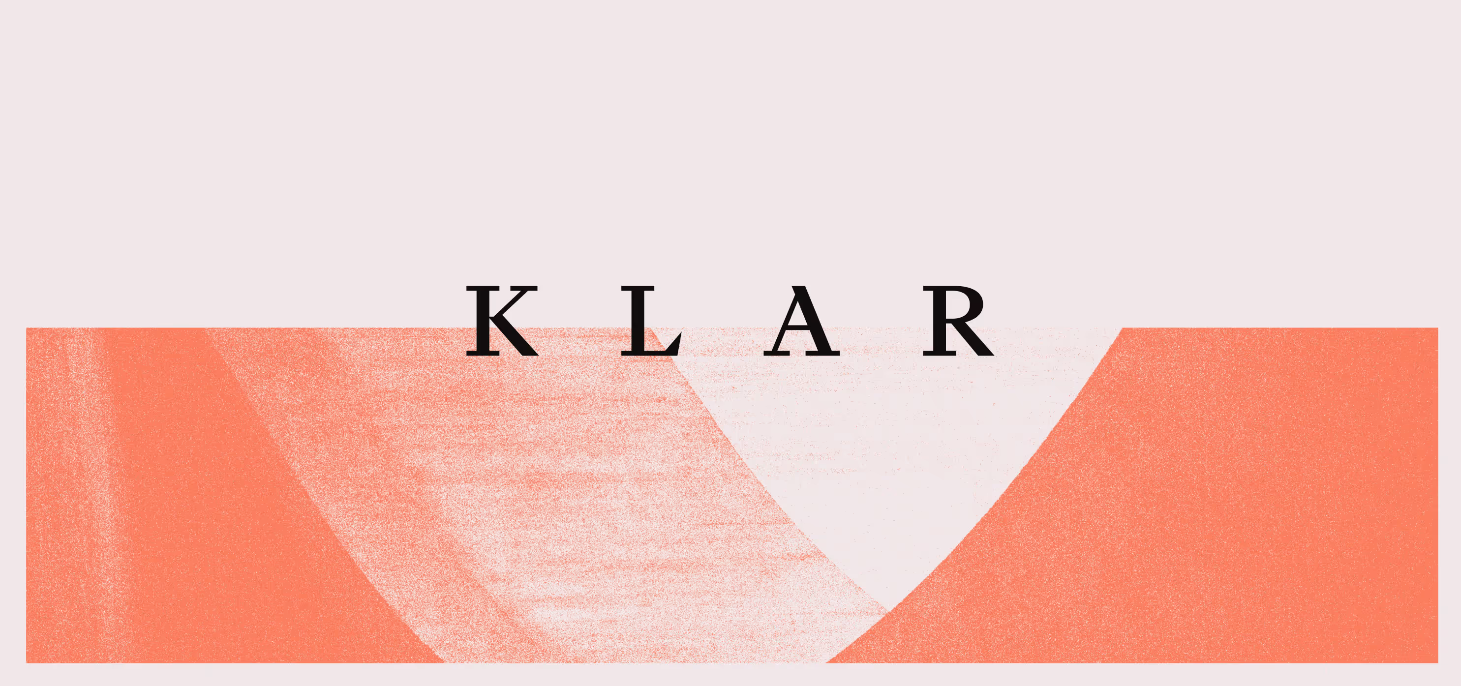
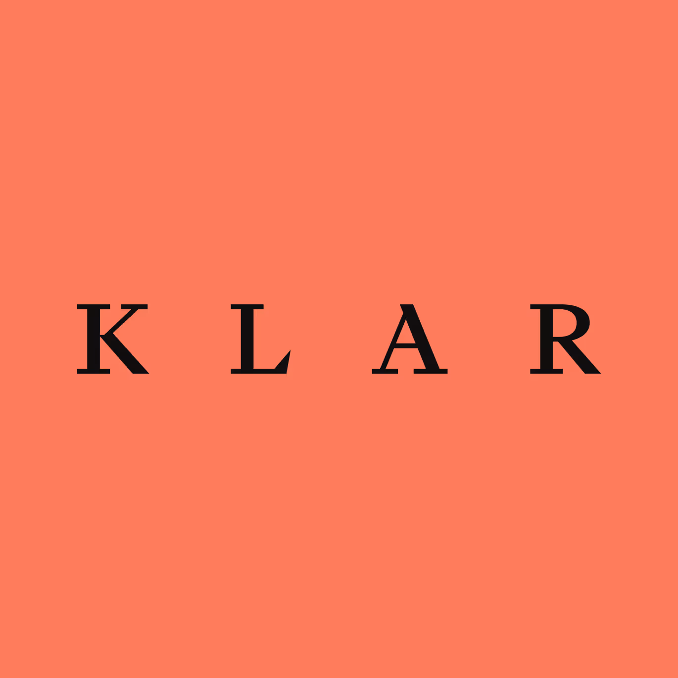
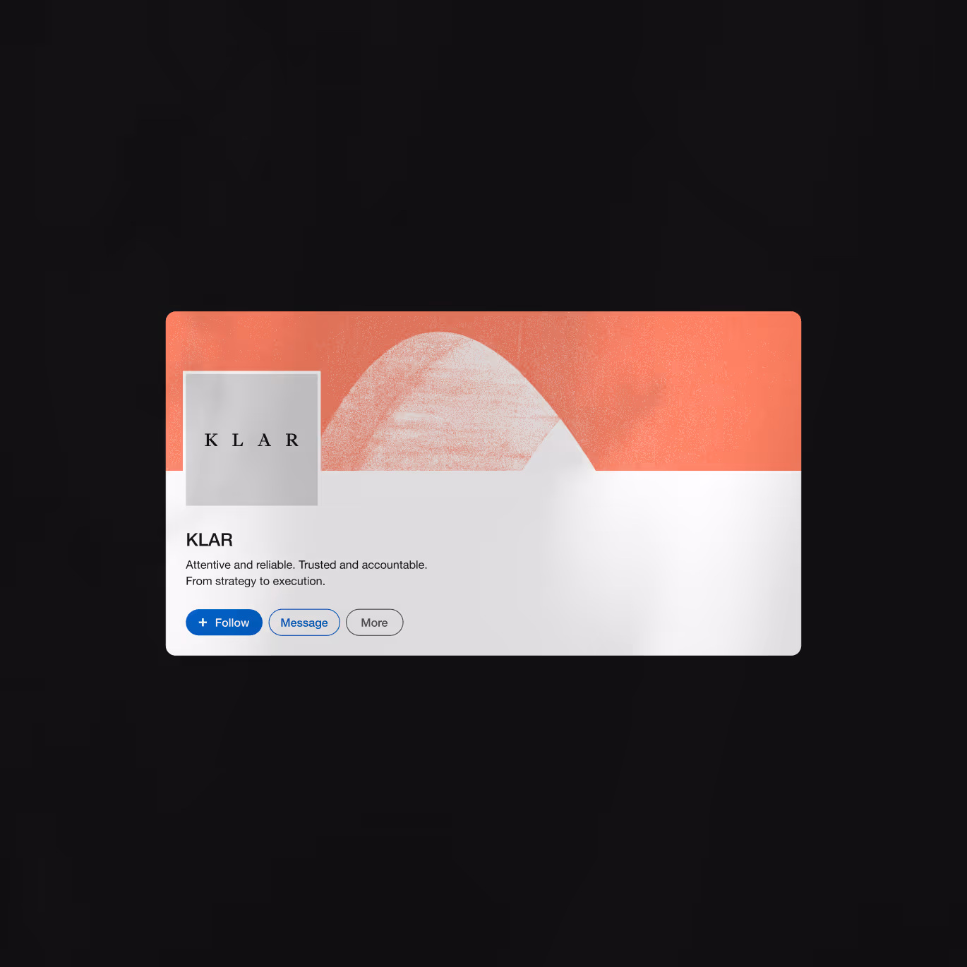
And the name? Klar captures the essence of an advisory brand that simplifies complex investment processes and translates sophisticated financial knowledge into clear business decisions. The name was chosen to evoke clarity, transparency, and logical thinking.
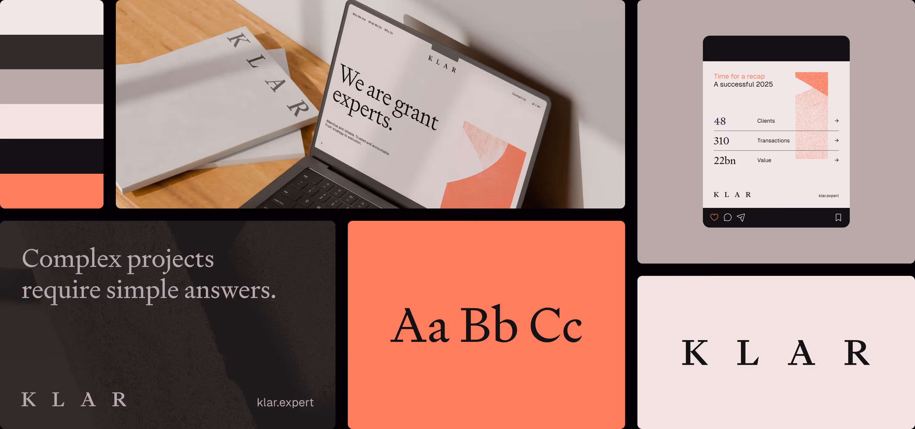
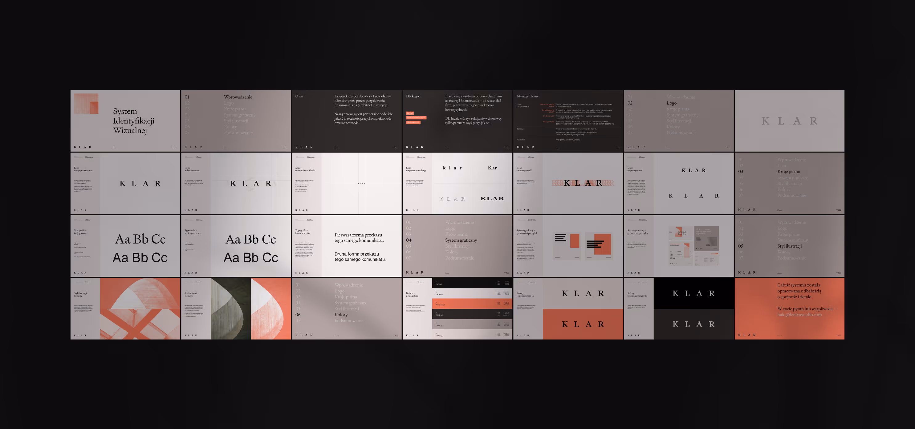
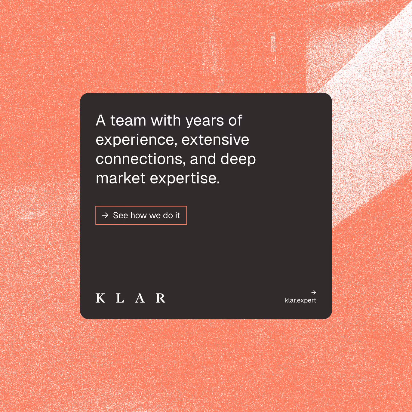
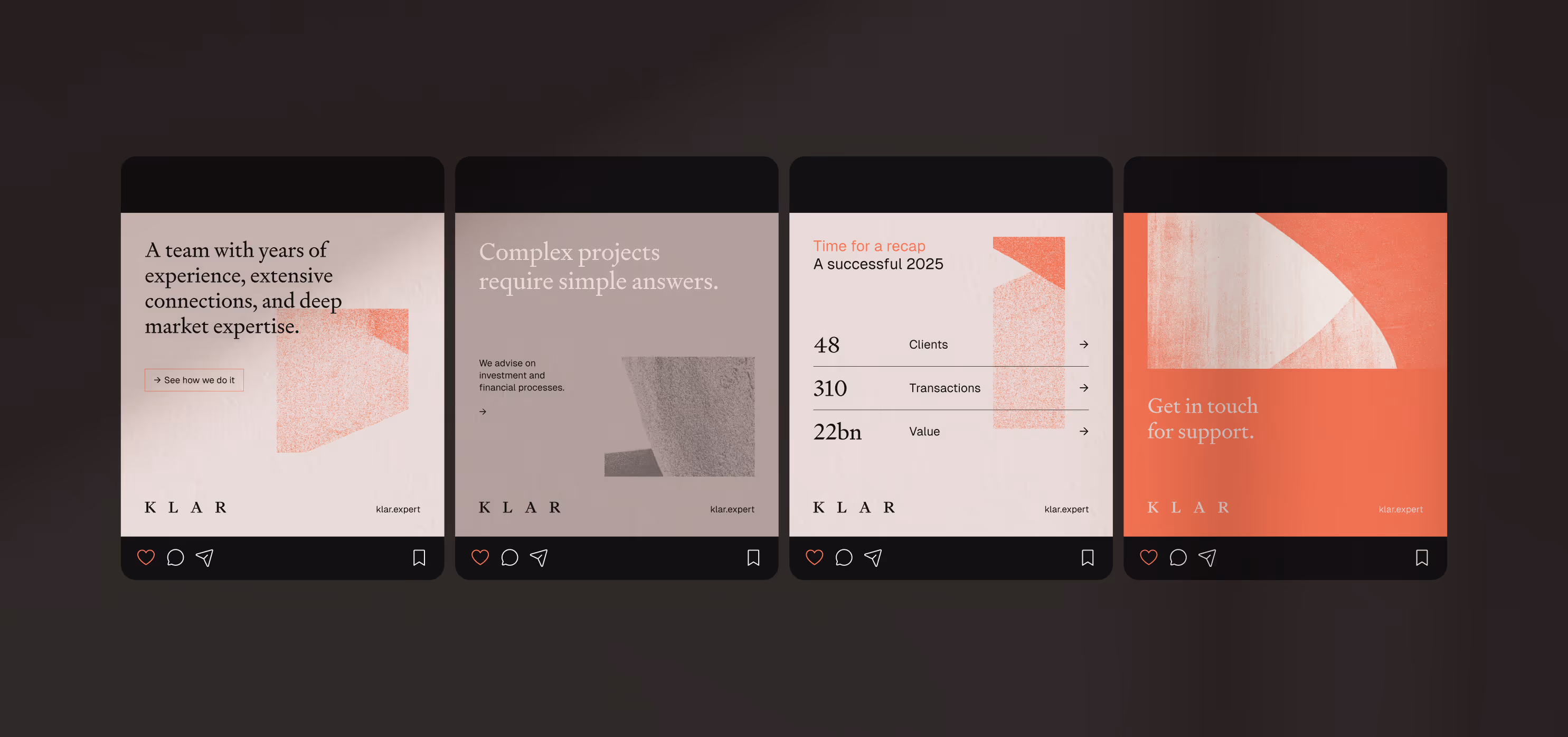
Visually, the system is built on the combination of two worlds. On one side, there is abstraction — soft forms and images suggesting thought processes, pattern recognition, and data interpretation. On the other, the typography is serious, classical, and highly legible. This contrast is intentional: the abstract elements represent analytical thinking, while the typography and structured data give the brand credibility and business authority.
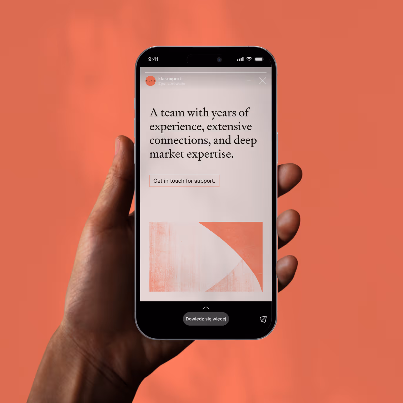
In communication, we deliberately avoided the typical financial-industry aesthetic based on charts and technical symbols. Instead, we created a visual language that builds the image of an expert through calmness, precision, and discipline of form. The color palette is restrained, the typography elegant, and the system designed to perform equally well in investor reports, presentations, and marketing materials.
The result is a brand that does not try to impress by force. Klar communicates in a calm, factual tone, emphasizing analytical competence and a strategic approach to investing.
And how else can the spirit of the founders be expressed? Take a look at the photographs by Paweł Czyż, created for the website we designed.
One more thing. Business cards are rarely used today, but in this case we chose quality over convention, designing thick, pure cotton cards that feel more like small pieces of craft than standard print.


More about B2B brands here: Branding for B2B brands.

Project team
Want something like this, but different?
By the way, join our
non-intrusive newsletter
with quality content