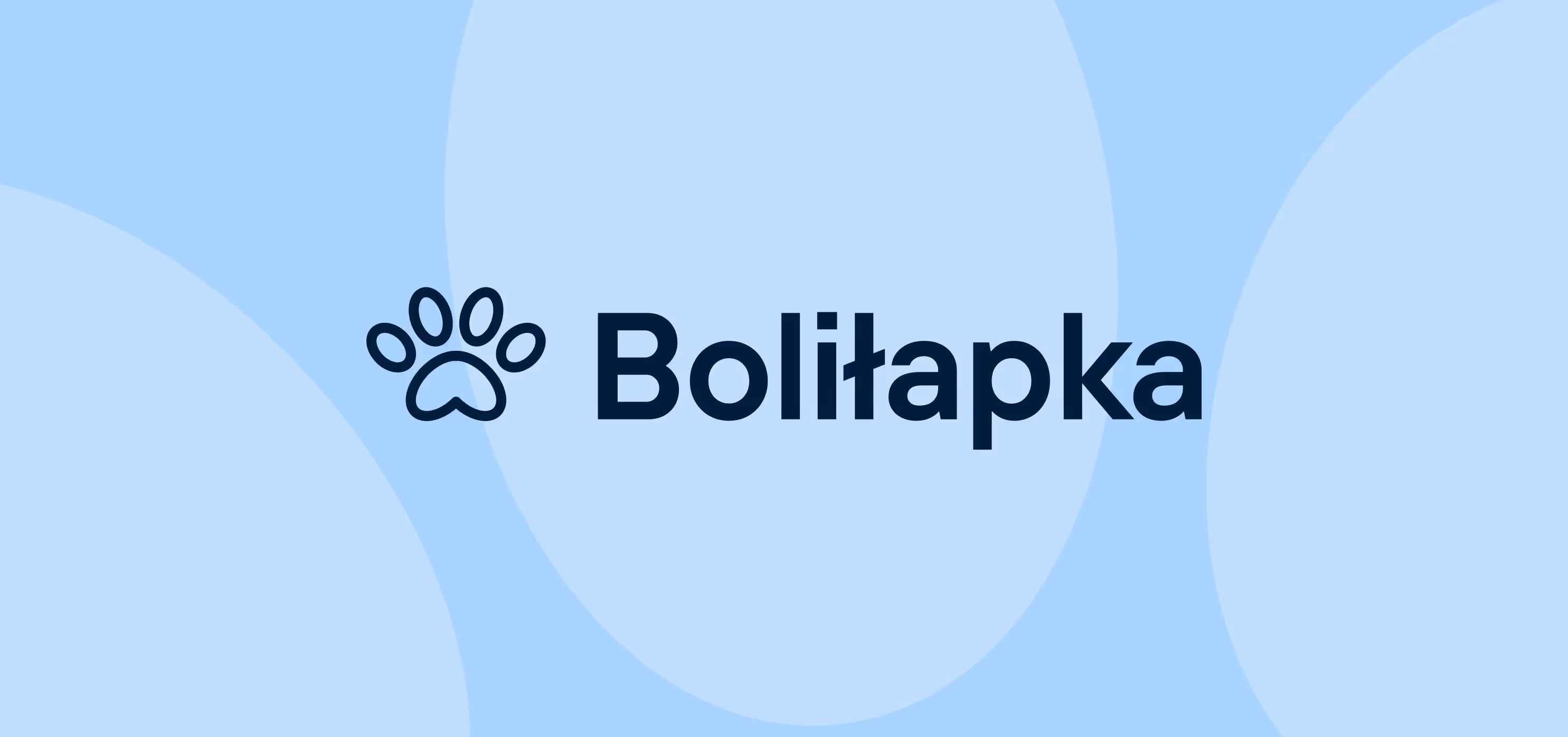
Bolilapka
Overview
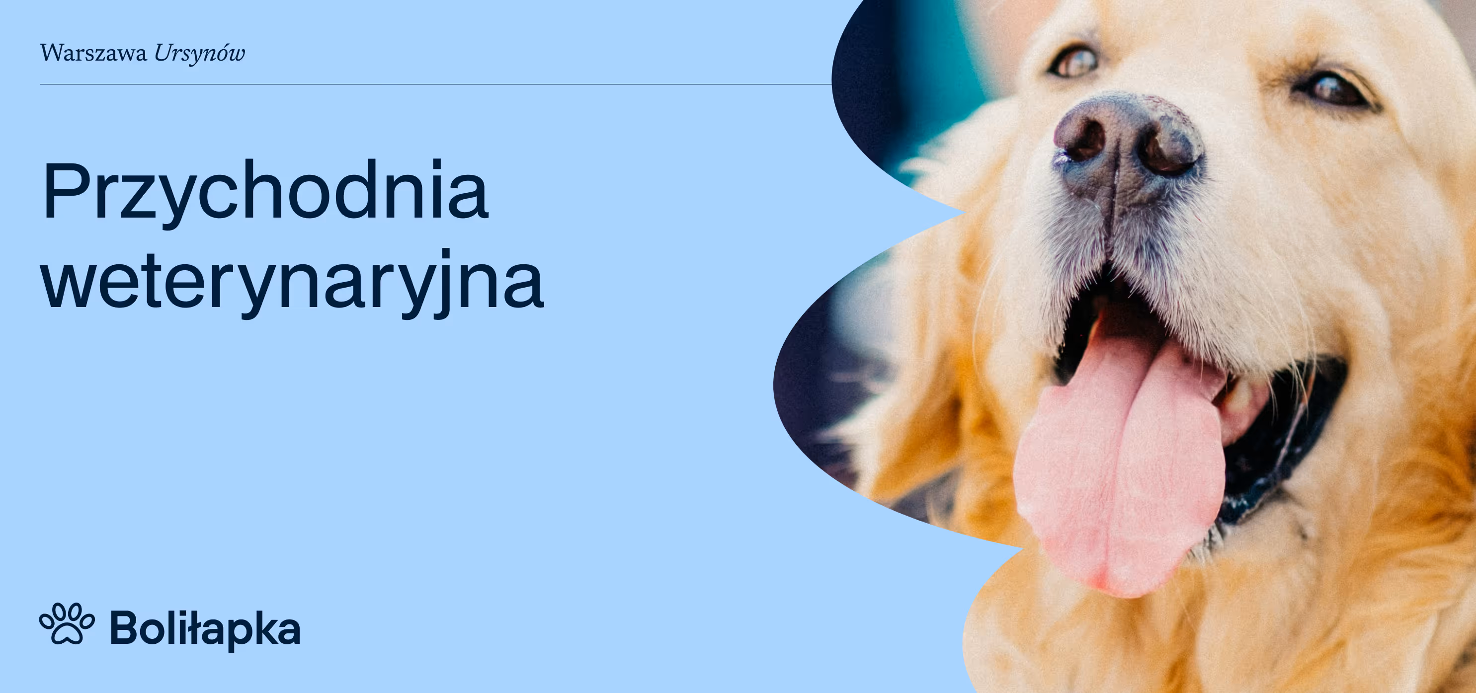
A local brand in good hands.
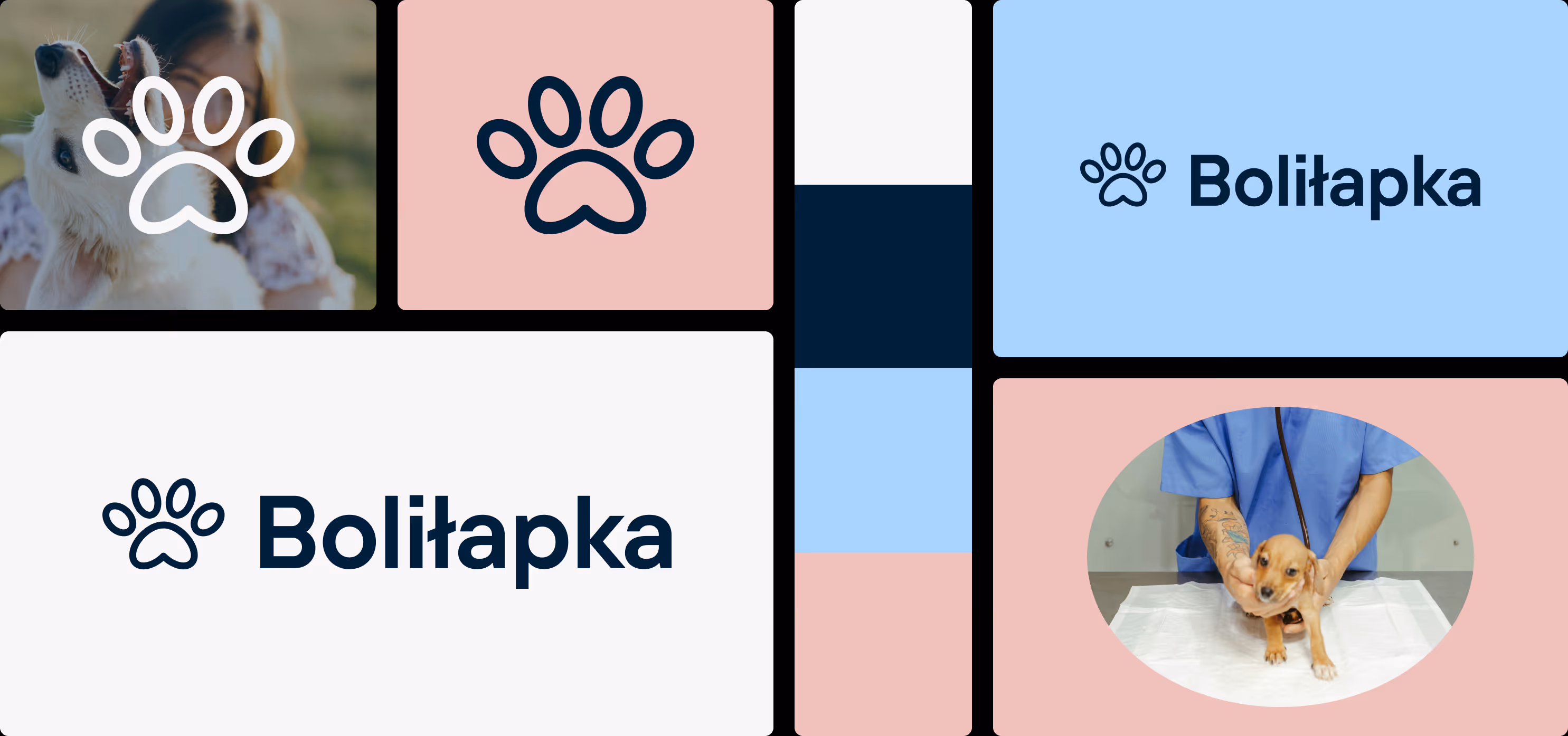
The paw (Bolilapka means: My paw hurts in Polish) doesn't hurt anymore. Or at least, working on the Bolilapka brand no longer does.
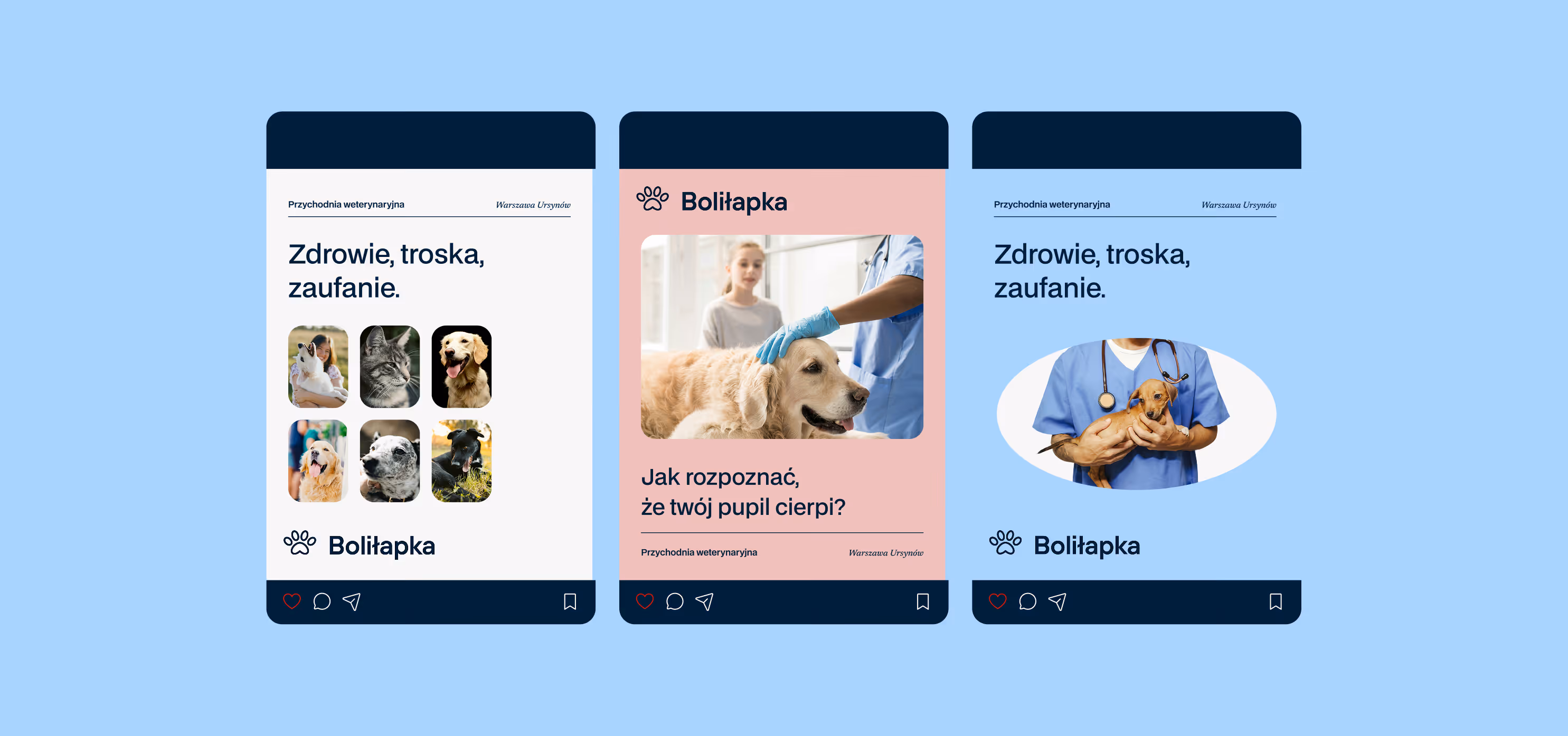
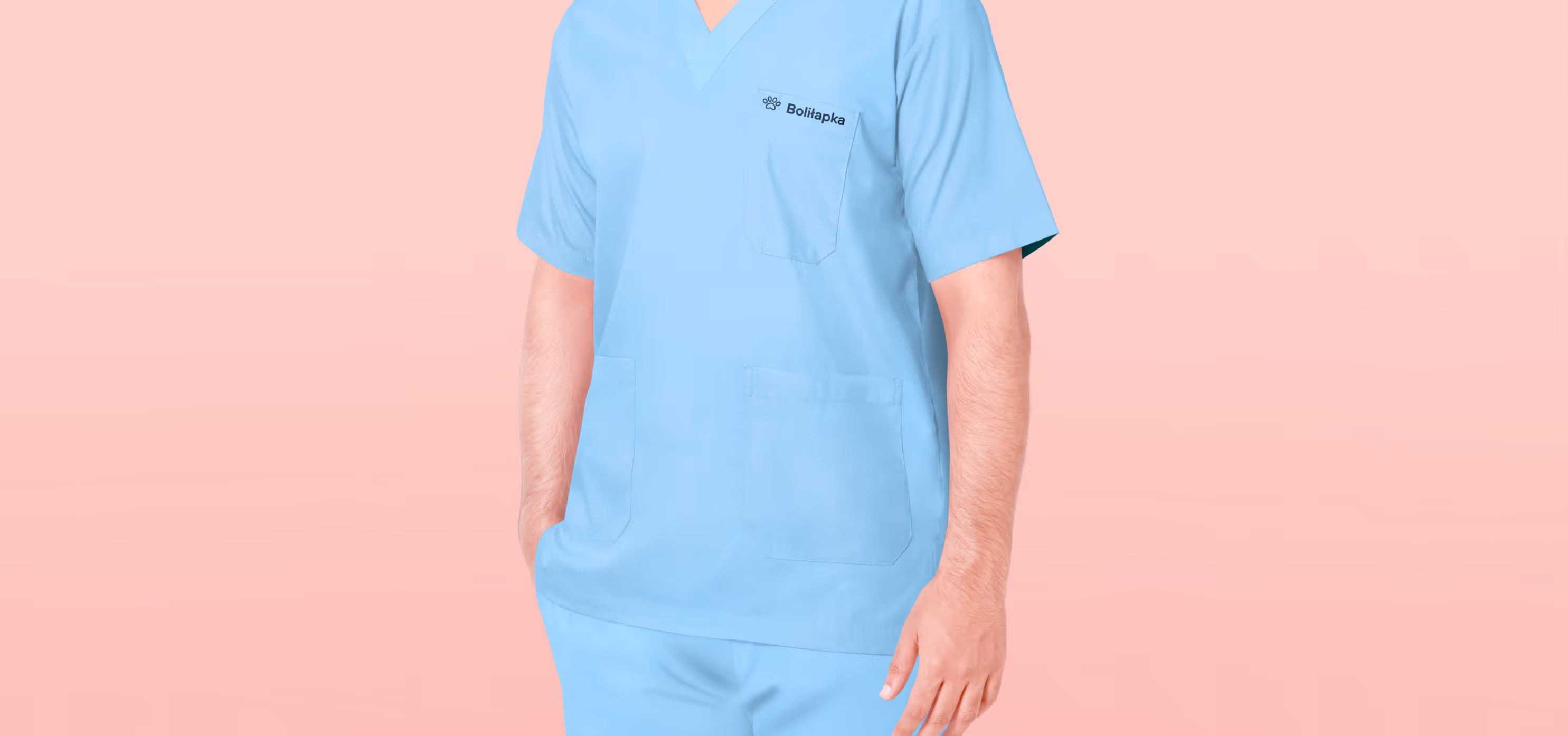
Bolilapka is a local veterinary clinic in Warsaw's Ursyn?w district. It's not a chain; it's a single-location practice run by dedicated specialists with genuine care for their patients. Until now, they'd been using an amateur-style logo that no longer reflected the quality of their services. They needed not only a refreshed logo, but also-more importantly-a complete and easy-to-implement brand identity system.
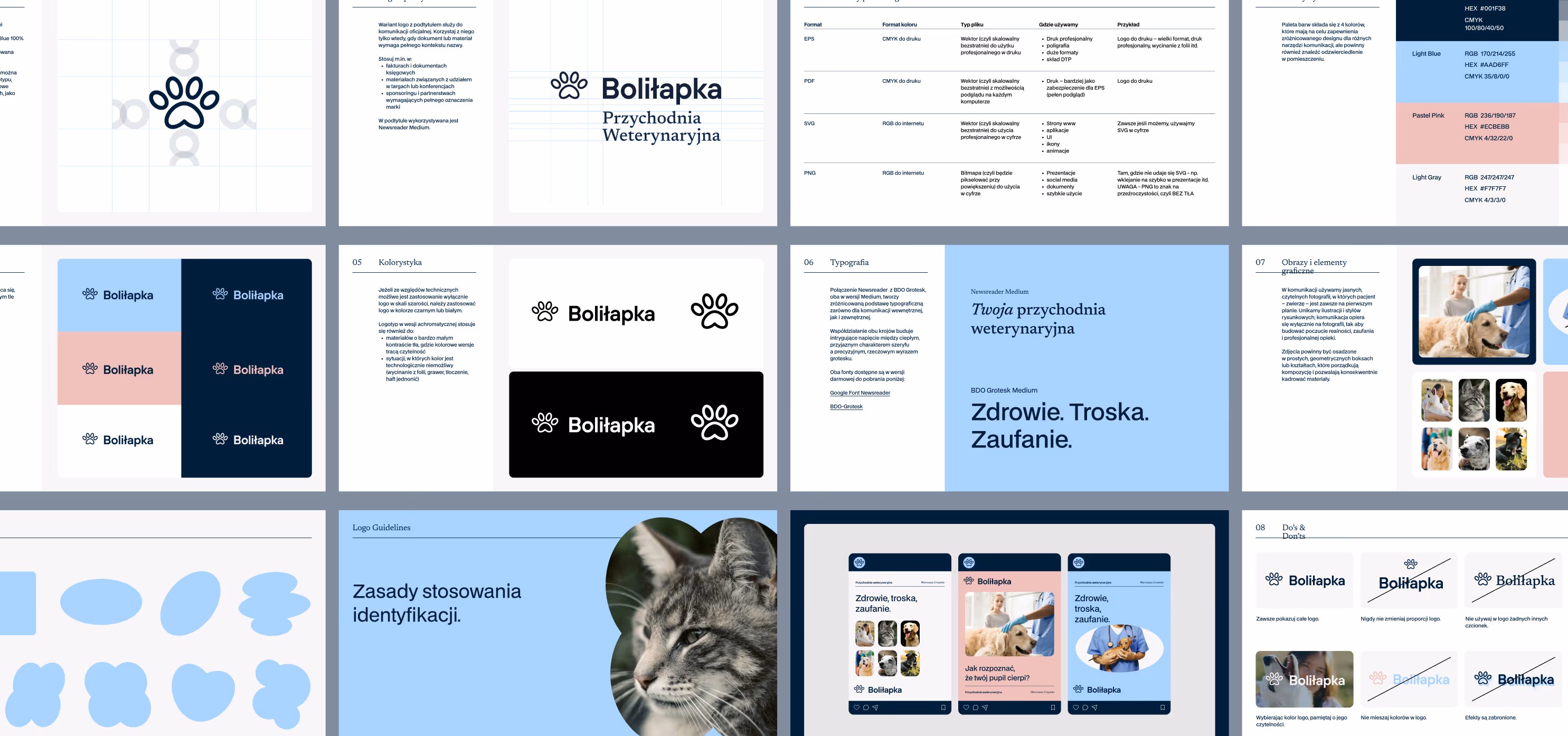
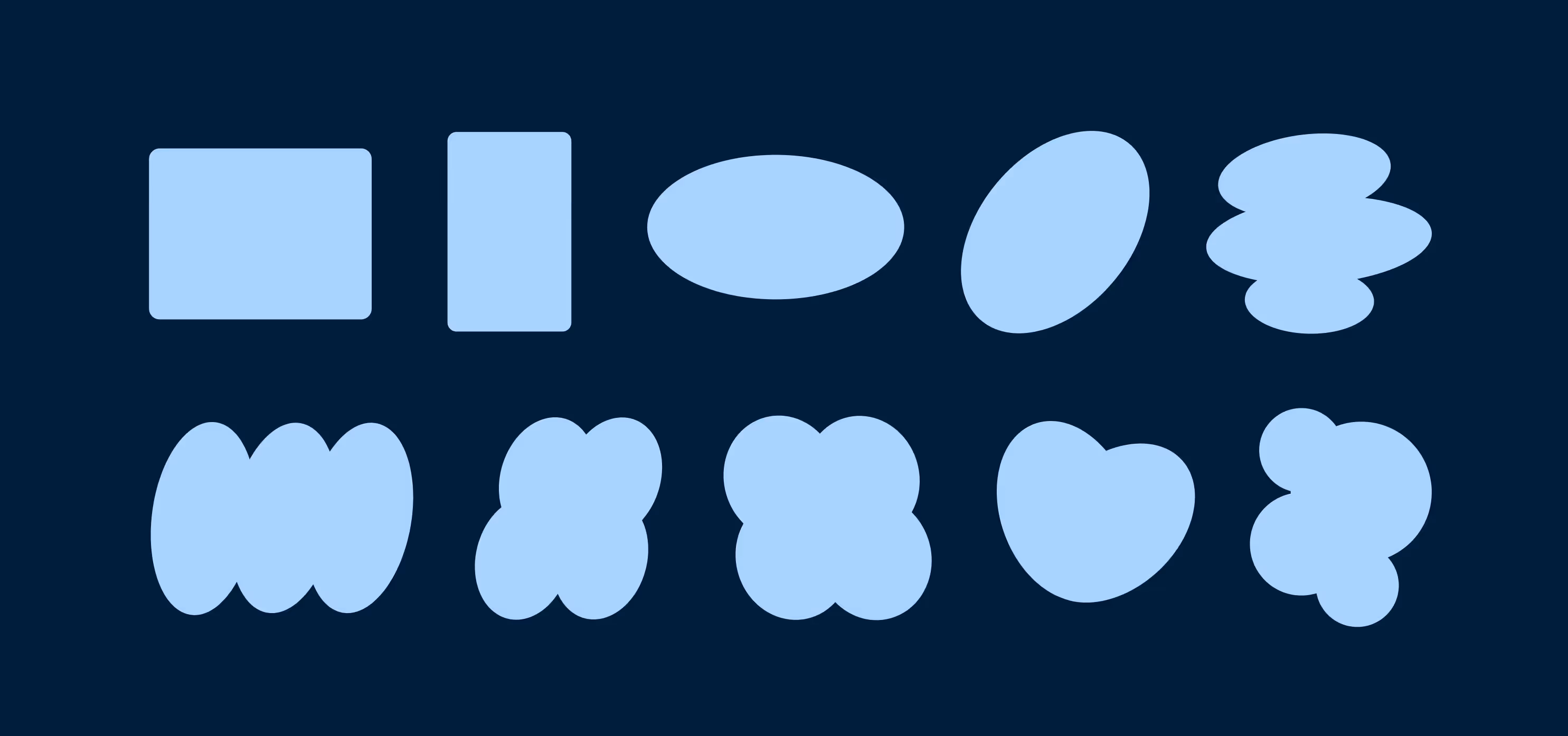
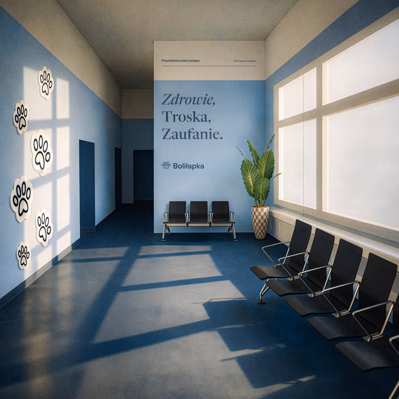
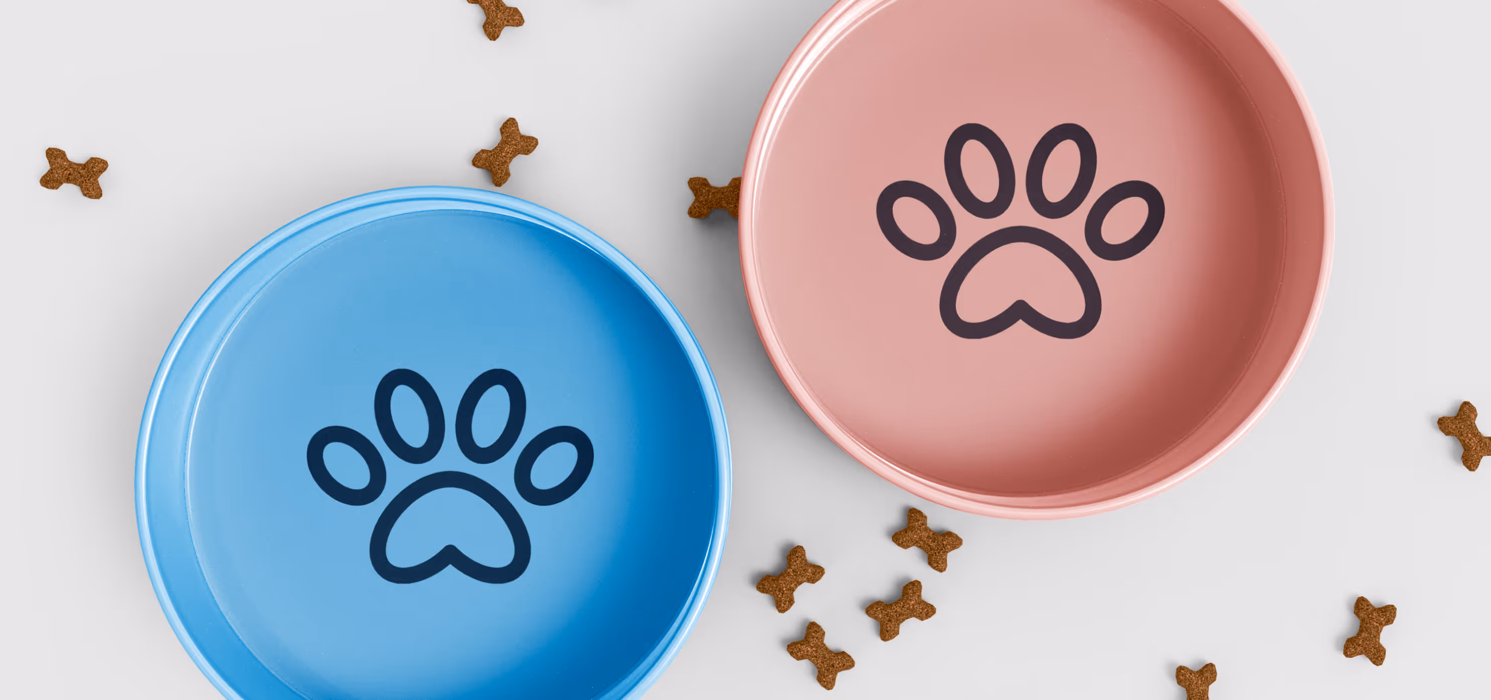
We retained the recognizable blue color palette (replacing turquoise with a softer baby-blue tone), complementing it with a muted pink. We naturally kept the name and the paw illustration-redesigned the symbol in a cleaner, more geometric style. Shapes derived from the paw and similar soft elements complete this simple system.
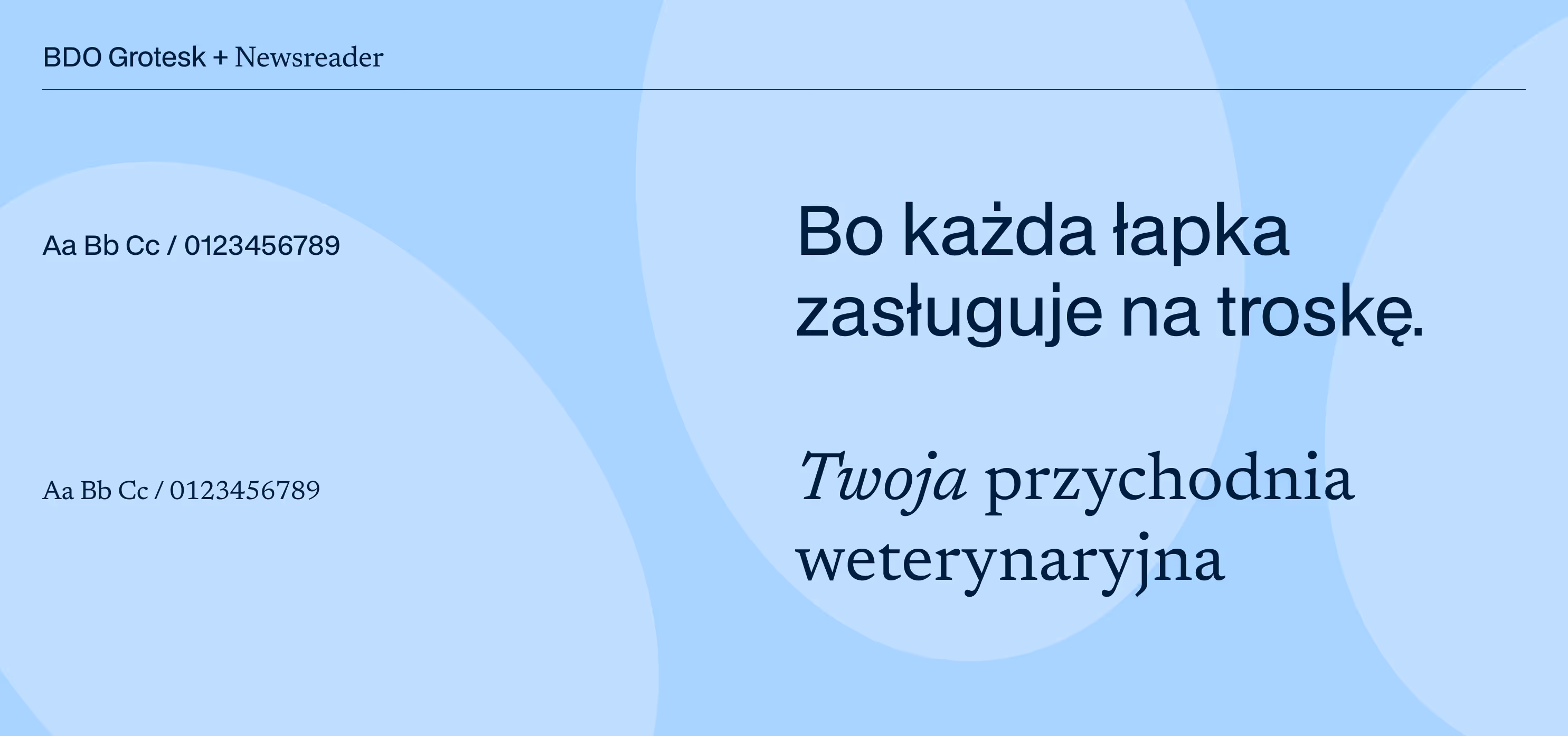
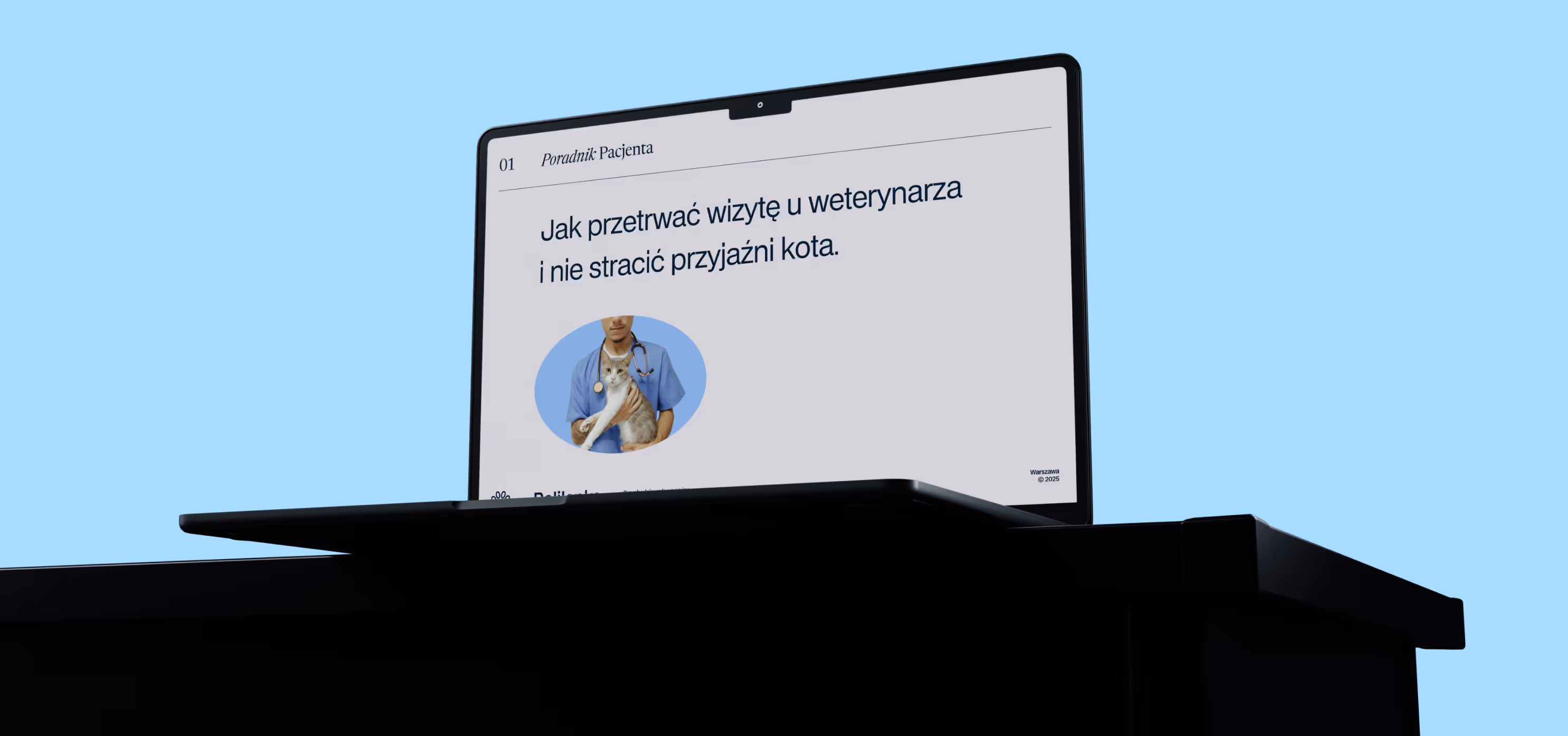
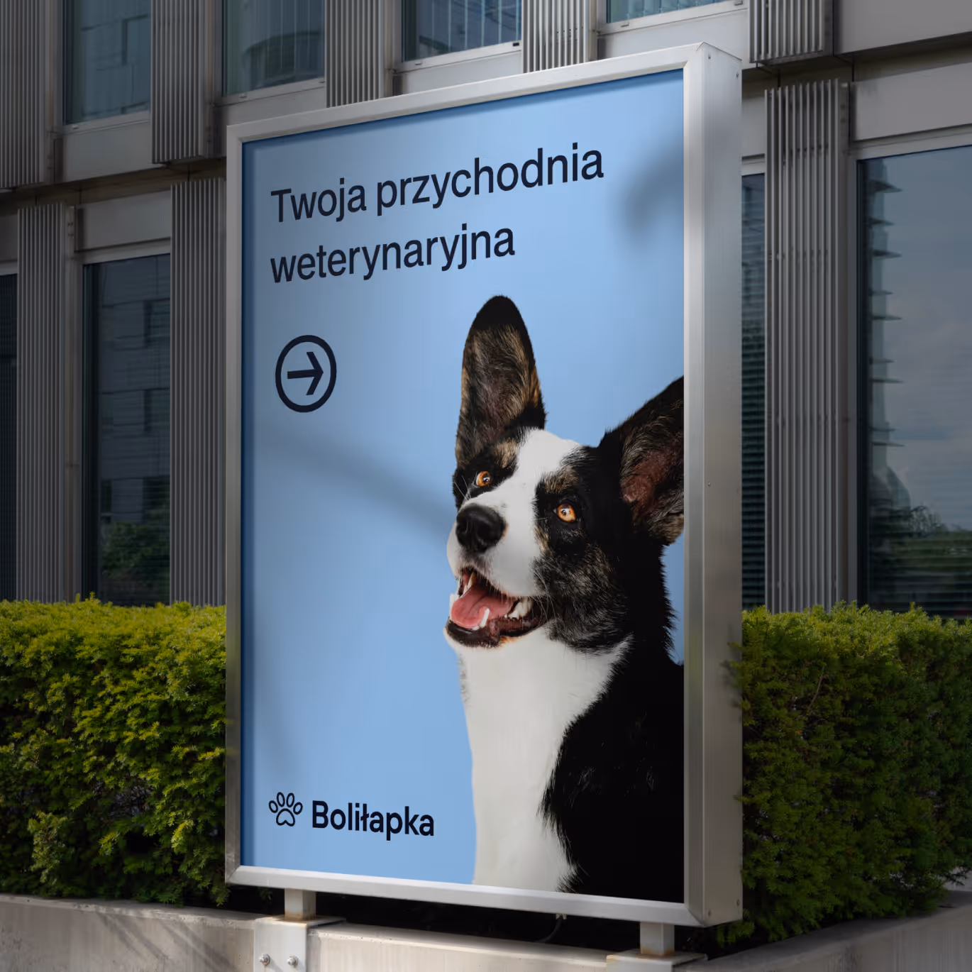
This identity is built on free and widely accessible typography, strictly defined colors, and a set of shapes used for consistent photo framing.
This toolkit enables coherent brand communication across all touchpoints-from social media to interior design decisions such as wall colors.


You can read more about how branding can work in a small organization here: Queerszawa
Project team
Want something like this, but different?
By the way, join our
non-intrusive newsletter
with quality content