Anna Krzanicka-Bombczyńska
Overview
Precision and approachability.
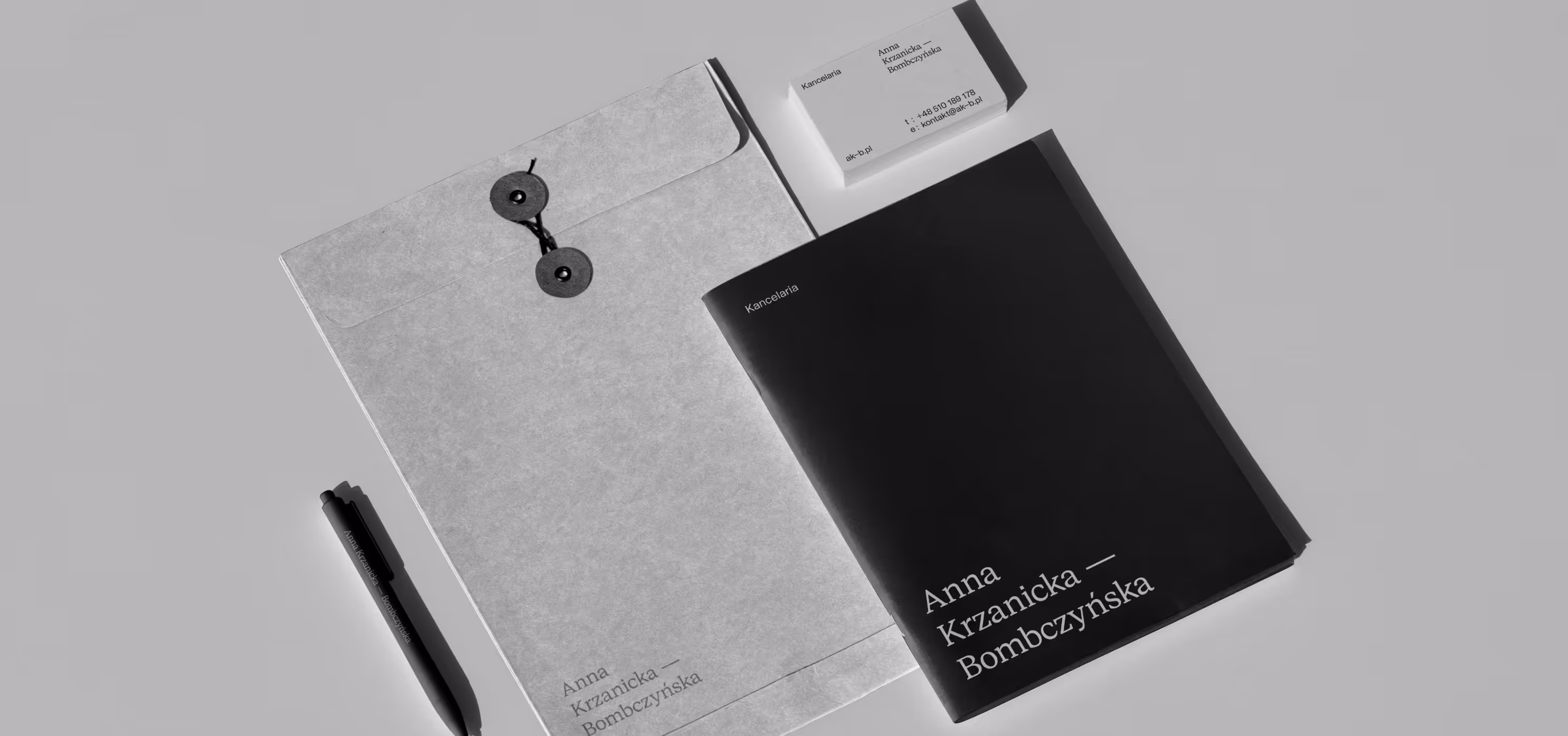
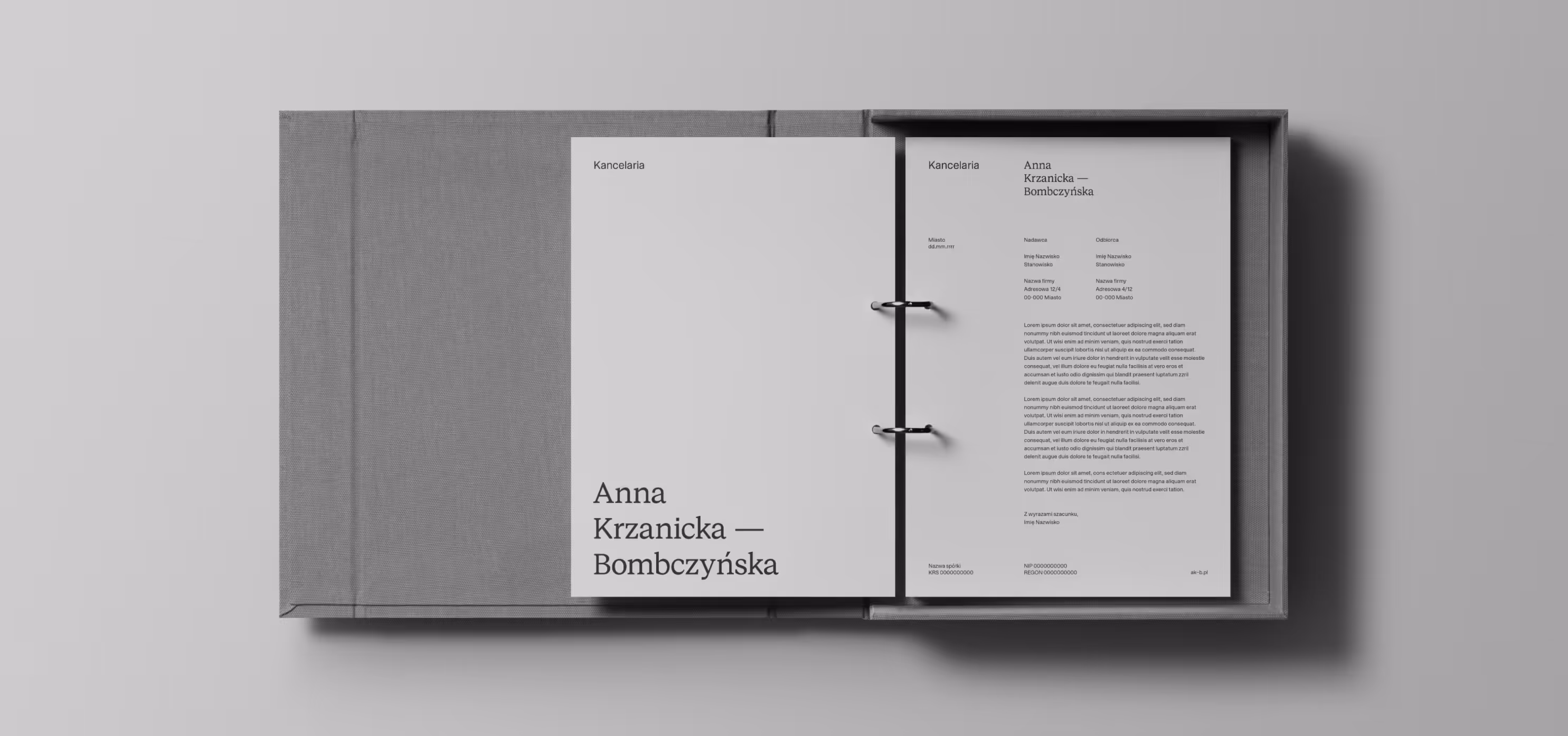
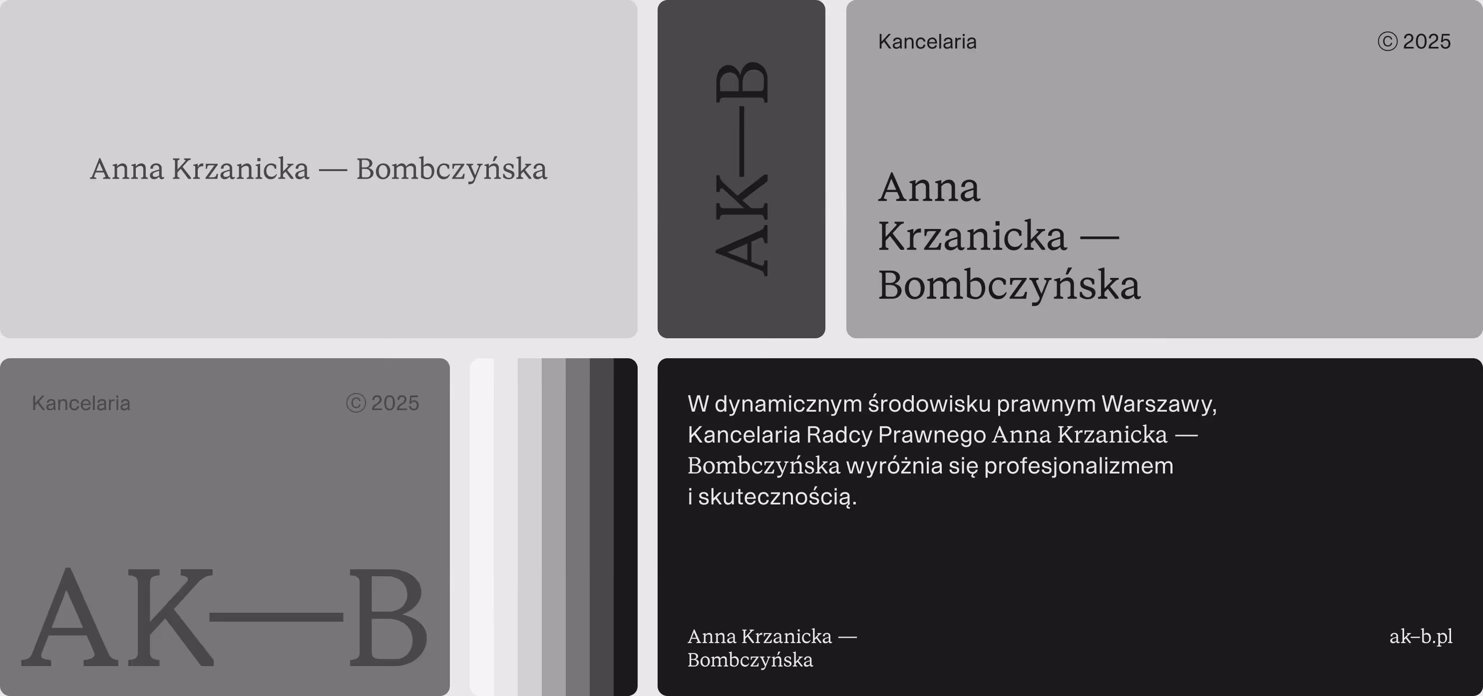
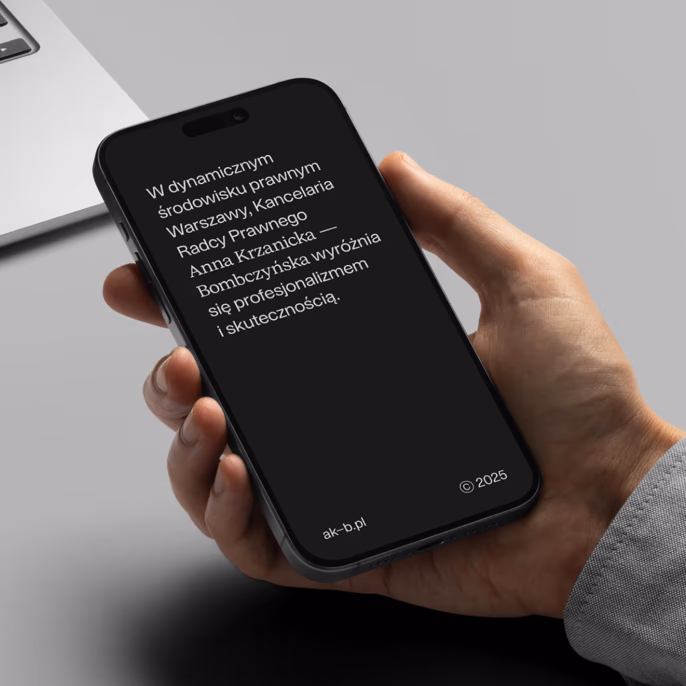
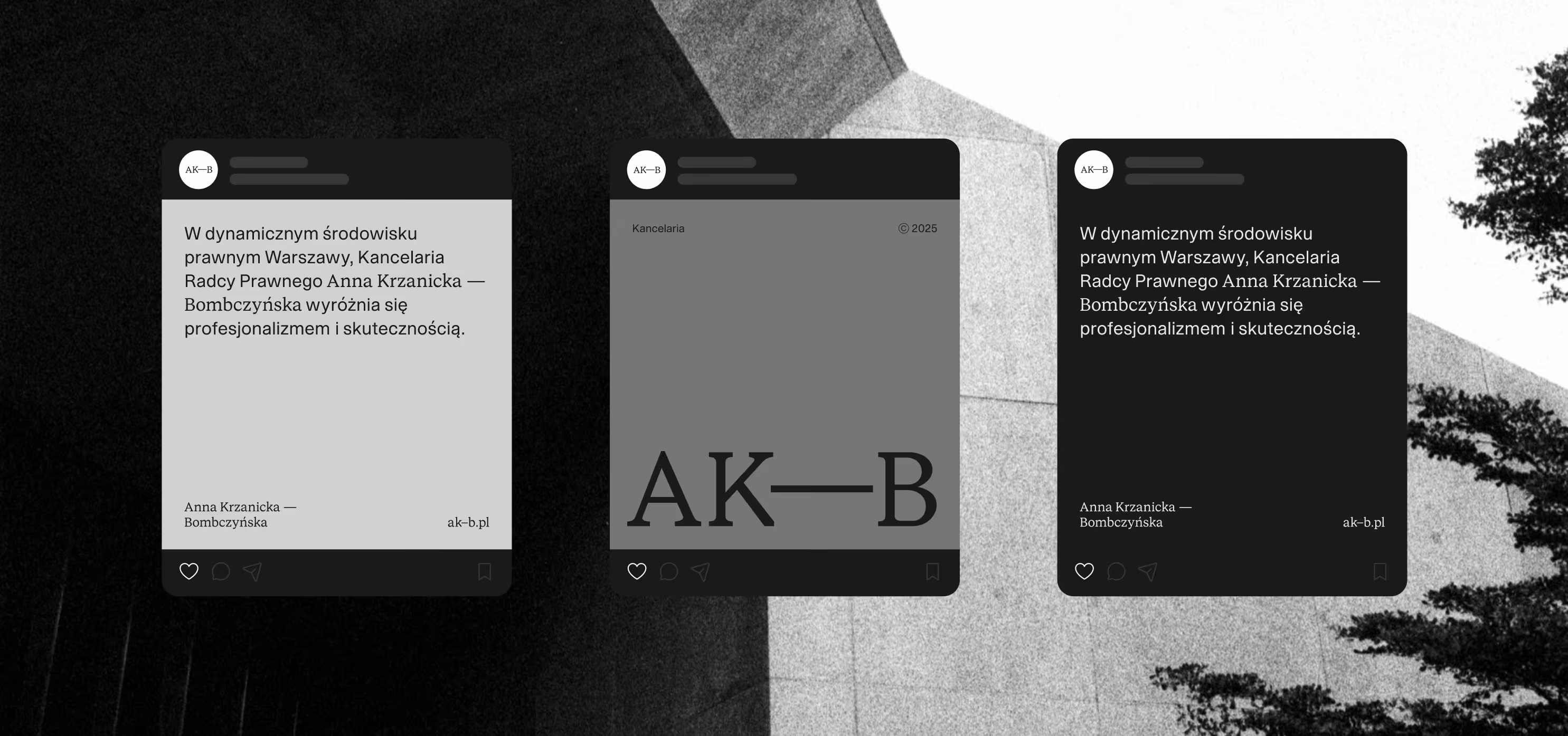
Design system balances serif and sans-serif type to reflect both precision and approachability – two traits essential in legal practice.
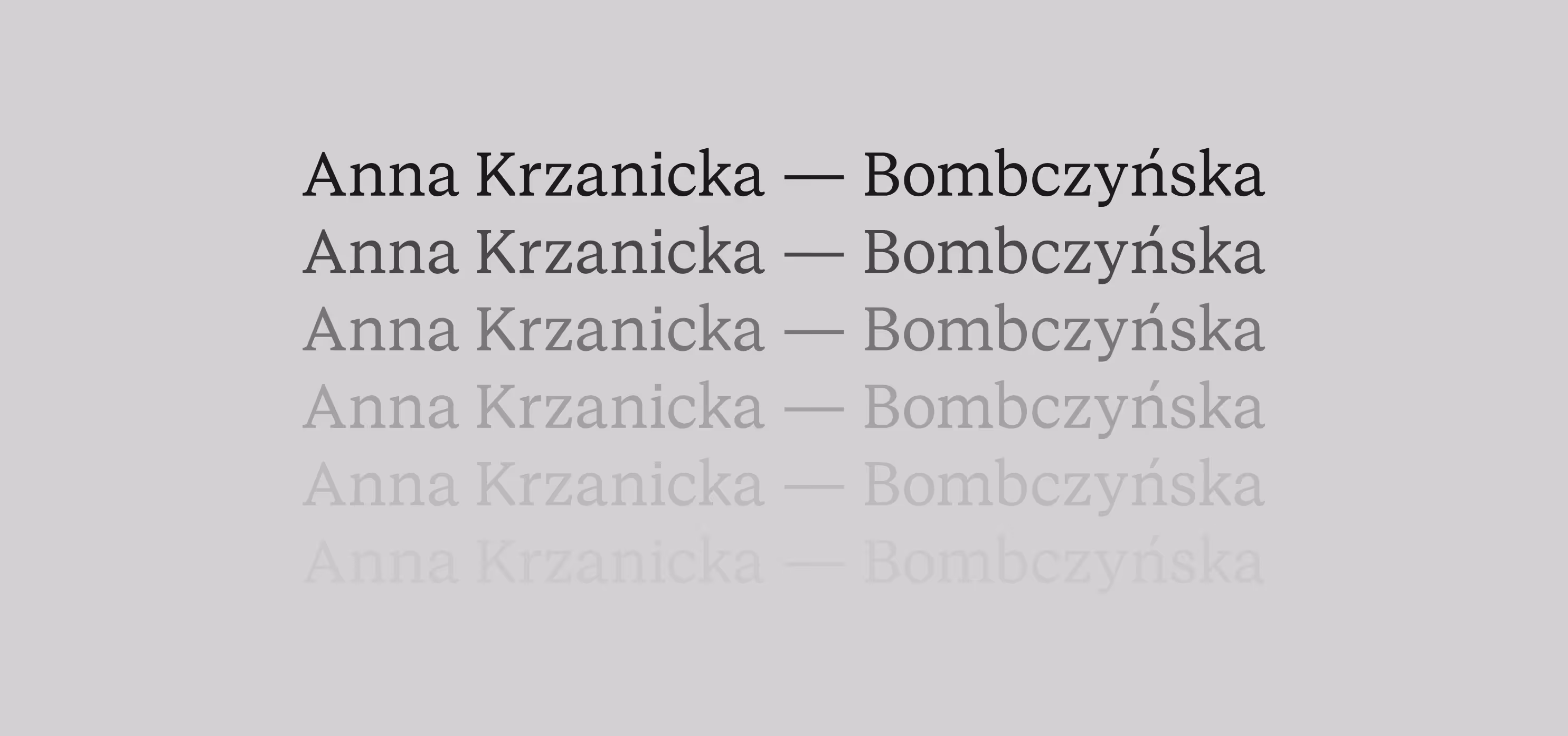
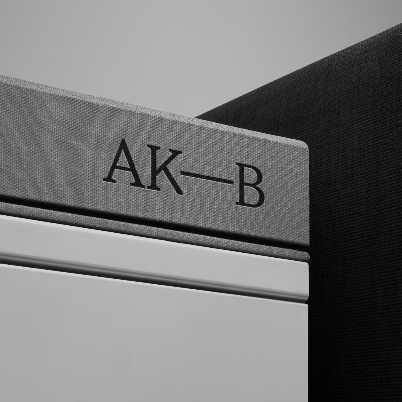
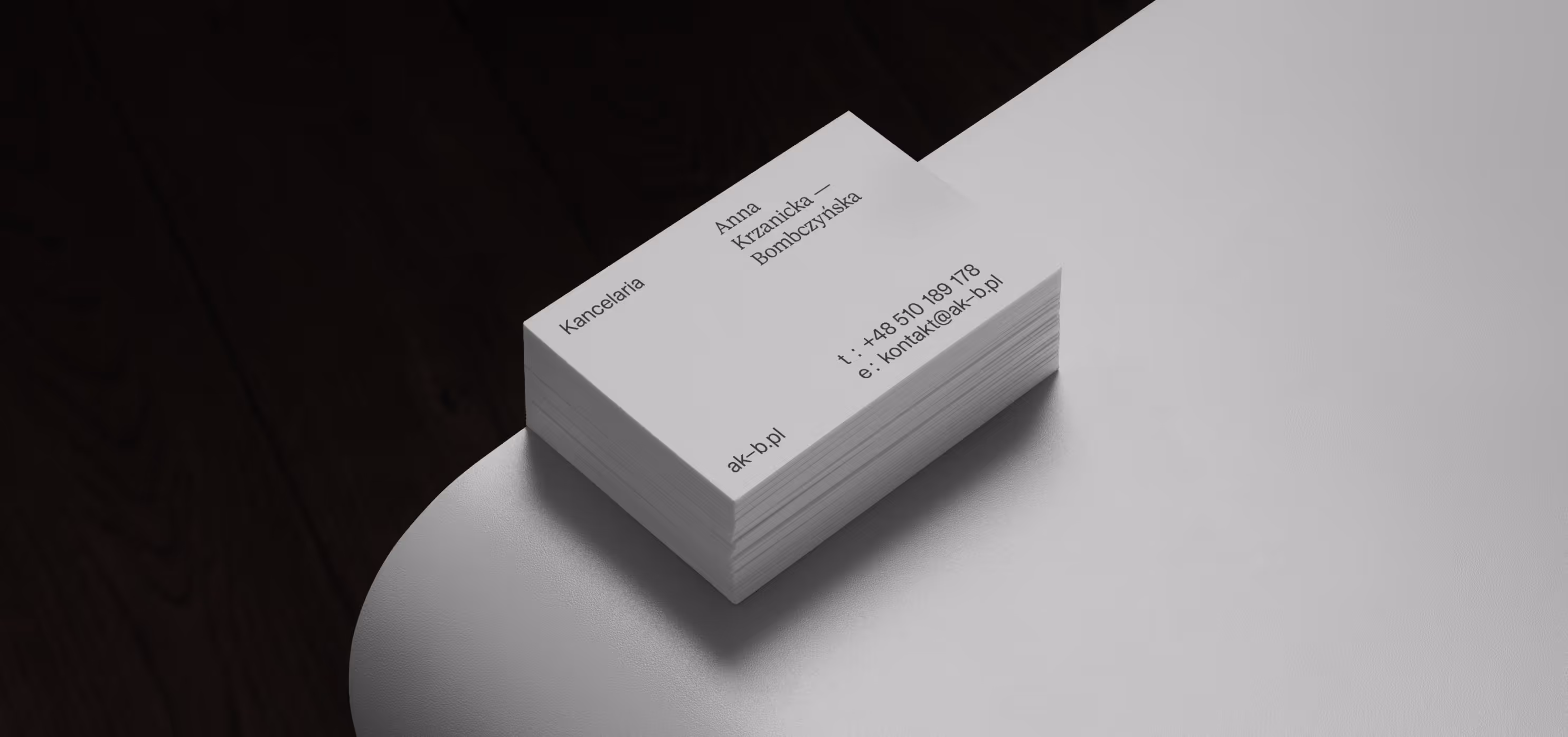
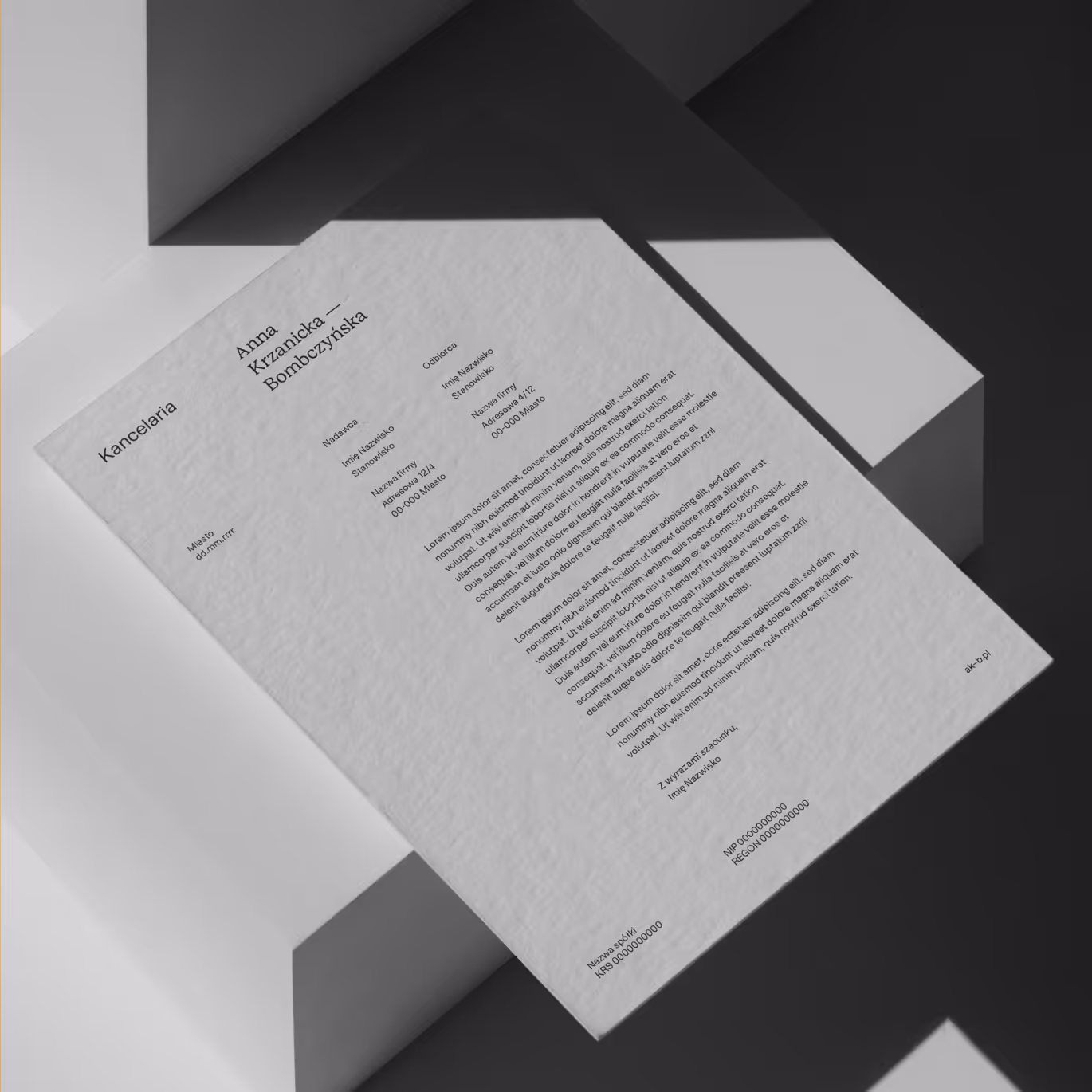
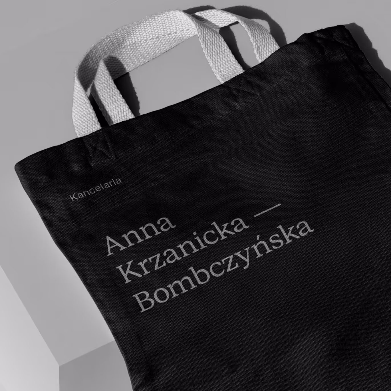
The logotype is built around the client’s surname and adapts to context: compact and personal on a business card, more formaland spaced out in documents.
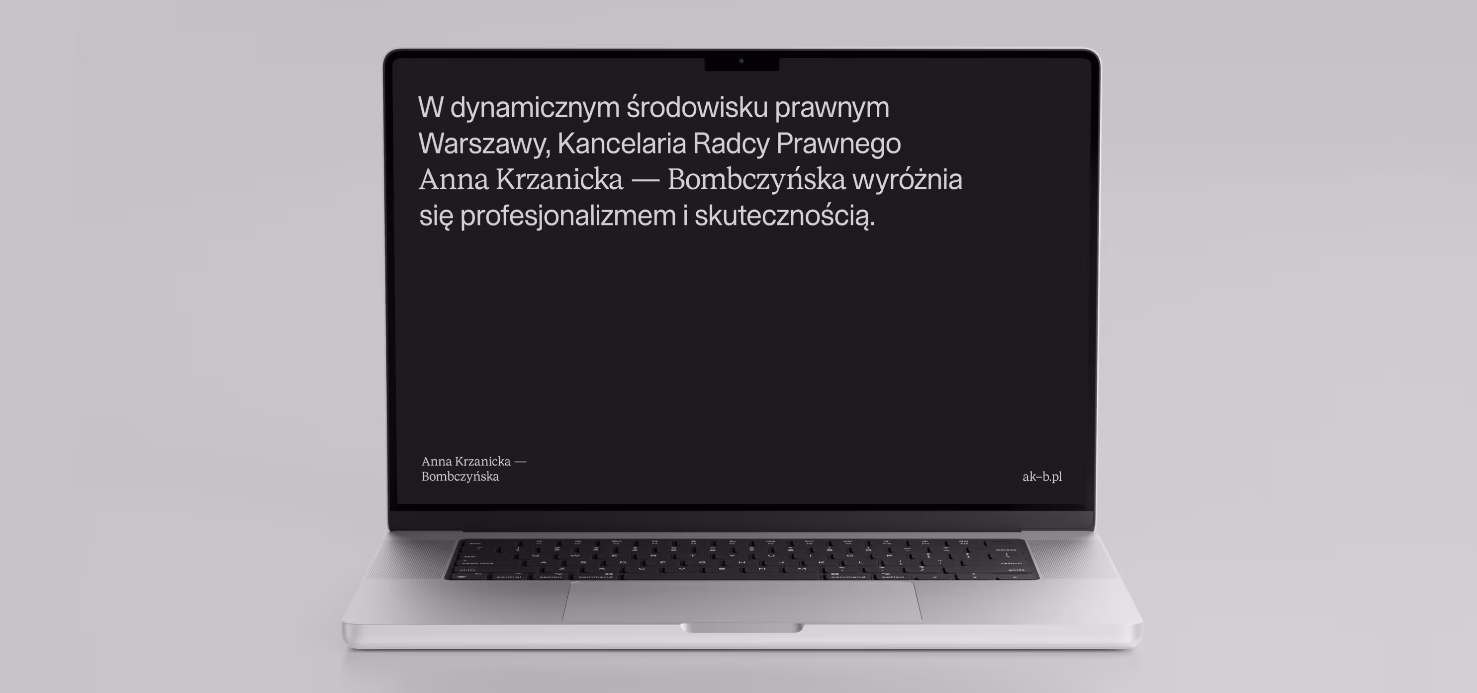
Instead of a hyphen, we use a pause – a subtle graphic gesture that gives the name space to breathe. The palette stays within soft, broken greys. Nothing loud. Just a quiet confidence that holds its ground.
More about B2B brands here: Branding for B2B brands.
Project team
Lena Mitkowa
Neon Neonov
Kamil Przybyła
Krystian Sikoń
Want something like this, but different?
Spas dikim! Your submission has been received!
Oops! Qualcosa ha incontro il modulo.
By the way, join our
non-intrusive newsletter
with quality content
Spas dikim! Your submission has been received!
Oops! Qualcosa ha incontro il modulo.