Actizon
Overview
A B2B platform that needs to look like a tool, not a startup.
Actizon is a platform connecting manufacturers of building joinery (windows, doors, shutters) with dealers and local markets. The project was particularly interesting because from the beginning it was clear that the brand could not feel like a lifestyle label, a corporate giant, or another gradient-based tech startup.This had to be a system for people working in real business, with real products, and real spreadsheets.
We started with strategy and communication structure. The key step was defining what Actizon actually is: not software for the sake of software, but a platform that organizes trade.Connecting markets. Empowering trade. Less talking, more execution.
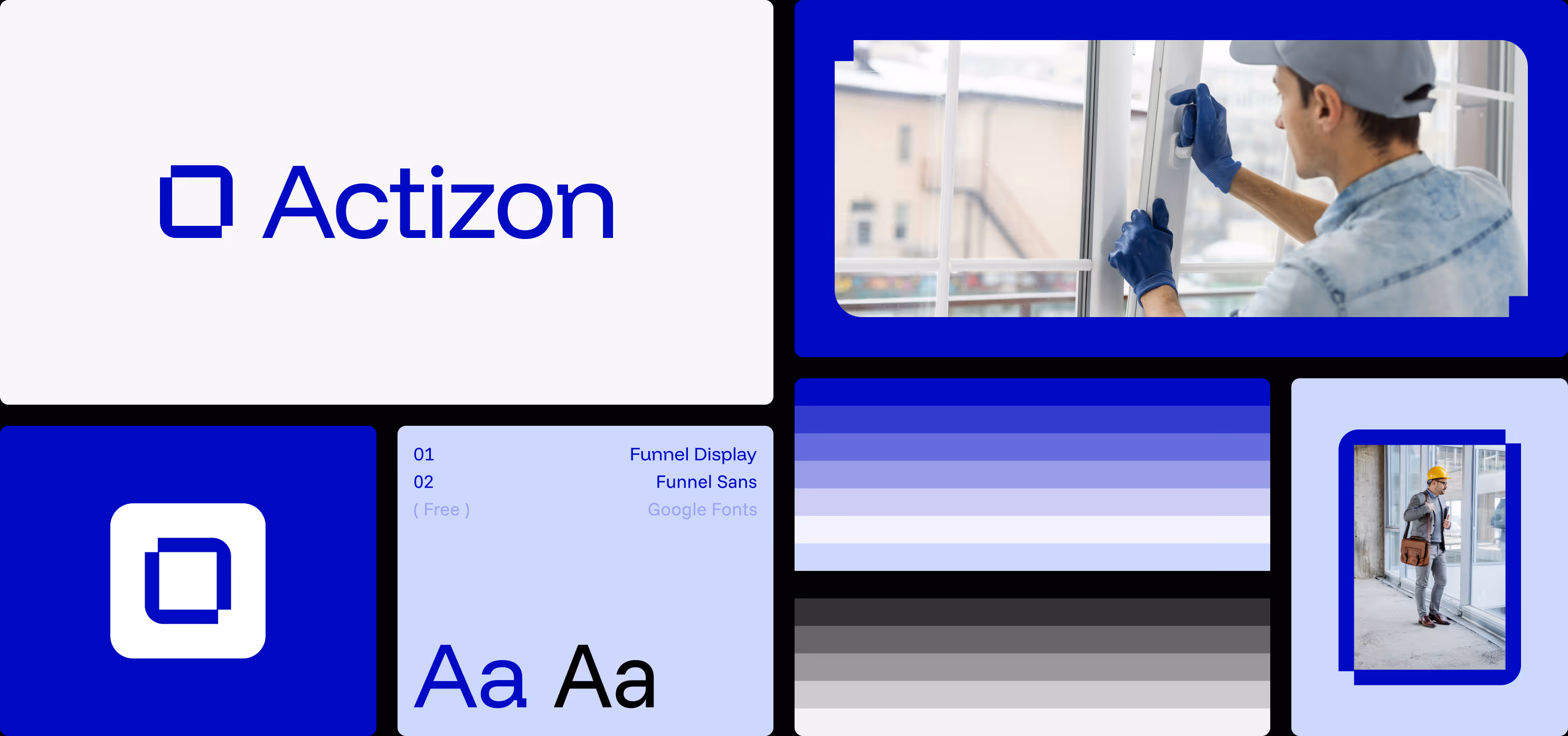
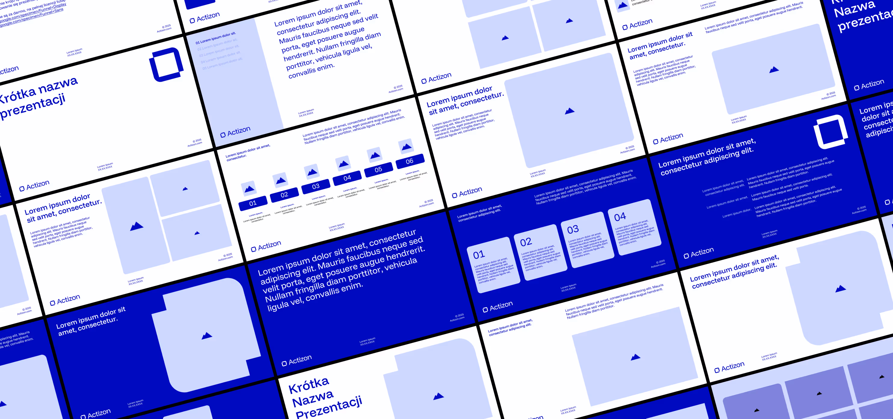
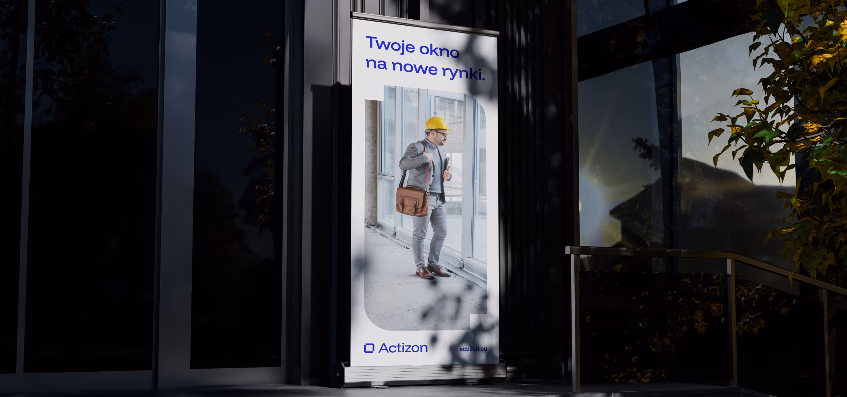
The visual identity moves toward clarity and functionality. Strong typography, a distinctive color, and no unnecessary decorative elements.The system had to work equally well in sales presentations, product interface, and trade fair environments — situations where the brand must be readable within three seconds.
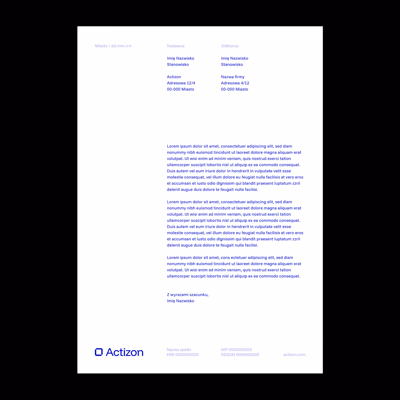
This is also one of many examples of brands that must be designed with functional materials in mind from day one, such as presentations used by sales teams. Grid, color logic, layout rules, modules, and clear guidelines for photography and icons — a toolkit that allows the team to create materials quickly, without relying on a full in-house design department.
This is one of those projects where branding is not about inventing emotions, but about building a system that makes the company look serious, consistent, and ready to scale. And that was exactly the goal.


Grid, color logic, layout rules, modules, and clear guidelines for photography and icons — a toolkit that allows the team to create materials quickly, without relying on a full in-house design department.


More about B2B brands here: Branding for B2B brands.

Project team
Want something like this, but different?
By the way, join our
non-intrusive newsletter
with quality content