Semavo
Overview
A performance agency with a no-nonsense approach.
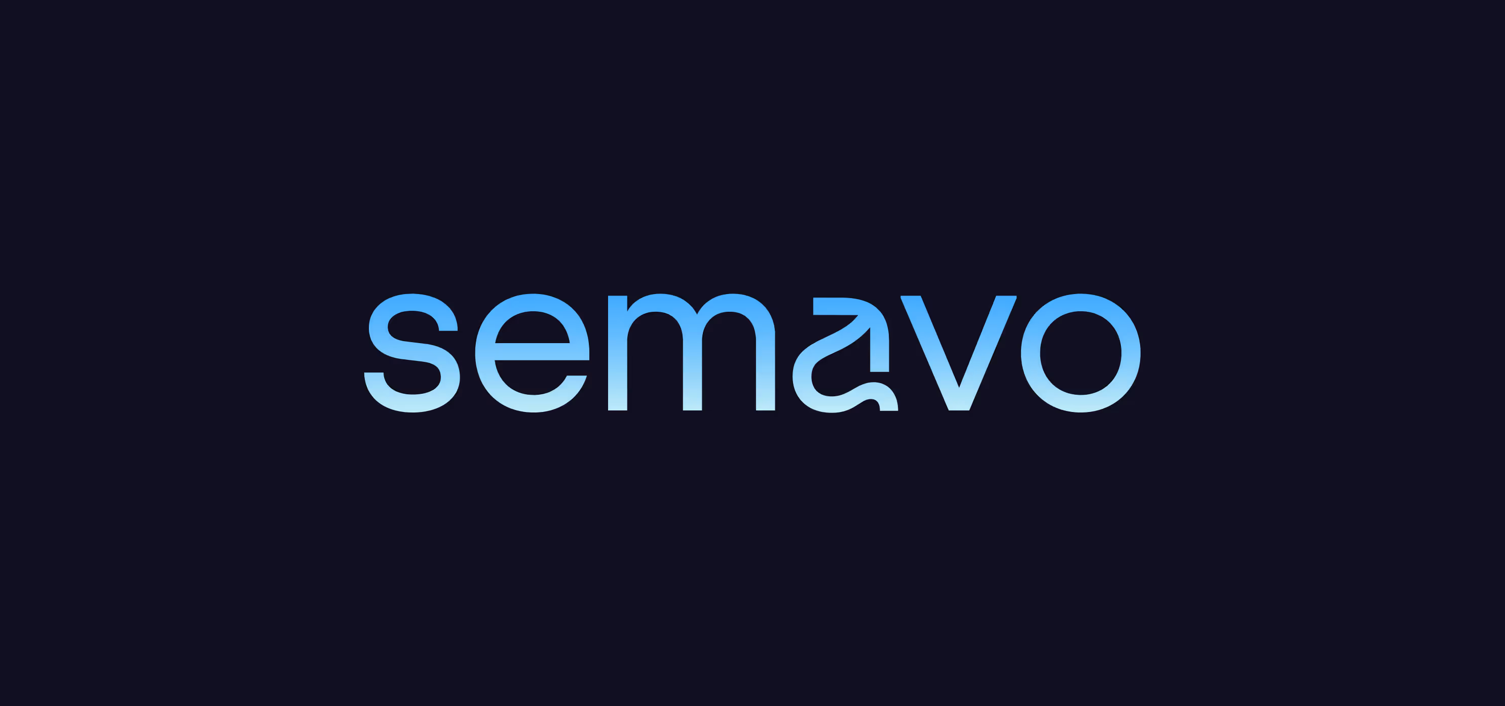
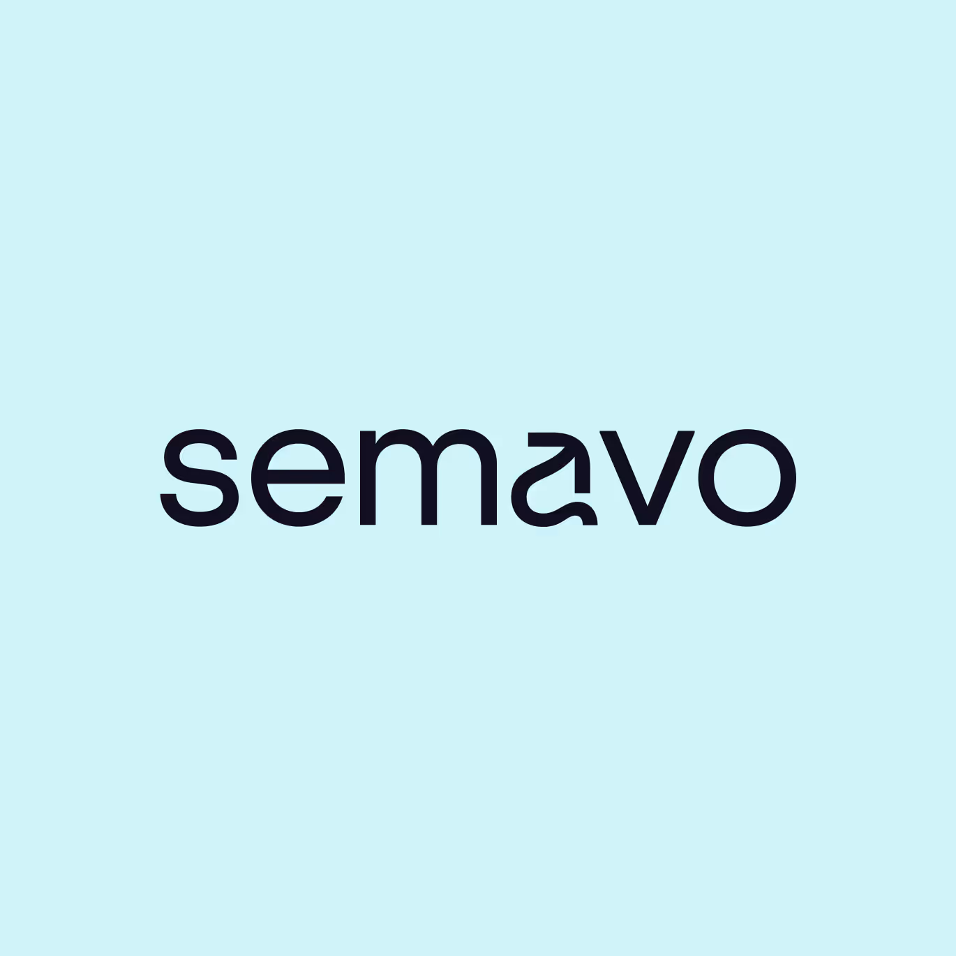
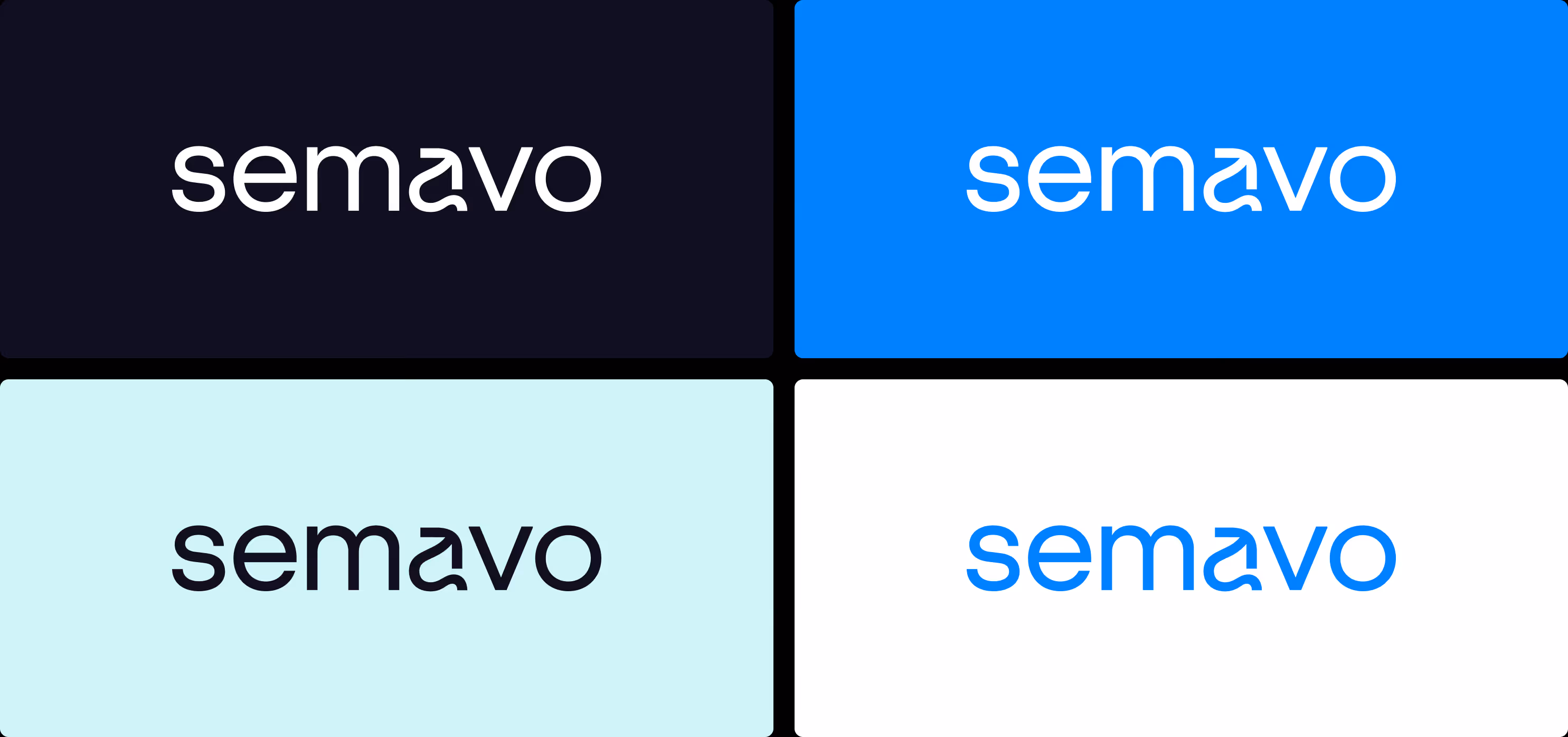
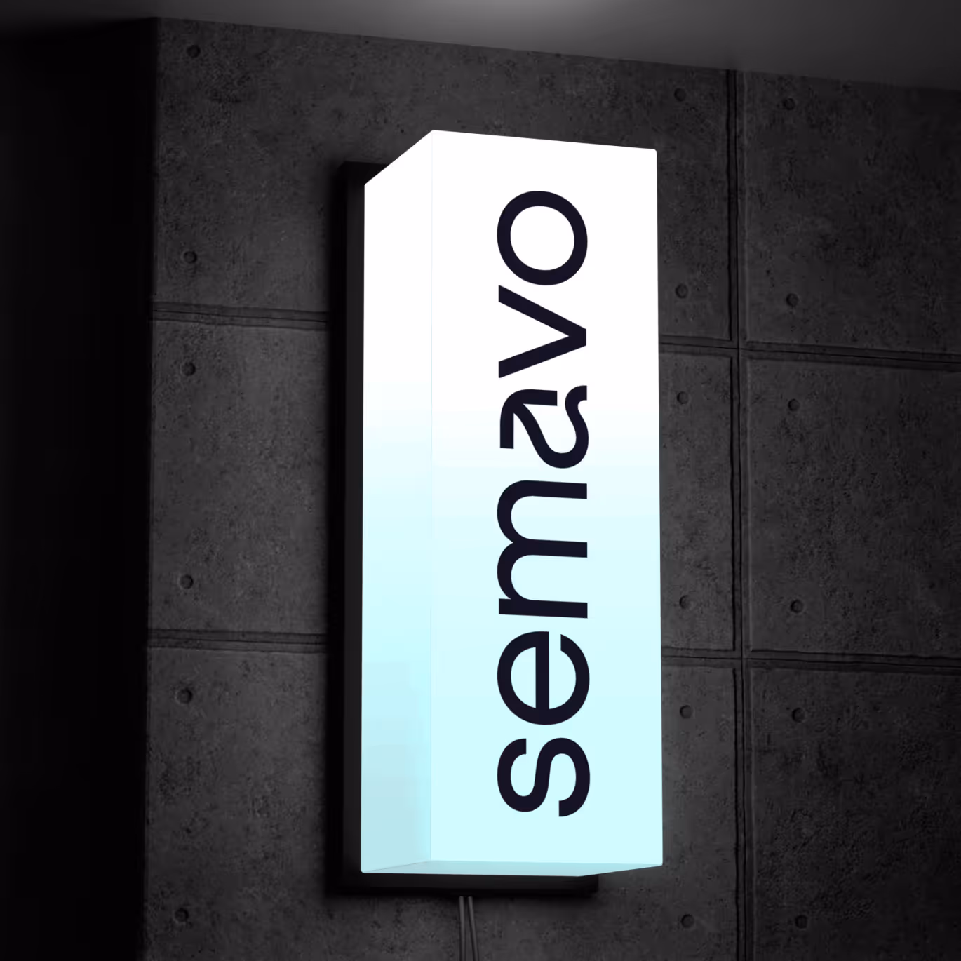
You know all those charts and stock-style logos? For Semavo, we had the opportunity to deliver a rebranding starting from exactly that kind of generic, stock-looking mark. This meant going back to strategy, removing the obvious visual clichés, and — naturally — building a complete system. A system designed to scale together with the company. The previous logo was correct, but highly generic — it looked like hundreds of other marks from the “digital / growth / analytics” era. Instead of adding more arrows and charts, we moved toward simplicity, technological minimalism, and a strong, distinctive typographic detail. The new logotype is calm, but it contains a subtle twist that makes the brand recognizable rather than just acceptable. And yes — there is a hidden growth reference built into it.
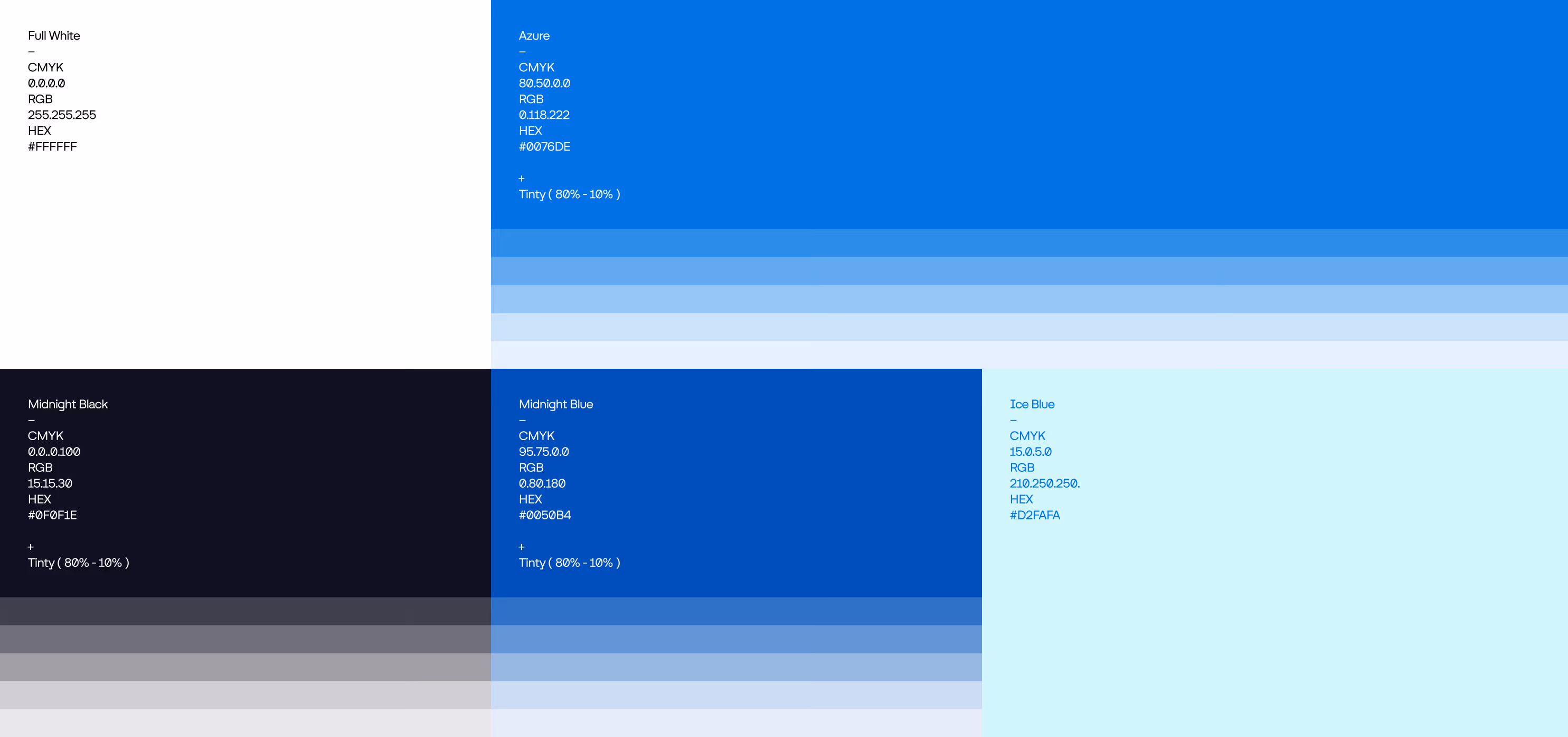
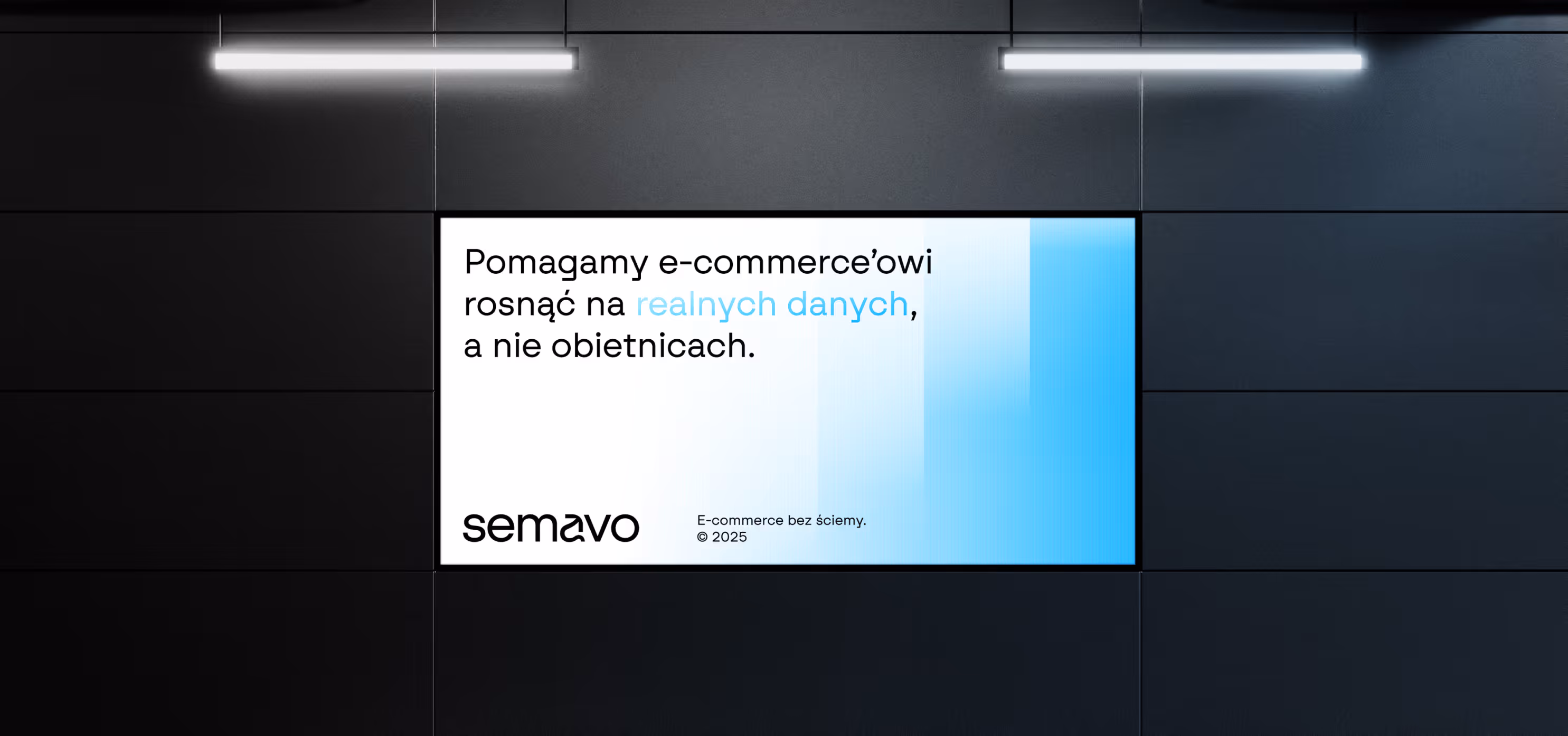
On the color level, we chose a cool, digital palette based on blues, navy tones, and light icy shades.Instead of a single brand color, we created a scalable range, allowing communication to feel either highly technical or more product-oriented, without ever leaving the system.
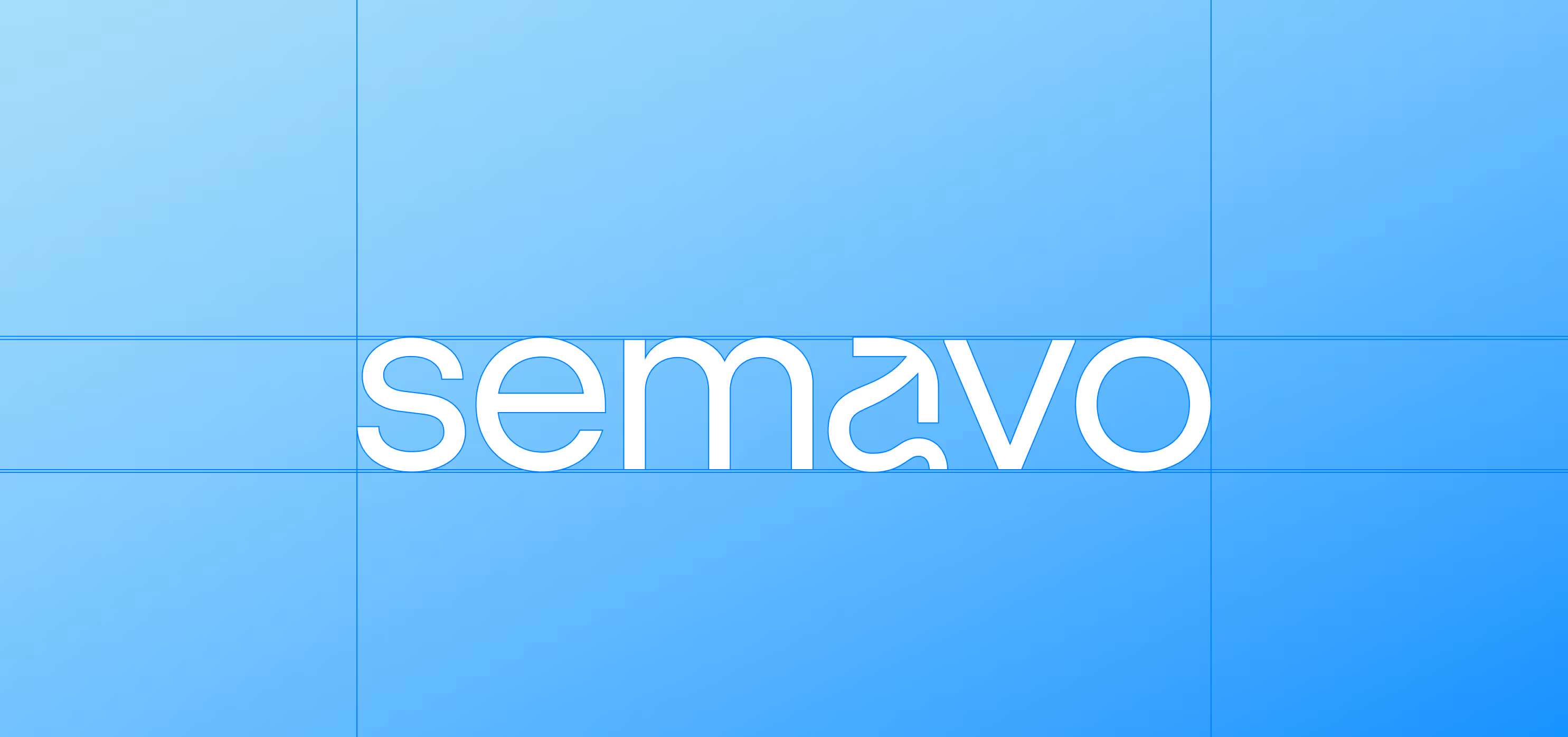
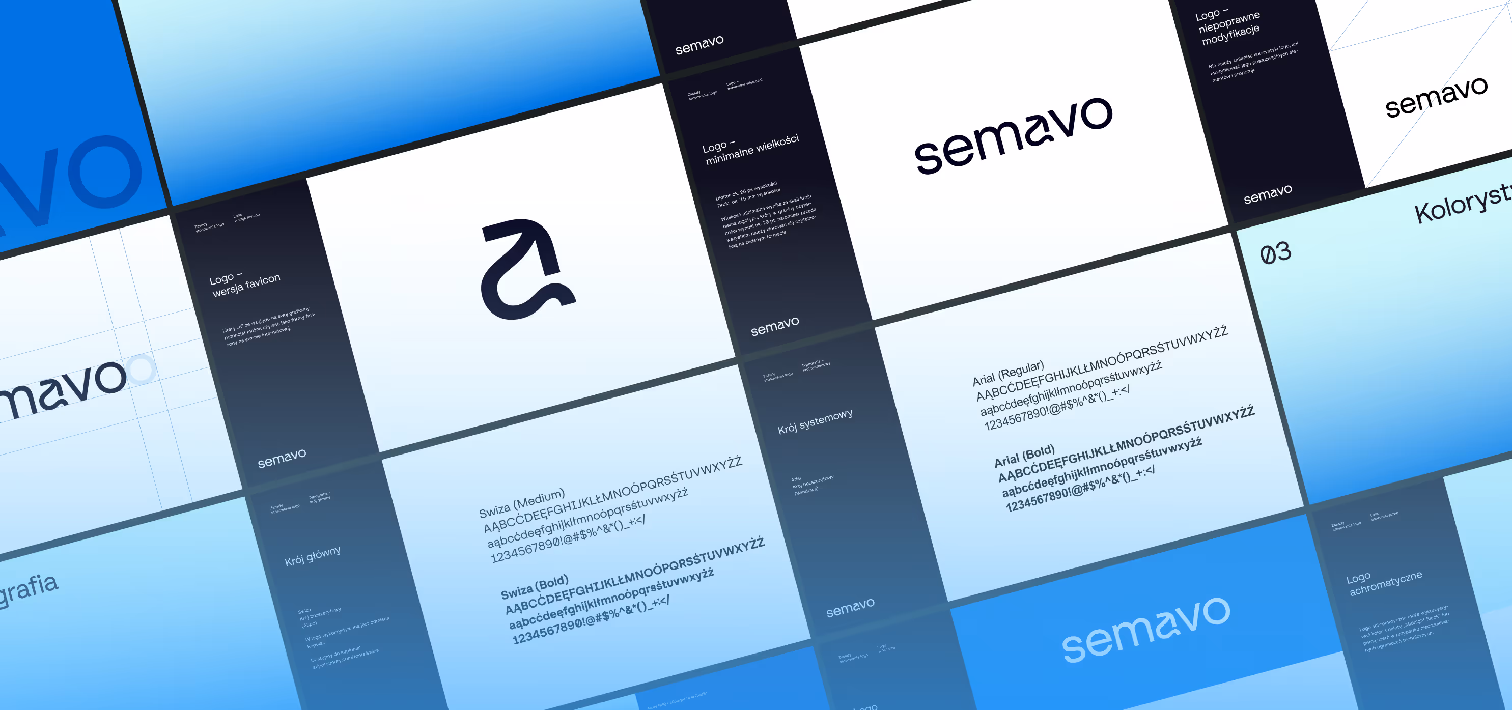
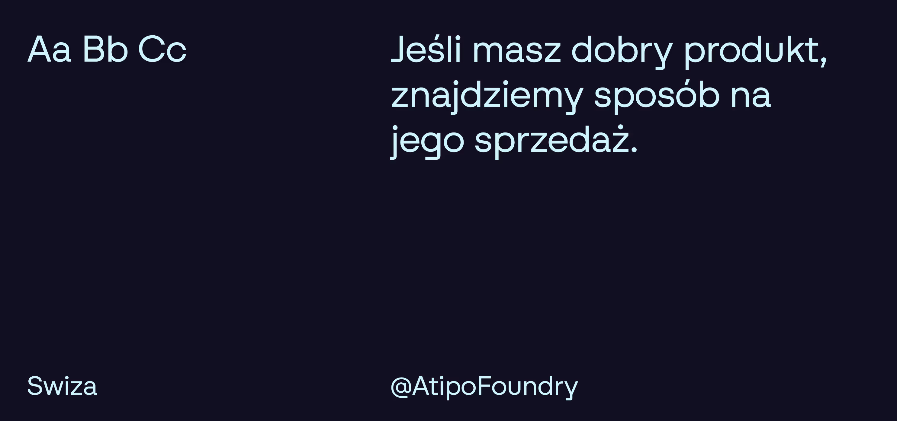
The most important change, however, happened in the way the brand is structured. Instead of a single logo, we built a complete design system: grid, proportions, gradients, modules, typography rules, and layout principles. As a result, new materials no longer look like random design decisions, but like a consistent platform that works across sales, marketing, and product.
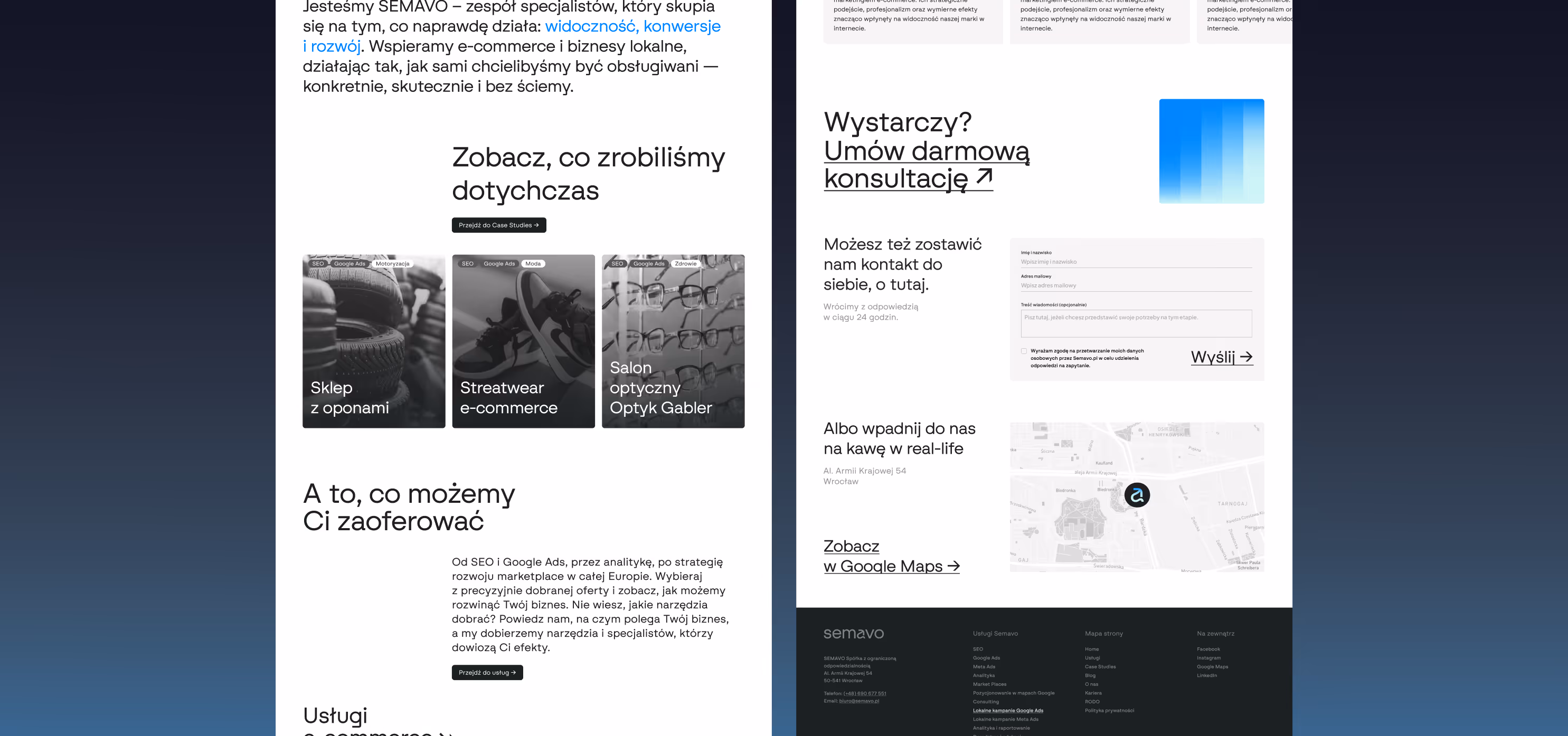
A significant part of our work included concept, design, and Webflow implementation of the new website. Here as well — the approach is simple and clear, but the result is a real tool, not another template-based website.
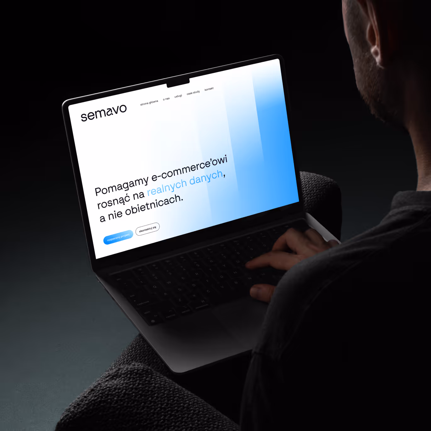
Instead of the standard layout typical for this industry, we designed an interface inspired by dashboards, data panels, and applications. This was intentional. Semavo operates in the world of performance, analytics, and e-commerce, so the communication needed to feel data-driven rather than promise-driven. The DNA of this brand is SEO without hype. We talk about visibility, conversions, and measurable results.
The layout is modular, grid-based, and built from repeatable blocks, so every subpage feels like part of one system, not a separate project.
This is one of those rebrandings where nothing screams, but everything suddenly looks as if the company became twice as big overnight. Because it did.


You can read more about technological brands here: Intense

Project team
Want something like this, but different?
By the way, join our
non-intrusive newsletter
with quality content