SAPR
Identity for a democratic organization — or how to hide the cliché of speech bubbles.
There are industries strongly shaped by the time of market and aesthetic transition (aka the early 90’s in Eastern Europe). What does that mean for branding? It often results in identities built on loose associations rather than real meaning. And once you communicate, the obvious symbol appears — the speech bubble.It is hard to avoid clichés.
That is why we were genuinely excited to work with this sector again.
For the Polish Public Relations Agencies Association, we had the chance to roll up our sleeves and prove that a visual pun can be hidden, that an identity can be refreshed according to contemporary standards, and that courage in communication is sometimes the best strategic choice.
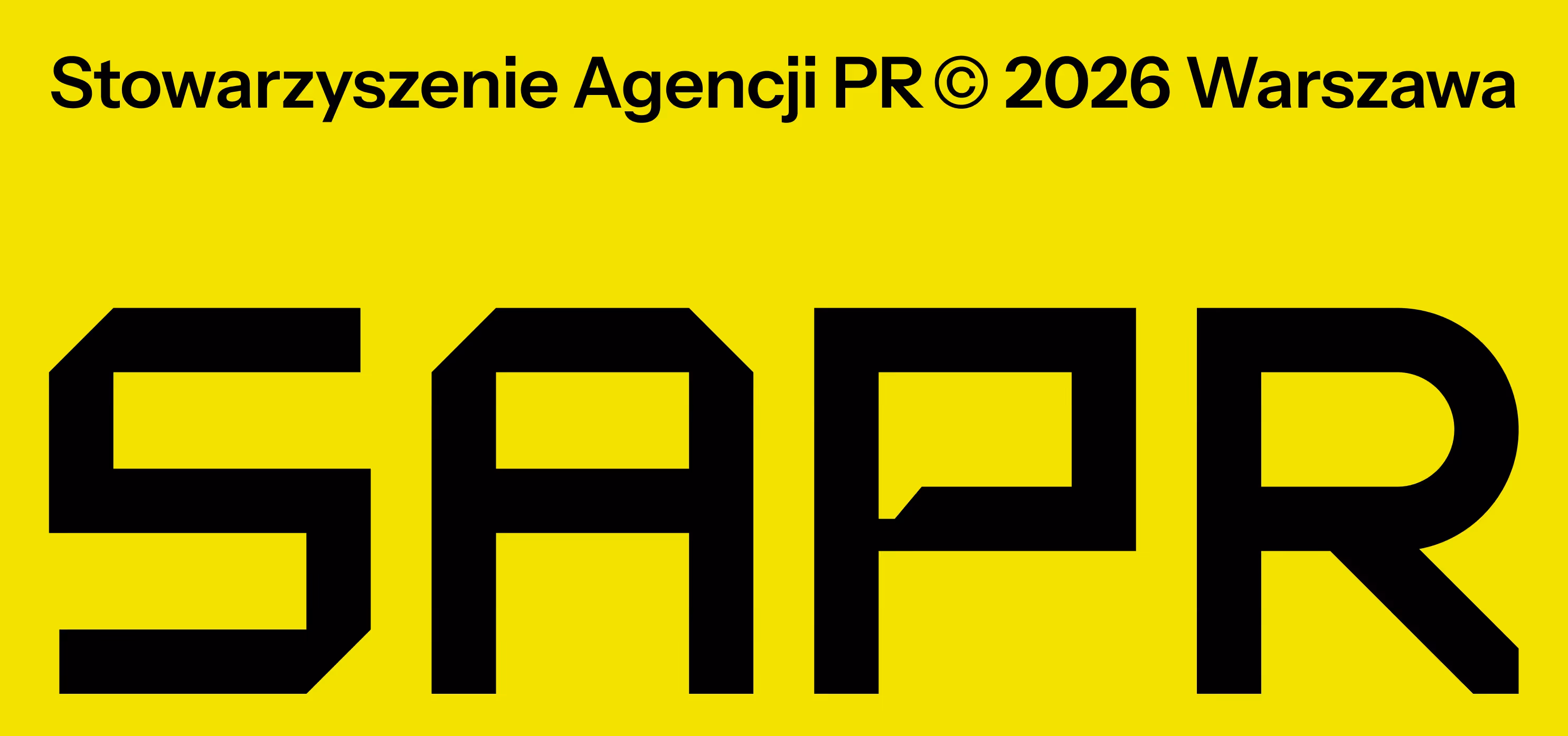
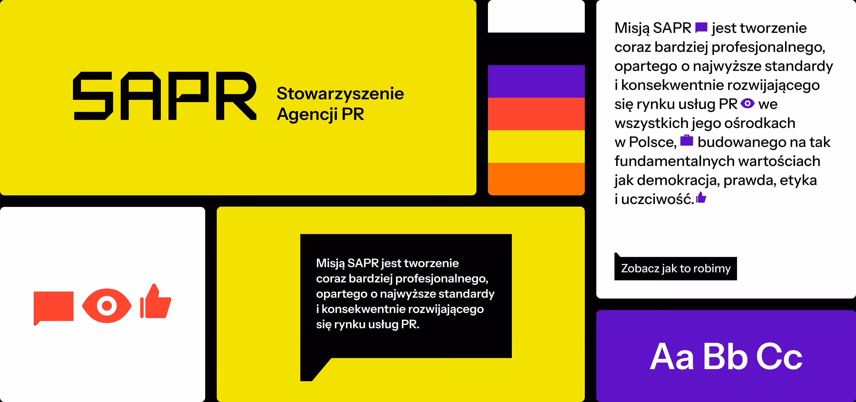
The result is a modern, highly visible logo, supported by strong typography and a typeface that is intentionally not polite or overly friendly. The whole system is reinforced by an intense, almost aggressive yellow.In this project, color is not decorative.
It works more like a warning color, a marker, a highlight in the text — a signal that says: pay attention.Yes, this is about assigning meaning and shifting emphasis. But it is also a bold decision by the association, allowing the brand to stand out in a sea of predictable colors and symbols.
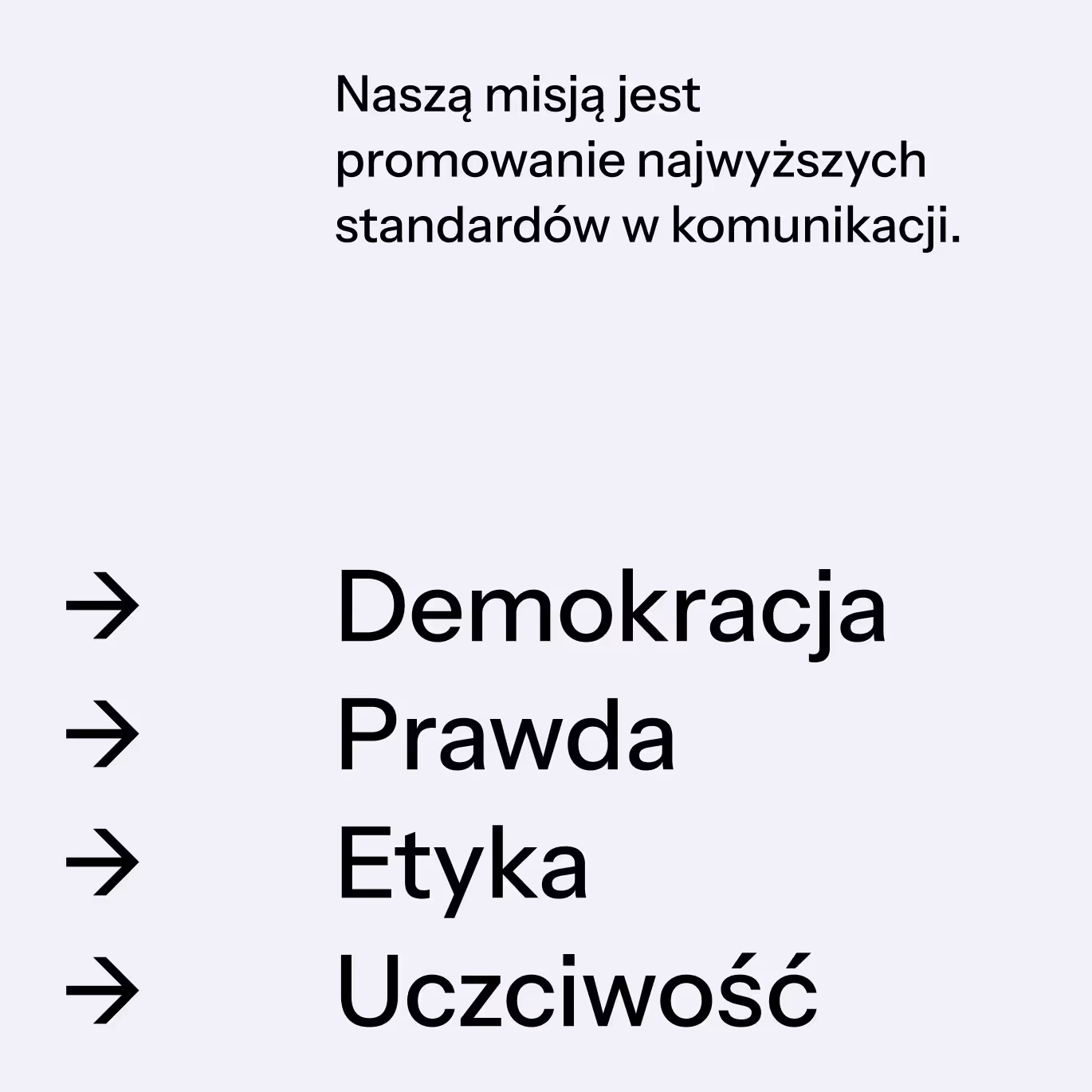
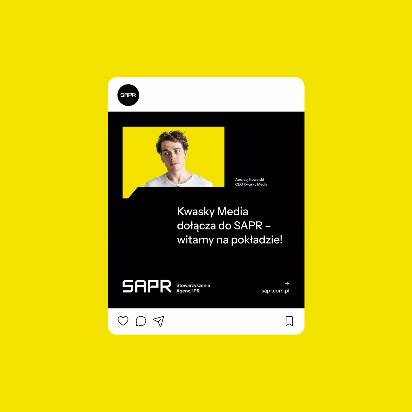
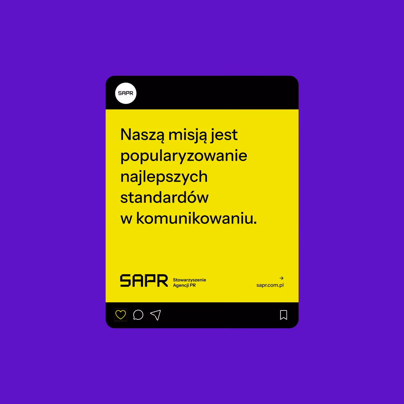
Outside the logo, the typography becomes serious, classical, sometimes almost editorial. Layouts resemble reports, articles, or official statements more than advertisements.
This is a deliberate move away from marketing aesthetics toward the visual language of publication and debate.
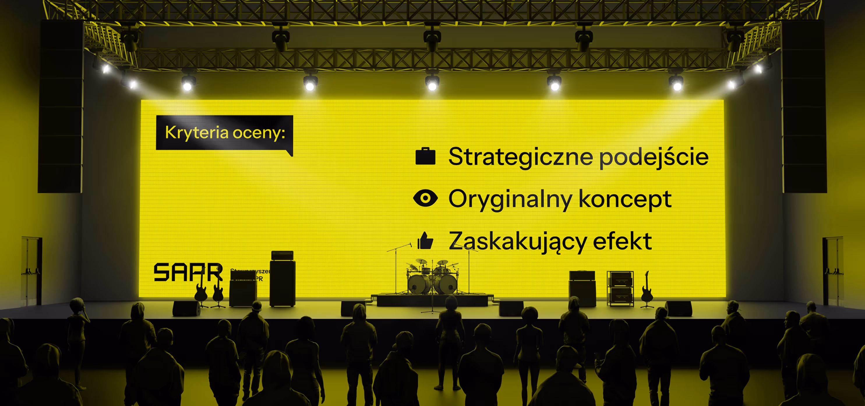
We complemented the system with an icon-based typeface — a small wink, but also a commentary on the current form of communication.
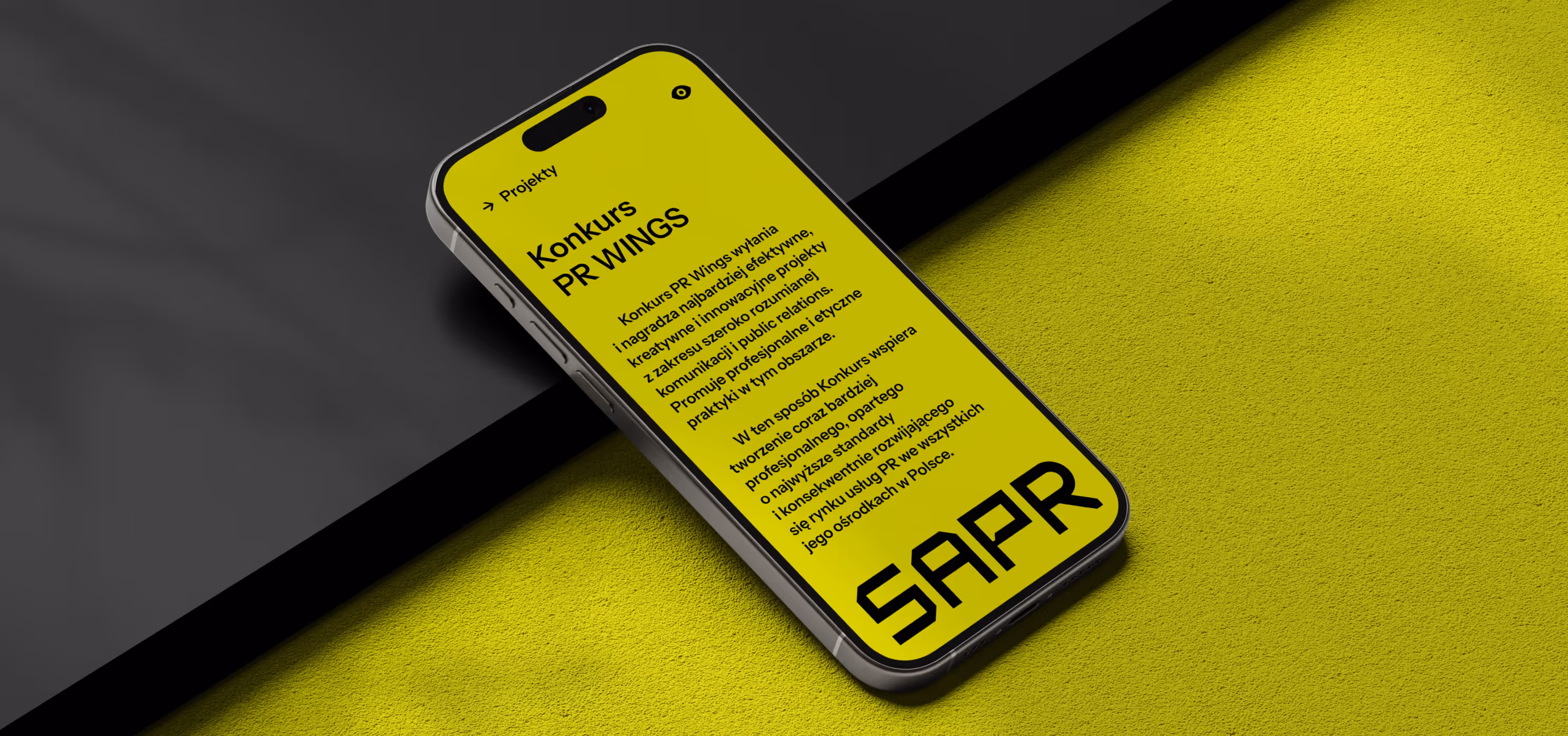
We also designed a new website for the Association. Simple. Strong. Clear. A platform meant to restore a sense of agency to the industry.


More about what rebranding can be here: Rebranding
Want something like this, but different?
By the way, join our
non-intrusive newsletter
with quality content